

When I talk to people who are not deep into the Power BI world, I often get the impression that they think of Power BI as a visualization tool exclusively. While that is true to a certain extent, it seems to me that they are not seeing the bigger picture – or maybe it’s better to say – they see just a tip of an iceberg! This tip of an iceberg is those shiny dashboards, KPI arrows, fancy AI stuff, and so on.
However, there is a lot more to it, as the real thing is under the surface…
In this series of articles, I’ll show you how Power BI can be used to create a fully-fledged analytic solution. Starting from the raw data, which doesn’t provide any useful information, to building, not just nice-looking visualizations, but extracting insights that can be used to define proper actions – something that we call informed decision making.
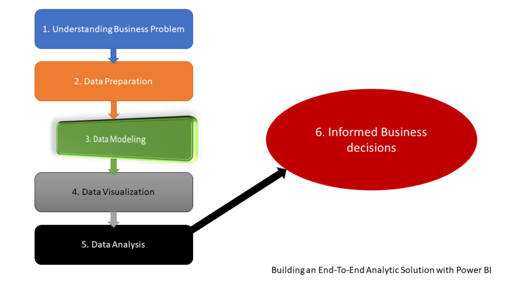
After we laid some theoretical background behind the process of building an end-to-end analytic solution and explained why it is of key importance to understand the business problems BEFORE building a solution, and applied some basic data profiling and data transformation, it’s the right moment to level up our game and spend some time elaborating about the best data model for our analytic solution. As a reminder, we use an open dataset about motor vehicle collisions in NYC, which can be found here.
Data modeling in a nutshell
When you’re building an analytic solution, one of the key prerequisites to create an EFFICIENT solution is to have a proper data model in place. I will not go deep into explaining how to build an enterprise data warehouse, the difference between OLTP and OLAP model design, talking about normalization, and so on, as these are extremely broad and important topics that you need to grasp, nevertheless if you are using Power BI or some other tool for development.
The most common approach for data modeling in analytic solutions is Dimensional Modeling. Essentially, this concept assumes that all your tables should be defined as either fact tables or dimension tables. Fact tables store events or observations, such as sales transactions, exchange rates, temperatures, etc. On the other hand, dimension tables are descriptive – they contain data about entities – products, customers, locations, dates…
It’s important to keep in mind that this concept is not exclusively related to Power BI – it’s a general concept that’s being used for decades in various data solutions!
If you’re serious about working in the data field (not necessarily Power BI), I strongly recommend reading the book: The Data Warehouse Toolkit: The Definitive Guide to Dimensional Modeling by Ralph Kimball and Margy Ross. This is the so-called “Bible” of dimensional modeling and thoroughly explains the whole process and benefits of using dimensional modeling in building analytic solutions.
Star schema and Power BI – match made in heaven!
Now, things become more and more interesting! There is an ongoing discussion between two confronted sides – is it better to use one single flat table that contains all the data (like we have at the moment in our NYC collisions dataset), or does it make more sense to normalize this “fat” table and create a dimensional model, known as Star schema?
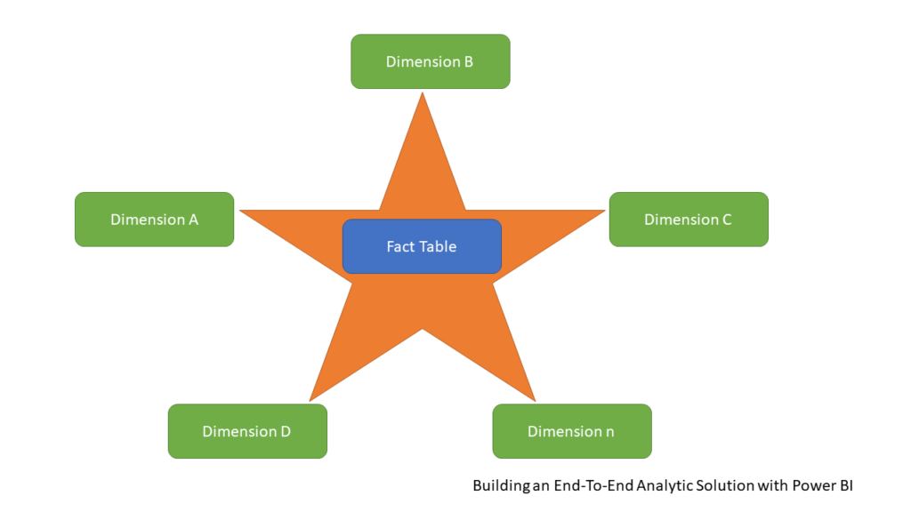
In the illustration above, you can see a typical example of dimensional modeling, called Star-schema. I guess I don’t need to explain to you why it is called like that:) You can read more about Star schema relevance in Power BI here. There was an interesting discussion whether the Star schema is a more efficient solution than having one single table in your data model – the main argument of the Star schema opponents was the performance – in their opinion, Power BI should work faster if there were no joins, relationships, etc.
And, then, Amir Netz, CTO of Microsoft Analytics and one of the people responsible for building a VertiPaq engine, cleared all the uncertainties on Twitter:

If you don’t believe a man who perfectly knows how things work under the hood, there are also some additional fantastic explanations by proven experts why star schema should be your preferred way of modeling data in Power BI, such as this video from Patrick (Guy in a Cube), or this one from Alberto Ferrari (SQL BI).
And, it’s not just about efficiency – it’s also about getting accurate results in your reports! In this article, Alberto shows how writing DAX calculations over one single flat table can lead to unexpected (or it’s maybe better to say inaccurate) results.
Without going any deeper into explaining why you should use Star schema, let me just show you how using one single flat table can produce incorrect figures, even for some trivial calculations!
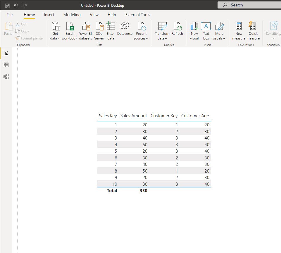
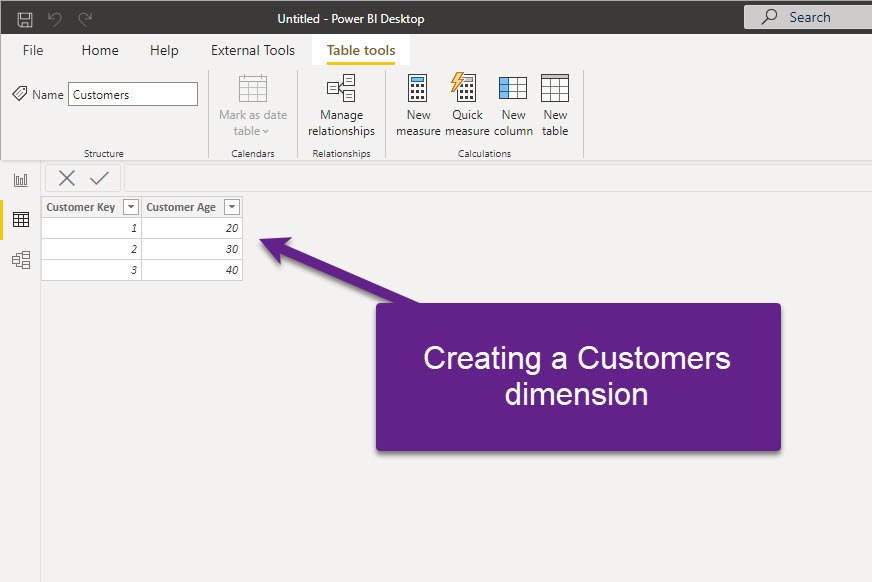
This is my flat table that contains some dummy data about Sales. And, let’s say that the business request is to find out the average age of the customers. What would you say if someone asks you what is the average customers’ age? 30, right? We have a customer 20, 30, and 40 years old – so 30 is the average, right? Let’s see what Power BI says…
AVG Customer Age = AVERAGE(Table1[Customer Age])
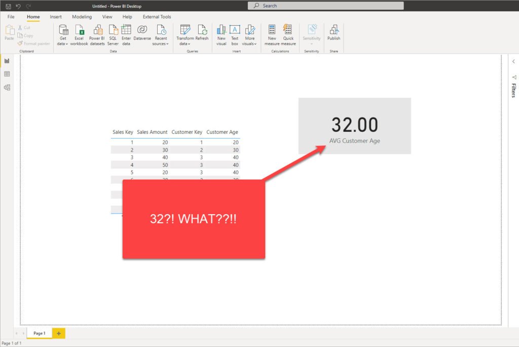
How the hell is this possible?! 32, really?! Let’s see how we got this unexpected (incorrect) number…If we sum all the Customer Age values, we will get 320…320 divided by 10 (that’s the number of sales), and voila! There you go, that’s your 32 average customers’ age!
Now, I’ll start building a dimensional model and take customers’ data into a separate dimension table, removing duplicates and keeping unique values in the Customers dimension:
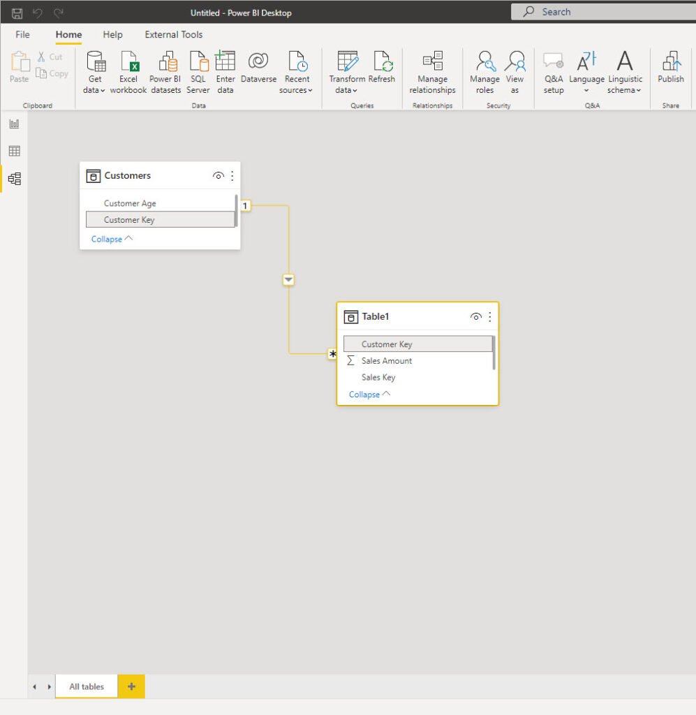
I’ve also removed Customer Age from the original Sales table and established the relationship between these two on the Customer Key column:
Finally, I just need to rewrite my measure to refer to a newly created dimension table:
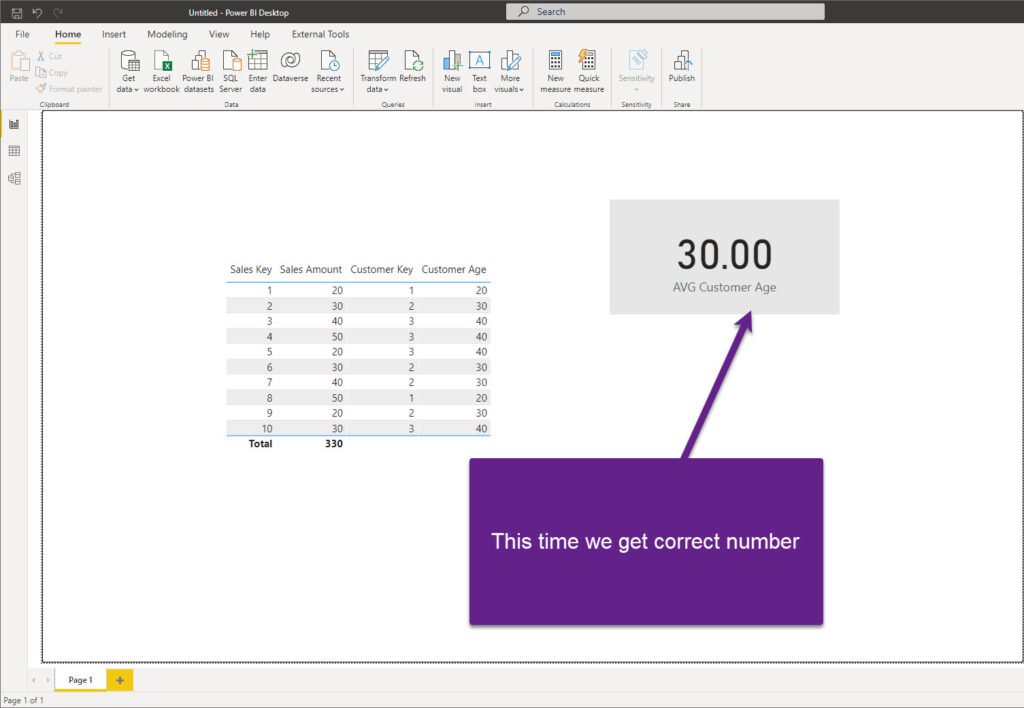
AVG Customer Age = AVERAGE(Customers[Customer Age])
And, now, if I take another look at my numbers, this time I can confirm that I’m returning the correct result:
Of course, there is a way to write more complex DAX and retrieve the correct result even with a single flat table. But, why doing it in the first place? I believe we can agree that the most intuitive way would be to write a measure like I did, and return a proper figure with a simple DAX statement.
So, it’s not only about efficiency, it’s also about accuracy! Therefore, the key takeaway here is: model your data into a Star schema whenever possible!
Building a Star schema for NYC Collisions dataset
As we concluded that the Star schema is the way to go, let’s start building the optimal data model for our dataset. The first step is to get rid of the columns with >90% missing values, as we can’t extract any insight from them. I’ve removed 9 columns and now I have 20 remaining.
At first glance, I have 5 potential dimension tables to create:
- Date dimension
- Time dimension
- Location dimension (Borough + ZIP Code)
- Contributing Factor dimension
- Vehicle Type dimension
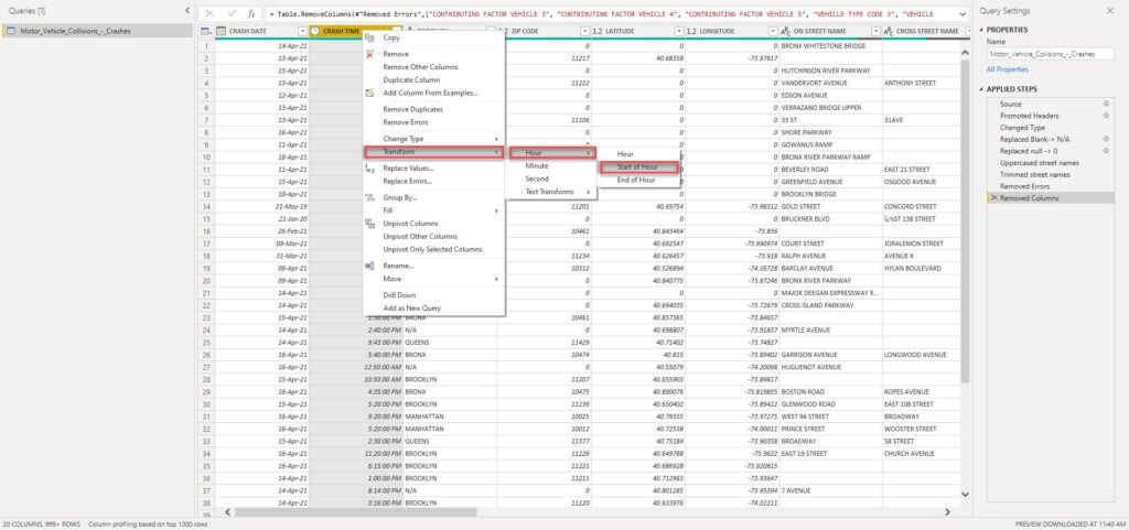
But, before we proceed to create them, I want to apply one additional transformation to my Crash Time column. As we don’t need to analyze data on a minute level (hour level of granularity is the requirement), I’ll round the values to a starting hour:
I’ll now duplicate my original flat table 4 times (for each of the dimensions needed, except for the Date dimension, as I want to use a more sophisticated set of attributes, such as day of the week for example). Don’t worry, as we will keep only relevant columns in each of our dimensions and simply remove all the others. So, here is an example how the Location dimension looks like:
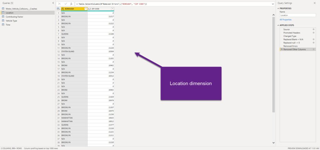
The next important step is to make sure that we have unique values in each dimension, so we can establish proper 1-M relationships between dimension and fact table. I will now select all my dimension columns and remove duplicates:
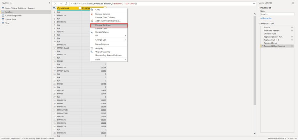
We need to do this for every single dimension in our data model! From here, as we don’t have “classic” key columns in our original table (like, for example, in the previous case when we were calculating average customers’ age and we had Customer Key column in the original flat table), there are two possible ways to proceed: the simpler path assumes establishing relationships on text columns – it’s nothing wrong with that “per-se”, but it can have implications on the data model size in large models.
Therefore, we will go another way and create a surrogate key column for each of our dimensions. As per definition in dimensional modeling, the surrogate key doesn’t hold any business meaning – it’s just a simple integer (or bigint) value that increases sequentially and uniquely identifies the row in the table.
Creating a surrogate key in Power Query is quite straightforward using Index column transformation.
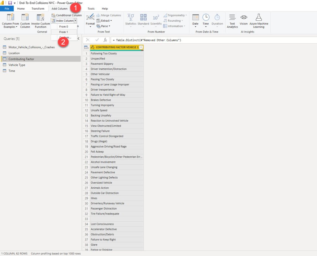
Just one remark here: by default, using an Index column transformation will break query folding. However, as we are dealing with CSV file, which doesn’t support query folding at all, we can safely apply Index column transformation.
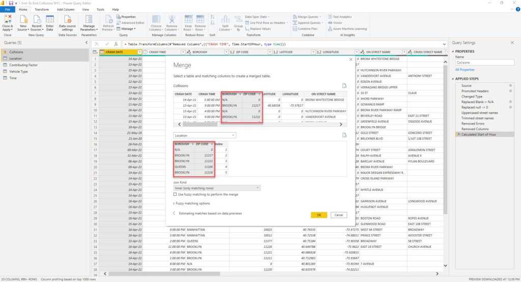
The next step is to add this integer column to the fact table, and use it as a foreign key to our dimension table, instead of the text value. How can we achieve this? I’ll simply merge the Location dimension with my Collisions fact table:
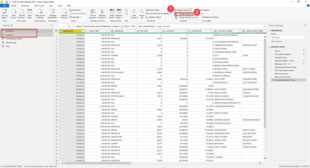
Once prompted, I’ll perform a merge operation on the columns that uniquely identify one row in the dimension table (in this case, composite key of Borough and ZIP Code):
And after Power Query applies this transformation, I will be able to expand the merged Location table and take the Index column from there:
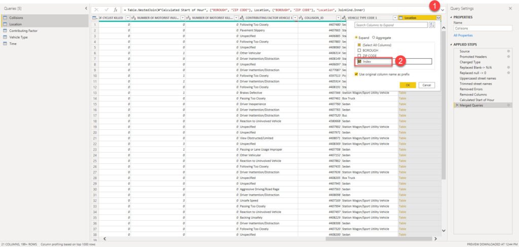
Now, I can use this one integer column as a foreign key to my Location dimension table, and simply remove two attribute columns BOROUGH and ZIP CODE – this way, not that my table is cleaner and less cluttered – it also requires less memory space – instead of having two text columns, we now have one integer column!

I will apply the same logic to other dimensions (except the Time dimension) – include index columns as foreign keys and remove original text attributes.
Enhancing the data model with Date dimension and relationships
Now, we’re done with data modeling in Power Query editor and we’re ready to jump into Power BI and enhance our data model by creating a Date dimension using DAX. We could’ve also done it using M in Power Query, but I’ve intentionally left it to DAX, just to show you multiple different capabilities for data modeling in Power BI.
It’s of key importance to set a proper Date/Calendar dimension, in order to enable DAX Time Intelligence functions to work in a proper way.
To create a Date dimension, I’m using this script provided by SQL BI folks.
Date =
VAR MinYear = YEAR ( MIN ( Collisions[CRASH DATE] ) )
VAR MaxYear = YEAR ( MAX ( Collisions[CRASH DATE] ) )
RETURN
ADDCOLUMNS (
    FILTER (
        CALENDARAUTO( ),
        AND ( YEAR ( [Date] ) >= MinYear, YEAR ( [Date] ) <= MaxYear )
    ),
    "Calendar Year", "CY " & YEAR ( [Date] ),
    "Month Name", FORMAT ( [Date], "mmmm" ),
    "Month Number", MONTH ( [Date] ),
    "Weekday", FORMAT ( [Date], "dddd" ),
    "Weekday number", WEEKDAY( [Date] ),
    "Quarter", "Q" & TRUNC ( ( MONTH ( [Date] ) - 1 ) / 3 ) + 1
i
After I’ve marked this table as a date table, it’s time to build our Star schema model. I’ll switch to a Model view and establish relationships between the tables:
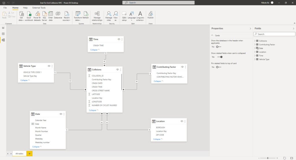
Does that remind you of something? Exactly, looks like the star illustration above. So, we followed the best practices regarding data modeling in Power BI and built a Star schema model. Don’t forget that we were able to do this without leaving the Power BI Desktop environment, using Power Query Editor only, and without writing any code! I hear you, I hear you, but DAX code for Date dimension doesn’t count:)
Conclusion
Our analytic solution is slowly improving. After we performed necessary data cleaning and shaping, we reached an even higher level by building a Star schema model which will enable our Power BI analytic solution to perform efficiently and increase the overall usability – both by eliminating unnecessary complexity, and enabling writing simpler DAX code for different calculations.
As you witnessed, once again we’ve proved that Power BI is much more than a visualization tool only!
In the next part of the series, we will finally move to that side of the pitch and start building some cool visuals, leveraging the capabilities of the data model we’ve created in the background.
Thanks for reading!


Rolly
Great article out there! . Is there any documentation as to how to create a star schema with multiple fact tables?
Nikola
Hey Rolly,
Patrick from Guy in a Cube has a great video on how to handle multiple fact tables in Power BI. Here is the link: https://www.youtube.com/watch?v=TnyRsO4NJPc
Hope this helps.
Michael
“I’ll now duplicate my original flat table 4 times”
Why is it a duplicate and not a link? (I hope the translation is correct)
Why for each of these requests to repeat all the previous steps?
Nikola
Hey Michael,
Thanks for your comment. You can also use Reference (I guess you thought Reference when you said link), but my preferred choice is almost always Duplicate. Let me explain why:
Duplicate creates a brand new copy with all the existing steps and a new copy is completely independent of the original query. You can freely make changes in both the original and new query, and they will NOT affect each other. On the other side, Reference is a new copy with one single step: retrieving the data from the original query. If you change the original query, let’s say, remove the column, the new query will not have it anymore.
Michael
If you use a Reference, then there are problems with the preview.
When the first table is the main table, you cannot see the columns of the referencing query and accordingly select them for the join. You can only do the opposite, but it makes no sense.
I hope you understand, I’m not an English speaker)
Nikola
All clear, thanks:)
Michael
yea, i already figured it out…