When I talk to people who are not deep into the Power BI world, I often get the impression that they think of Power BI as a visualization tool exclusively. While that is true to a certain extent, it seems to me that they are not seeing the bigger picture – or maybe it’s better to say – they see just a tip of an iceberg! This tip of an iceberg is those shiny dashboards, KPI arrows, fancy AI stuff, and so on.
However, there is a lot more to it, as the real thing is under the surface…
In this series of articles, I’ll show you how Power BI can be used to create a fully-fledged analytic solution. Starting from the raw data, which doesn’t provide any useful information, to building, not just nice-looking visualizations, but extracting insights that can be used to define proper actions – something that we call informed decision making.
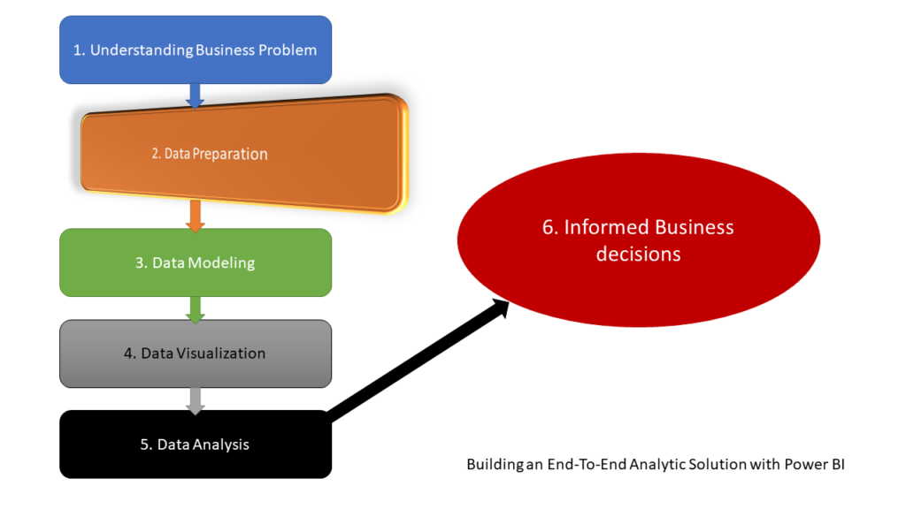
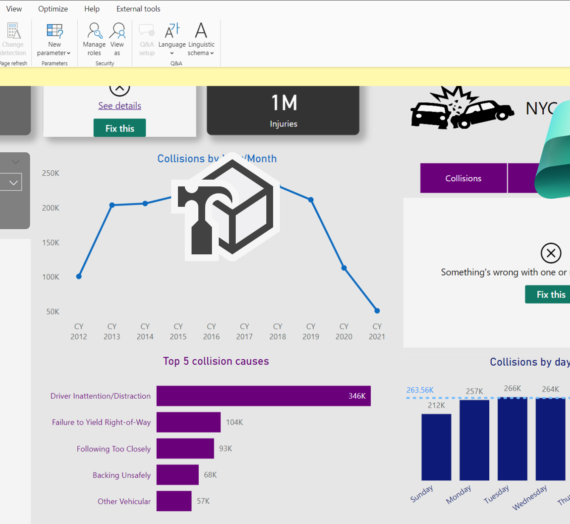
In the previous part of the series, we laid some theoretical background behind the process of building an end-to-end analytic solution and explained why it is of key importance to understand the business problems BEFORE building a solution. Now, it’s time to pull our sleeves up and start real work with our dataset. As a reminder, we will use an open dataset about motor vehicle collisions in NYC, which can be found here.
First look into the dataset
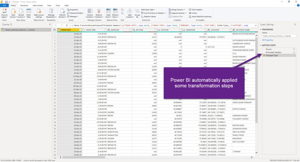
Data is stored in the CSV format, and we have one flat table containing ~1.8 million rows and 29 columns. Let’s take a quick look at the data once it’s imported into Power BI:
Before we go deeper into specific challenges related to data modeling, let me briefly stop here and state a few important things:
- Power BI (or to be more specific, Power Query Editor), automatically applied some transformation steps and start shaping our data. As you can see, Promoted Headers transformation took first row values and set them as column names, while Power Query also changed the type of various columns
Data Preparation
Here starts our journey! This is the first station to debunk the myth about Power BI as a visualization tool only. Let me quickly explain why: you could just hit that Close & Apply button in the top left corner of the Power Query Editor and start building your visualizations right away!
But, the fact that you CAN do something, doesn’t mean that you SHOULD…For some quick ad-hoc analysis, you may sneak through without applying additional steps to shape and prepare your data, but if you plan to build a robust and flexible analytics solution, that would be able to answer a whole range of different business questions, you would be better spending some time to face-lift your data and establish a proper data model.
Since we are dealing with CSV file in our example, Power Query Editor is the obvious place to apply all of our data preparation work. If we were to use, for example, SQL database as a data source, we could’ve also performed data shaping on the source side – within the database itself!
Here, as a best practice, I’ll quote Matthew Roche’s famous “maxim”:
Data should be transformed as far upstream as possible, and as far downstream as necessary…
Matthew Roche
Data Profiling
For the starter, Power Query Editor offers you a very handy set of features to perform data profiling. I’ll go to the View tab and turn on Column quality, Column distribution and Column profile features to help me better understand the data and identify potential issues that need to be resolved.
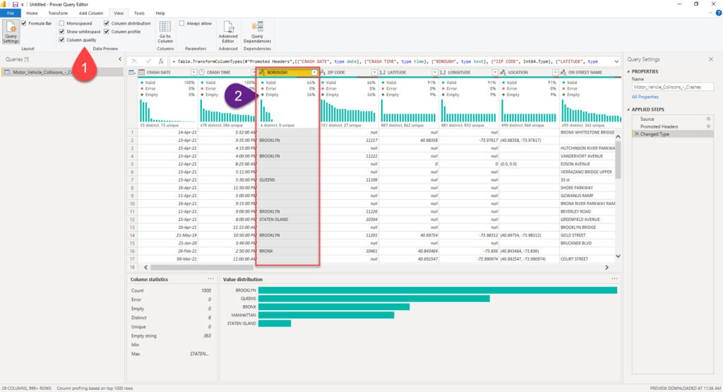
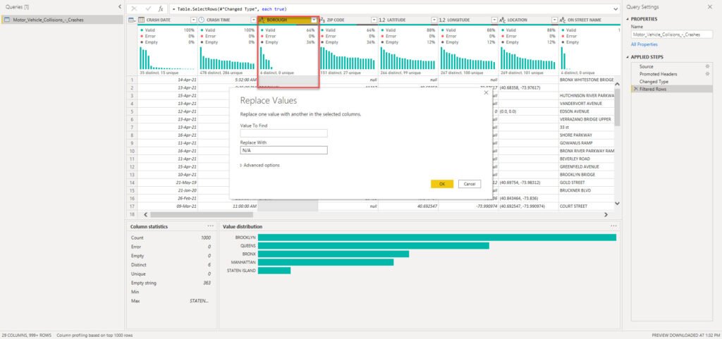
This will enable me to immediately spot that, for example, there are 36% of missing values for the Borough column. Based on the findings, I can decide to leave it like that, or apply some additional transformations to fix the missing or incomplete data. For example, I can decide to replace all blank or null values with N/A or something similar.
I could also quickly identify outliers or anomalies (if any). Let’s imagine that we profile Number of Persons Injured column:
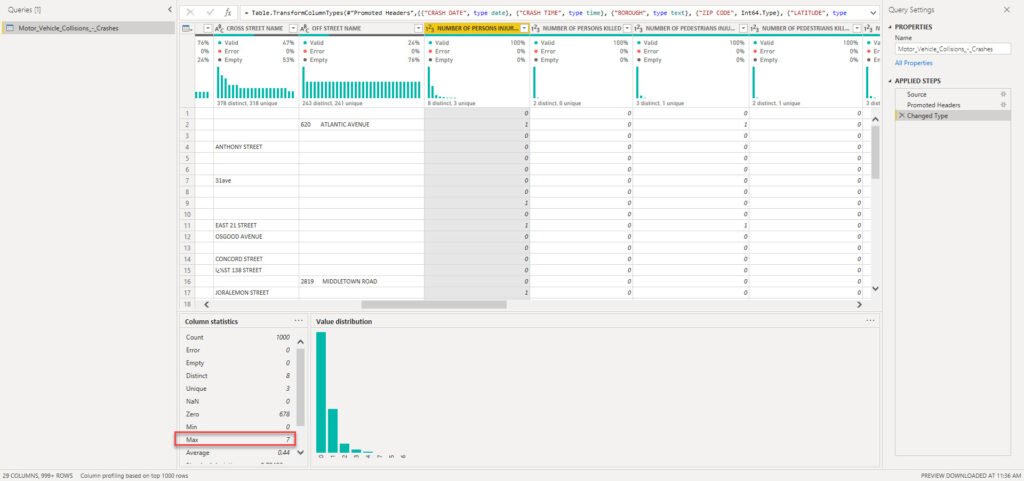
If there were some data anomalies (i.e. instead of 7 for the Max number of injured persons, let’s say 7000), we would be able to spot that right away and react accordingly!
Data Shaping
It’s time to enhance our dataset and invest some additional effort to improve the data quality. Let’s start with replacing blank values with N/A in the Borough column:
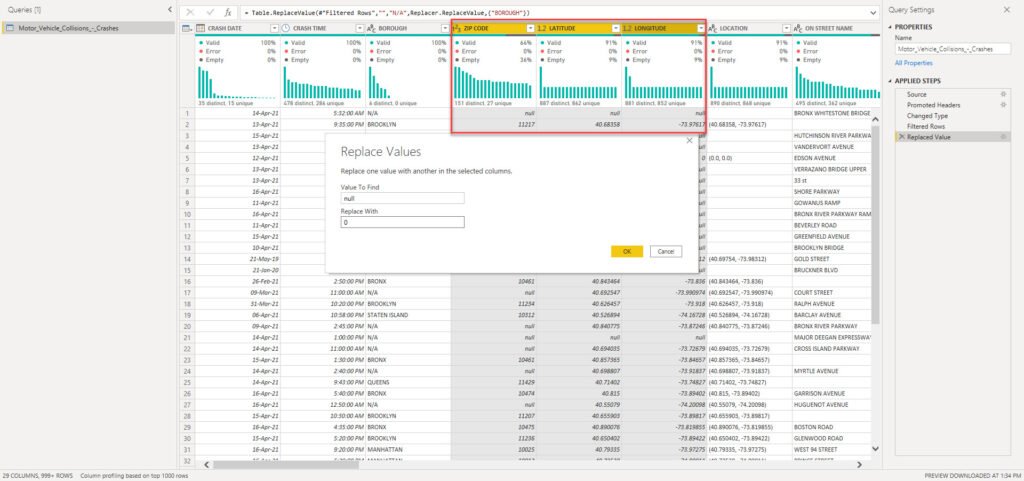
The next step will be to clean the numeric columns. ZIP Code is the whole number column, while Latitude and Longitude are represented as decimal values. That being said, we will replace nulls with 0 value in each of these columns:
That was quick and easy, right? Now, let’s move on and try to profile other columns and check if some more sophisticated transformations are needed. Column On Street Name is extremely important, because it’s needed to answer one of the crucial business questions: what are the riskiest locations in the city? Therefore, we need to ensure that this column has the highest level of data quality.
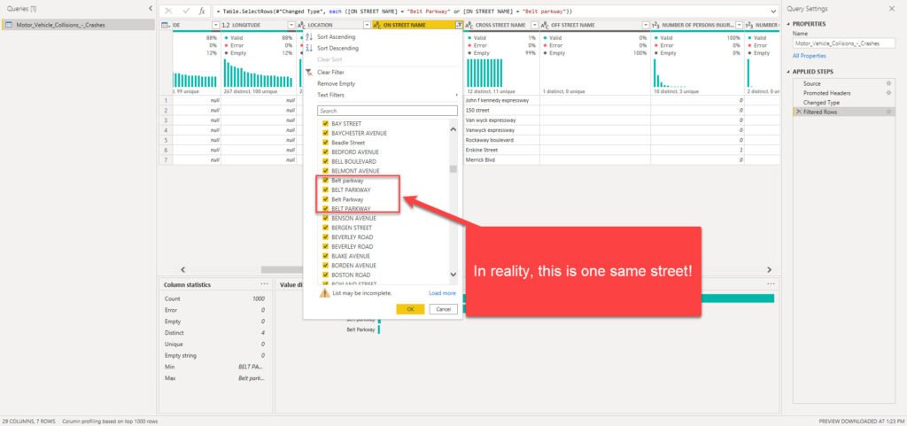
Wait, what?! Belt Parkway is the same as Belt parkway, right? Well, in reality – YES! But, in Power Query M language, case sensitivity will make these two as completely different entities! So, we need to conform the values to be able to get correct results in our reports:
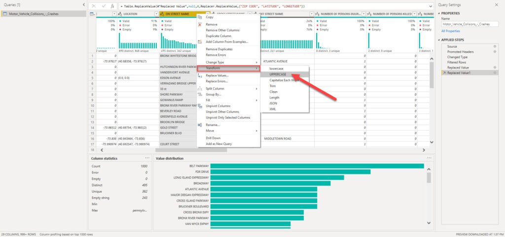
As you can see, I will apply Uppercase transformation to all the columns containing street names, and now we should be good to go:
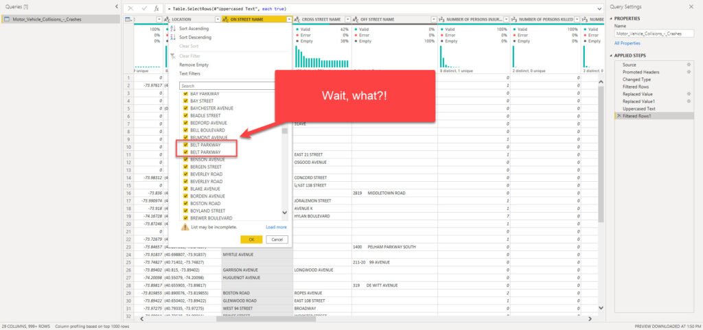
Why do we have two exactly the same uppercased values for BELT PARKWAY? Well, the original CSV file sometimes can contain hidden characters, such as tabulator, new line, or space. Don’t worry, I have good news for you: Power Query enables you to solve this specific issue with one click!
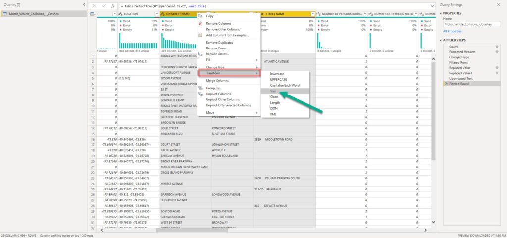
This time we used Trim transformation to remove or leading and trailing blank characters. And, let’s check again if that resolved our issue with duplicate values:
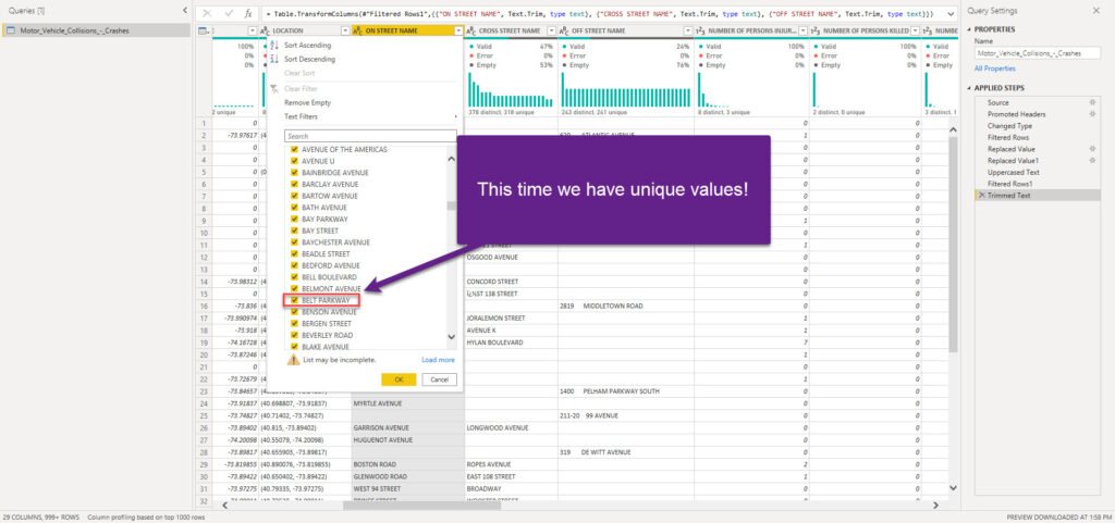
Finally, our column looks as expected: we have unique values!
Thinking forward…
Now, you can be tempted again to hit that Close & Apply button and start building nice visualizations in Power BI. But, please be patient, as we need to do put some additional effort before closing Power Query Editor.
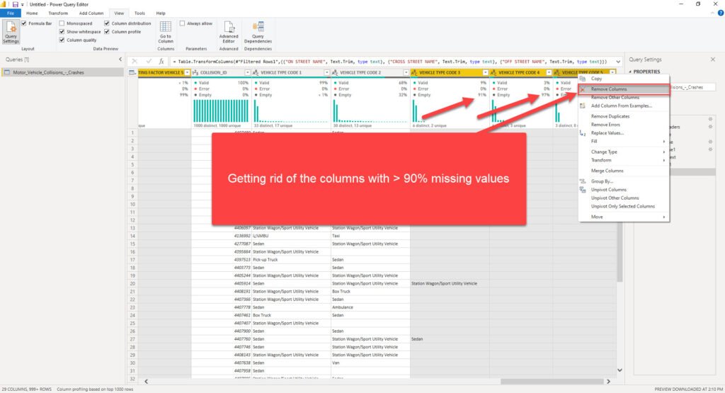
First consideration – do we need all 29 columns for our analytic solution? I’ll put my money that we don’t. So, let’s follow best practices regarding data model optimization, and get rid of the unnecessary data. There are 6 columns with more than 90% empty values (thanks again Power Query Editor for enabling me to spot this in literally a few seconds) – so, why on Earth should we bloat our data model with these columns when they can’t provide any useful insight?!
Now it looks much better! Before we proceed to the next stage of our process and start building an efficient data model, there is one more thing that should be done, to stay aligned with the best practices when working with Power Query Editor.
I will rename each transformation step, so that if someone (or even I) opens this file in a few months, I know exactly which step performs which transformation! I mean, it’s easy when you have just a few transformation steps (even though you should follow the recommendation to rename them in that case too), but once you find yourself within tens of transformation steps, things quickly become more cumbersome…Instead of walking through each of the steps trying to understand what each of them does, you will be able to easily catch the logic:
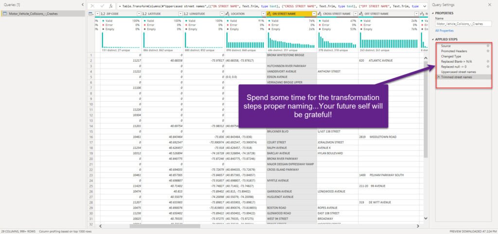
Trust me, your future self will be extremely grateful after a few months:)
Before we conclude the Data Preparation phase, I’ve intentionally left the best thing for the end: all of the transformation steps you defined will be saved by Power Query Editor, and every time you refresh your dataset, these steps will be applied to shape your data and will always bring it to the desired form!
Conclusion
After we emphasized the importance of understanding the business problems that need to be solved by the analytic solution, in this part we got our hands dirty and started to shape our data in order to prepare it to answer various business questions.
During the data preparation process, we performed data profiling and identified different issues that could potentially harm our final solution, such as missing or duplicate values. Using an extremely powerful built-in transformation tool – Power Query Editor – we were able to quickly resolve data inconsistencies and set the stage for the next phase – data modeling! Don’t forget that Power Query Editor, which is an integral part of Power BI, enables you not just to apply complex transformations using a simple UI, without any coding skills, but also offers you a possibility to enhance your data model significantly by using very powerful M language if needed.
Therefore, when someone tells you that the Power BI is a “visualization tool only”, ask her/him to think again about it.
In the next part of the series, we’ll continue our journey on building an end-to-end analytic solution using Power BI, by focusing on the data modeling phase.
Thanks for reading!