

In this series of Power BI 101 articles, I’ll try to cover and explain different foundational concepts related to Power BI, such as data shaping, data profiling, and data modeling.
Understanding these concepts is essential in order to create optimal business intelligence solutions. Once you master these general concepts, you will be able to build scalable and flexible Power BI reporting solutions, that will add real business value to their existing environments.
Do you like reading crime stories? Personally, I adore them. And, when I was younger, I admired Sherlock Holmes and Hercule Poirot so much, that I wanted to become like them when I grow up:)
What were these two characters best in? They could infallible profile the people, collect the facts based on that profiling, so in the end, everything looked so easy and obvious – like anyone can do that!
Honestly, my detective skills were not even close enough to be successful in that “job”. But, instead of profiling people, I decided to profile the data…
What is a Data Profiling?

According to Ralph Kimball, data profiling is a systematic upfront analysis of the content of a data source. There are multiple keywords in this sentence, but let’s just focus on a few of them:
- You have to know your data before you can start to work with it (upfront)
- You have to check all aspects of your data, from checking the memory footprint and cardinality to complex business rules (systematic)
- You should perform data profiling on the source data – there is a famous sentence in the data warehousing world: Garbage IN, garbage OUT! In simple words, if your data is of bad quality in the source itself, you can’t expect that your reports can display accurate numbers
There are multiple types of data profiling techniques:
- Completeness – how many blanks/nulls do I have in my column?
- Uniqueness – how many unique values (cardinality) do I have in my column? Do I have any duplicates? Is it allowed to have duplicates?
- Value distribution – distribution of records across different values for a specific attribute
- Range – finding the minimum, maximum, average value within the column
Why do I need data profiling?

The main benefit of performing data profiling is to improve the quality of your data. That way, you can, for example, spot if there are letters in your phone number column, or if the ZIP code doesn’t match the expected pattern.
Additionally, you can catch if some outlier pops-up within your data. Simply imagine that you have a column which contains the individual price of different fruits – and let’s say that this ranges between 1 and 1000. But, all of a sudden, you notice the value of 1.000.000 (someone made a mistake, or whatever). Now, imagine your report showing the average price of the fruits! I bet you would not expect to see that apples, oranges or bananas have an average price of few thousands:)
Know your data
Finally, you should aim to know your data before putting it in front of your users’ eyes. Because, based on data distribution and other characteristics of your columns, you can easier decide which visuals to use, or if it is necessary to apply some additional steps for data cleansing or data transformation.
Studying the nuances of your data and finding anomalies in the underlying structures can make your report shine and more accurate at the same time.
Data profiling with Power BI
One of the things I like most in Power BI is that it gives you a possibility, not only to create appealing visualizations but also to shape your data prior to that.
That being said, when it comes to data profiling, Power BI has a lot to offer. Even more, it enables you to perform data profiling in quite user-friendly way, since it has some built-in functionalities that will make your “Data-Sherlock” job much easier.

I’ll share with you some tips regarding data profiling, that I apply in my day-to-day work.
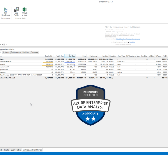
The first thing I prefer to do, is to open the data model in Model tab within Power BI Desktop:
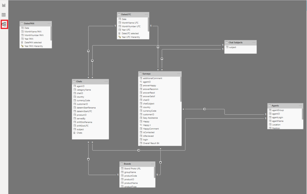
This way, I’m getting familiar with the tables, I can identify key columns, relationships between the tables, types of relationships (1:1, 1:M; active/inactive), etc. That gives me a nice overview of the data model, so I can focus on specific things later.
The next step is turning on the Power Query editor, where most of the data profiling occurs. So, let’s see how it’s done:
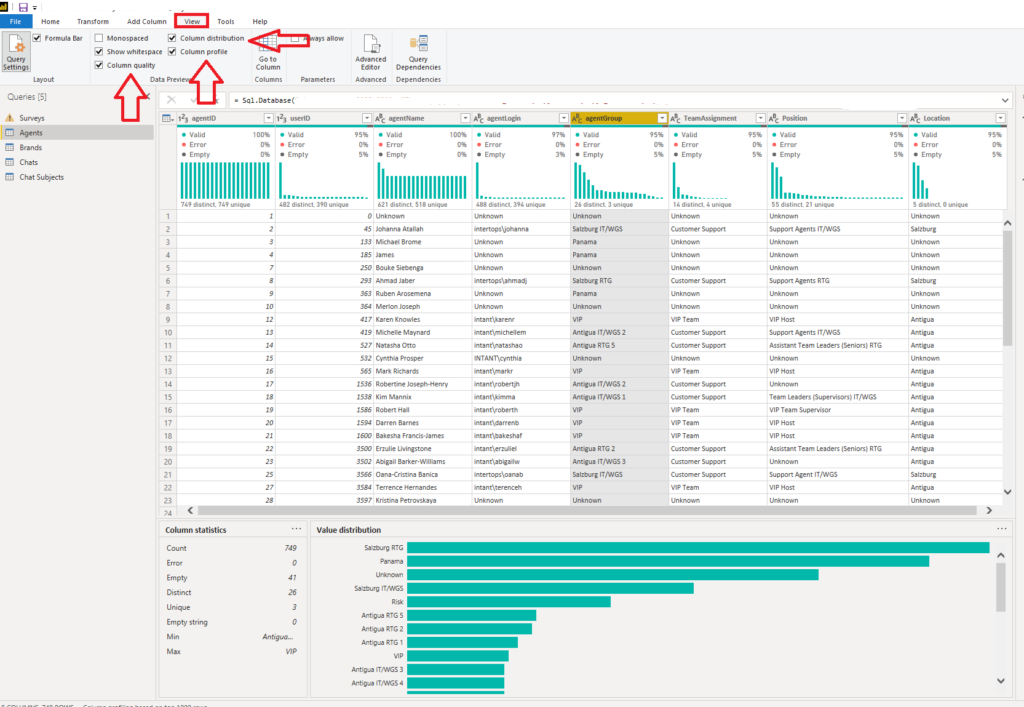
Under the View tab, turn on Column distribution, Column profile, and Column quality options. Once you select a specific column, you should be able to see your data profiled. Even more, it’s being displayed in a nice and human-readable way, so you can quickly get a detailed overview of the underlying data!
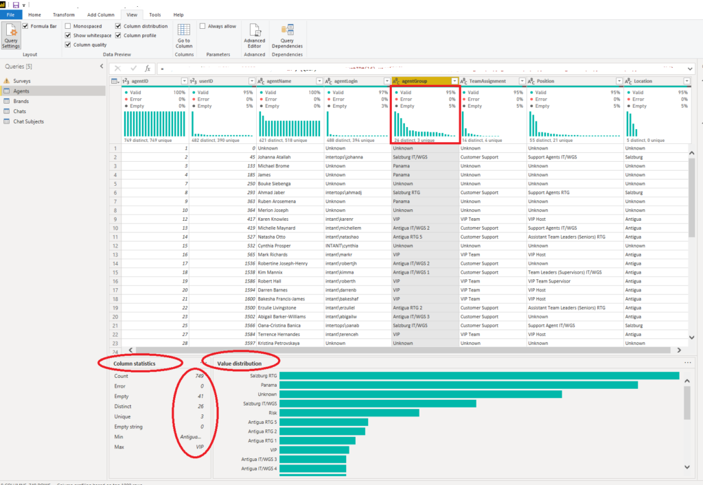
This way, Power BI (or Power Query to be more precise), helps you spot the outliers, anomalies, or any other unexpected “behavior” of your data.
Let’s now examine what all of these visuals display:
- Column quality displays percentages of valid vs error vs empty data. In a perfect world, 100% of the data will be valid, but that’s hardly the case in reality
- Column distribution displays the data distribution within the column, but also the number of distinct and unique values. These two are not the same: distinct values include duplicates and NULLs, while unique values don’t. Therefore, distinct values are the total number, while unique tells how many of those values are not duplicates or NULLs.
- Column profile displays a more in-depth overview of the column, including the count of rows, and if there were errors while importing the data in the specific column. You can also check the number of empty rows, the same as the minimum and maximum value within the column. That’s especially useful when you profile a numeric column since you can quickly spot any possible outliers (please recall our previous example with fruits’ price)
Additionally, when applied to numeric columns, Column Statistics will also include the number of zeroes and NULLs, but also some statistical functions, such as the average value, standard deviation, and distribution between even and odd numbers.
Having all these stats can help you understand data distribution and support you if you decide to additionally transform or clean the data.
Conclusion
One of the greatest challenges in modern data warehousing is to achieve the highest possible level of data quality. And, the first (and the most important) step on this path is data profiling.
Going back where we started – with Sherlock Holmes and Hercule Poirot – as they were able to spot fine nuances and identify some unusual behavior (outlier) during their investigations, that brought them success in the end!
To wrap-up: spend some time being a “Sherlock” or “Poirot” before you switch your focus to building nice visuals within the report.
Thanks for reading!
Last Updated on October 20, 2020 by Nikola

Steve
Great info. Looking forward to your other Power BI 101 topics/posts.
Nikola
Thanks Steve! The next article is already published: https://data-mozart.com/power-bi-data-shaping-in-a-nutshell/
Stay tuned for the rest of the series:)
forough
Thank you for the very clear explanations and good examples