

This blog post is part of the “Data Modeling” series, created together with my friend and well-known Power BI expert – Tom Martens
Table of contents
- PRELUDE TO DATA MODELING WITH POWER BI
- THE POWER BI DATA MODEL
- RELATIONSHIPS
- PARENT-CHILD HIERARCHIES
- AGGREGATIONS
- OUT-OF-THE-BOX THINKING
- Disconnected tables
- A different approach to the event-in-progress problem
In an ideal world, all of our data would have come to the reporting solution cleaned, shaped, and well-structured, so our only task should be to drag the numbers in the visuals and let our report users slice and dice however they like.
However, there is no “Data Utopia” in the real world, and we, as data modelers, have to solve all kinds of challenges when it comes to designing an optimal data model for our business intelligence solutions. Sometimes, it’s enough to establish a proper Star schema to get the job done – but, sometimes, probably more often than not, we have to deal with more complicated things.
And, sometimes, it’s not about whether the source data is bad or incorrect…
Different data source systems store the data in different ways!
Let me briefly explain this statement. The way you would store the data in a relational database will probably be different than the one if you’re using non-relational storage. Data in Excel files look quite different compared to the normalized model in the SQL Server database. And, we are not talking about the “wrong” or “right” way to store the data – it’s simply different!
So, to build a proper semantic model for your Power BI solution (which, essentially, relies on a Tabular model behind the scenes), we need to make some tweaks depending on the manner of the original data structure.
One of the most common challenges is displaying the hierarchical data in the Power BI report. It’s not a big issue when you have regular hierarchies, where each attribute contains an identical number of levels – a good example would be my previous article describing the hierarchy of Product Category -> Product Subcategory -> Product. In this case, hierarchy depth is exactly the same for each hierarchy member.
However, problems may occur when we need to display the data related to parent-child hierarchies where the exact number of levels can’t be determined. Usual “suspects” are organizational hierarchy, account charts, geographical hierarchies, and so on.
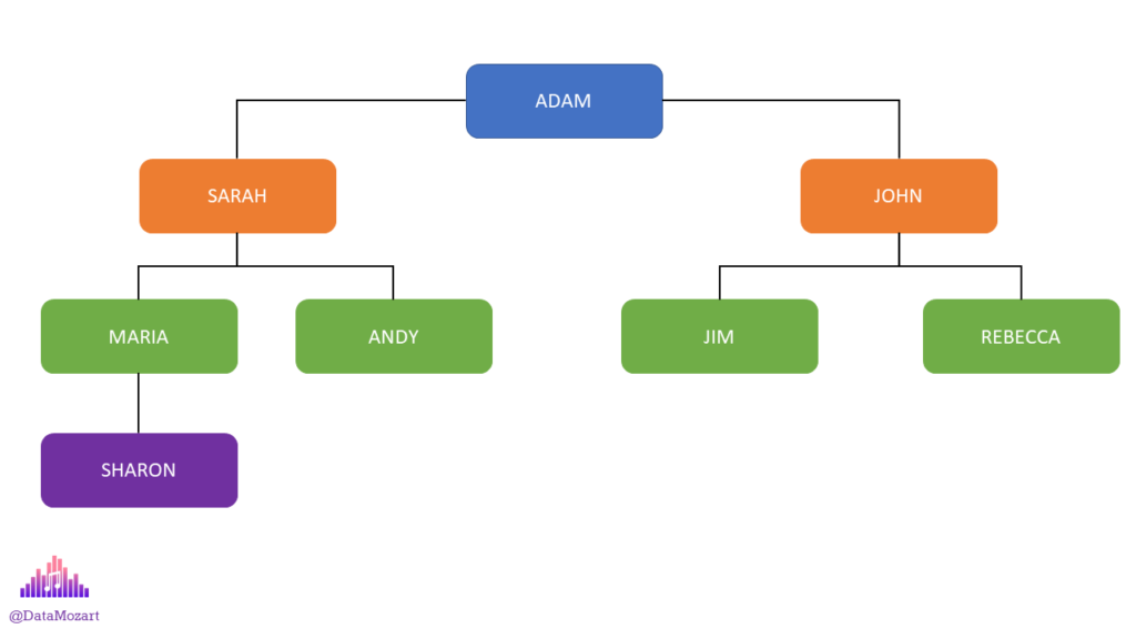
In the illustration above, you can see a typical example of the parent-child hierarchy. Each employee has their manager above in the hierarchy. But, the number of levels is not the same for every hierarchy member: on the “right” side, we have two levels of depth, while on the left side, Sharon has three levels above!
Now, this type of hierarchy is easy to understand when looking at the illustration, and you can quickly identify the lineage between the “nodes”. However, relational databases usually store this data in a whole different way, by providing information only about the first direct parent of the specific member:
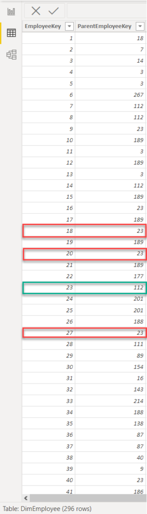
As you may notice, employees with IDs 18, 20, and 27 are all “under” employee with ID 23, whereas the employee ID’s 23 manager is employee ID 112, and so on…However, looking at these two columns, it’s extremely hard to identify the exact number of hierarchy levels and understand the full lineage of each employee.
Luckily, DAX offers a whole set of parent-child functions to help us parse the data from this type of hierarchy.
Finding the right PATH
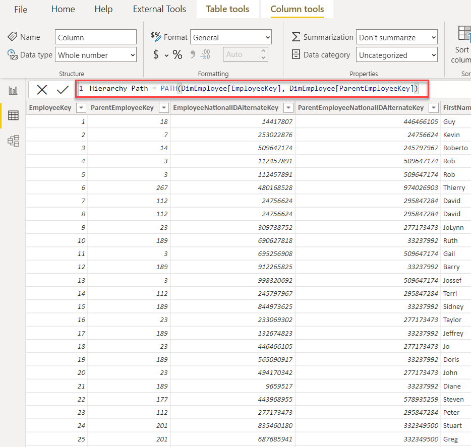
We’ll start by using the PATH function to create a new column in the DimEmployee table, which will enable us to identify the whole lineage of the specific member:
Hierarchy Path = PATH(DimEmployee[EmployeeKey], DimEmployee[ParentEmployeeKey])
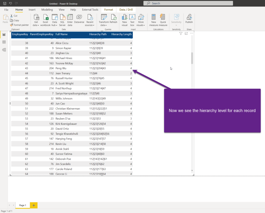
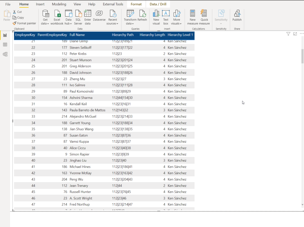
Once I drag this column to the Power BI report, it’s now easier to understand the data lineage and see how many hierarchy levels has each employee:

In this example, Jean is on the 2nd level of the hierarchy, A.Scott Wright on the 3rd, whereas Willis Johnson is on the 4th level. As you may notice, employee ID 112 is present as the first level node in all rows – this means that employee ID 112 is the top-level manager in our company!
Ok, this looks promising, but the data is still not user-friendly in this report. First of all, we still don’t know what is the level in the hierarchy for each member, unless we check ourselves for every single record! That’s a tedious job to do!
Luckily, there is another DAX function that helps us solve this specific task. I’ll create a new column in the DimEmployee table, by applying the following formula:
Hierarchy Length = PATHLENGTH(DimEmployee[Hierarchy Path])
Now, the next step is to flatten this hierarchy and display the full name of the employee on every hierarchy level. But, we still don’t know what is the maximum depth of the hierarchy, right? So, let’s grab this information first:
Max Hierarchy Depth = MAX(DimEmployee[Hierarchy Length])
This is the measure that will return me the maximum value of the hierarchy length (in our case it’s 5), so now I know how many levels of the hierarchy have to be flattened into columns. Let’s start by creating a column for the first level of the hierarchy:
Hierarchy Level 1 = LOOKUPVALUE(
                            DimEmployee[Full Name], DimEmployee[EmployeeKey],
                            PATHITEM(DimEmployee[Hierarchy Path], 1, INTEGER)
)
With the PATHITEM function, we are able to navigate through the hierarchy path that we previously created, and the second argument represents the level in the hierarchy path that we want to grab (in our case, this is the top manager). The third argument defines the data type – it has to be an integer, because we will need it to operate over the EmployeeKey column which is also of integer data type.
LOOKUPVALUE enables us to grab the name of the employee on that hierarchy level, based on their EmployeeKey:
By applying similar logic, I’ll build columns for all the remaining levels (up until 5th), so my final table in the report looks like this:
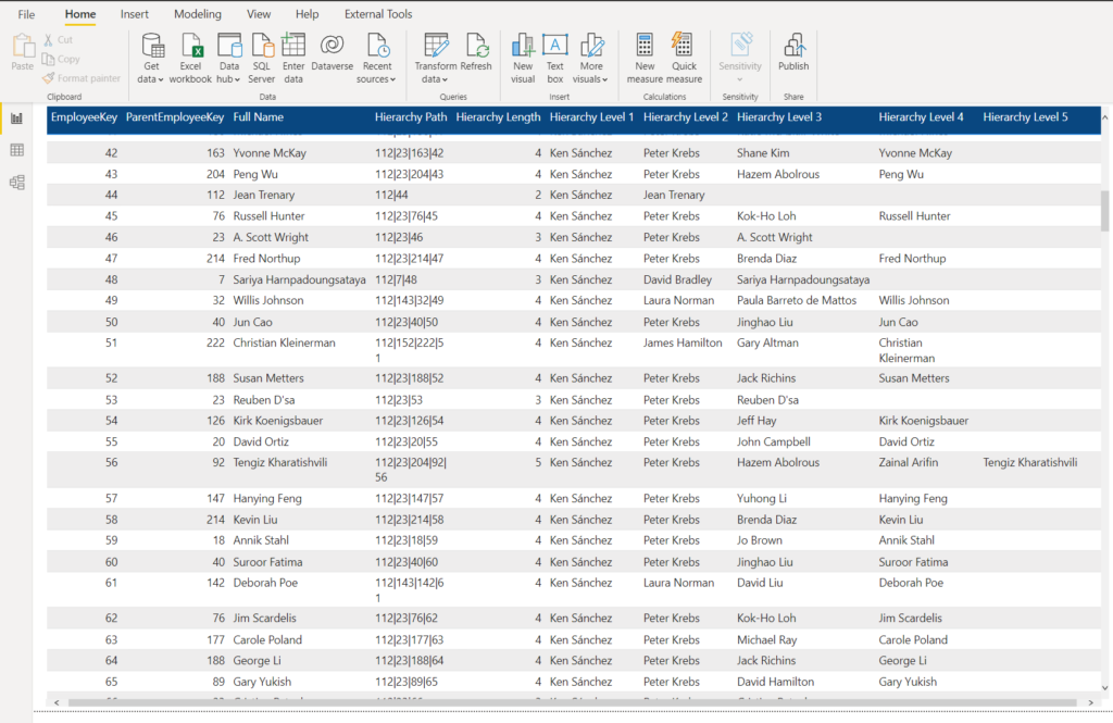
Now, you can quickly identify the full data lineage of the parent-child hierarchy in a user-friendly and human-readable way.
Additional things to consider
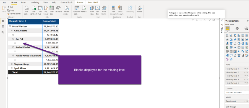
That’s one part of the story. However, if you try to put this data in the context of, let’s say, sales, you will probably notice quite a strange behavior of the matrix visual in the Power BI report. Or, maybe it’s not the strange behavior, but more the consequence of how the data is structured at the moment:
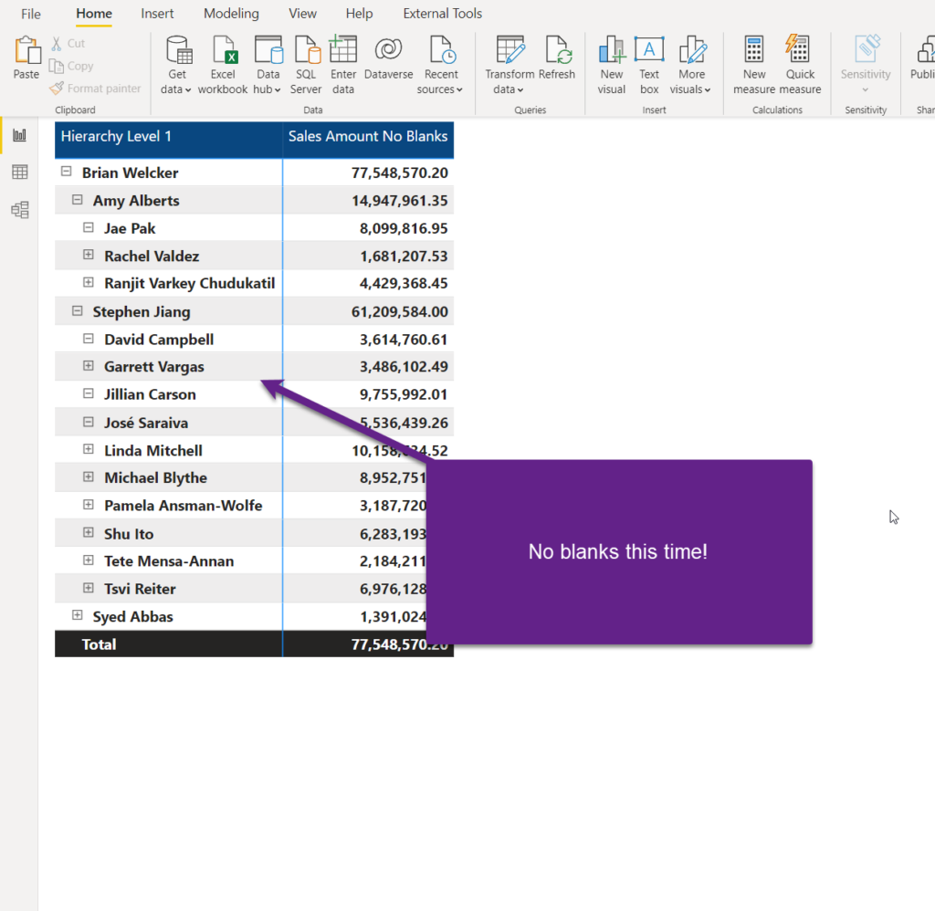
Guys from SQLBI.com explained in this article that covers DAX patterns for parent-child hierarchies, how to get rid of these blanks in the matrix visual, and display the data properly. I will not repeat the logic that Marco and Alberto implemented in their solution, as I strongly recommend you read the full article.
However, once implemented in our scenario, the final solution looks like this:
Conclusion
Dealing with specific data structures requires a various range of toolsets under your belt. Handling parent-child hierarchies is a very common business scenario. Therefore, it’s of key importance to understand how to model this structure in Power BI and enable your users to quickly and easily navigate through various hierarchy levels without sacrificing user experience.
Don’t forget, DAX offers a whole set of parent-child hierarchy functions, that will help you shape the model according to your specific business needs.
Thanks for reading!
Last Updated on November 15, 2025 by Nikola


Gold
SQLBI.com article is paid version , can you please help to explain how it was done to remove the blanks