
DP-500 Table of contents
Performance, performance, performance…We always strive to make our (Power) BI solutions more efficient! I’ve already written many articles on HOW to improve performance in multiple scenarios – for example – by reducing the overall data model size, or by taking advantage of the query folding feature, or by optimizing the visualizations used in the report.
And, don’t get me wrong, of course, it’s super important to know how to fix the problem! However, the most challenging part is often to identify where the problem is!
DISCLAIMER: This article will cover the topic of identifying the data loading bottlenecks, while the separate article covers the performance improvements implementation tips and techniques
Unlike the poorly performing front end of the report (the area exposed to users), where you can bet someone will complain if the report renders slow, with data loading and data refresh you can’t rely on the end user alarming you. Simply, they don’t have any idea what’s going on behind the scenes, and it may be the case that the data refresh process takes a few hours, while the report works super fast.
Understanding the data refresh process
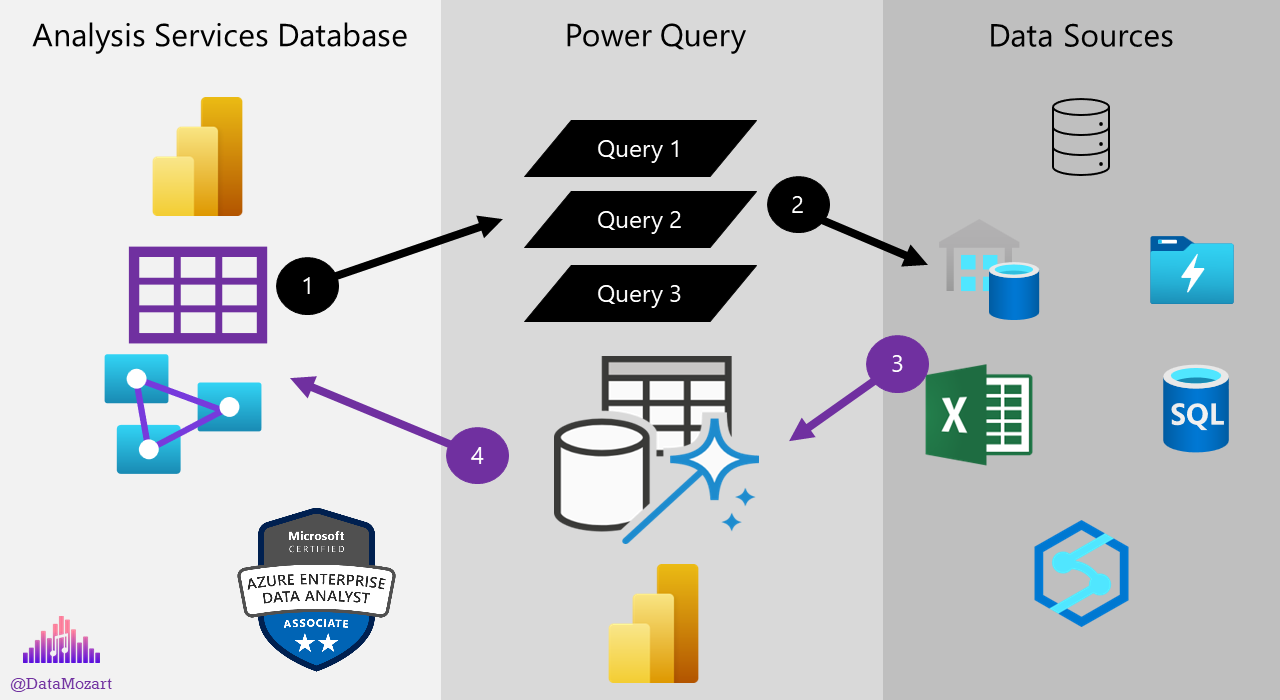
Before we explain how to identify the bottlenecks, let’s first examine the flow of the data refresh process in Power BI:
It’s important to keep in mind that this workflow applies to the Import mode only, as with DirectQuery there is no PowerQuery layer in-between, no data loading into the instance of the Analysis Services that serves Power BI report, since the queries generated by Power BI will target data sources directly.
Let’s briefly explain all the stages of the workflow, once you initiate the data loading process:
- The Analysis Services instance that stores the data for the Power BI model, will run a query, or in most real-life cases, multiple queries to retrieve the data. Power Query is the logical layer between the data stored physically in the instance of Analysis Services and data stored physically outside of Power BI (i.e. SQL Database, Excel files, Azure Data Lake, Azure Synapse, etc.)
- Power Query will forward the queries to various data sources outside of Power BI
- Various data sources will send the data back to Power Query
- Power Query will apply necessary transformations (if any) to the data and push the final data back to the Analysis Services database
As you might have noticed by looking at the illustration above, there are three different “grey zones”. Each of these three zones may be the root of the performance issues. That doesn’t help a lot, right?
So, let’s see how we can identify the main culprit behind the slow data refresh process.
I hear you, I hear you: we can use refresh history in Power BI Service to determine if there was a problem with the data refresh. That’s true, but it only shows the total refresh time, without providing a more granular view. It may be enough to ring the bell and drag your attention, but it doesn’t help on which part of the data refresh process to focus.
Power BI Premium offers a more granular overview with the Power BI Premium Capacity Metrics app:

Troubleshooting Power Query performance
You might have spotted that sometimes it happens that the data refresh process runs at a very different pace for the same data, if you compare Power BI Desktop and Power BI Service. Depending on where the Power Query queries run, performance may differ significantly.
If you’re using Power BI Desktop for developing the report, Power Query queries run locally on your machine. If you’re connecting to cloud sources exclusively, then Power Query queries run in the Power BI Service.
Finally, and this is important from the troubleshooting perspective, if you’re connecting to on-prem data sources, your Power Query queries will run on the machine that hosts the Power BI data gateway! Why is this important? Well, because it introduces another potential bottleneck in the data refresh process: a machine where the gateway is installed.
With all these in mind, Power Query performance may depend on the complexity and efficiency of the queries themselves, but also on the hardware specifications of the machine where these queries run (CPU and RAM).
Good old SQL Server Profiler to the rescue
Since Power BI stores the data in the instance of the Analysis Services Tabular database, we can leverage a good old SQL Server Profiler to get the most granular information about the different events initiated by the Analysis Services during the data refresh process.
Since I’m now testing performance on my local machine, once I grab the localhost port information, I can use SQL Server Profiler to gather various metrics behind the data refresh. I’ll select Command Begin, Command End, Query Begin and Query End events:

As soon as I hit refresh in my Power BI Desktop, Profiler will capture a bunch of different events happening in the background. Once the data refresh is over, you should be able to see something like this:

There are many useful information displayed here, such as seeing the longest running object, the total duration of the data refresh in milliseconds (in our case, it took around 76 seconds), the total time spent by the CPU, but also an XMLA query generated behind the scenes.
SQL Server Profiler is the most reliable method of troubleshooting the data refresh process and until recently, it was my go-to way to check if there are any bottlenecks during the data refresh.
You might be wondering – why until recently. Is there a better or more convenient way to achieve the same goal?
Level PRO with Phil Seamark’s data refresh process visualization
This is level PRO when it comes to troubleshooting the data refresh process. I love it so much, that during my Power BI performance tuning workshops, I’m teaching people how to use it. It’s powerful, robust and super-intuitive, and I can guarantee you that it will immensely ease the troubleshooting workflow.
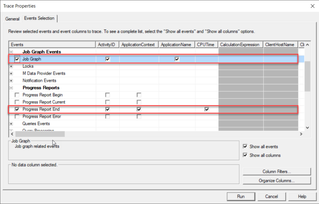
What is it all about? Well, at the core of this approach is (again) SQL Server Profiler, but this time we’re going to save the SQL Server Profiler log into a Trace XML file, and then visualize the whole process using Power BI!
Here is the link to the original post on Phil Seamark’s blog, where you’ll find a step-by-step tutorial and PBIX file that you can use as a template for your own troubleshooting tasks:

And, under Events Selection, choose Job Graph and Progress Report End:
Once the data refresh process is completed and you import the XML trace log data into Power BI, you should be able to see something like this:
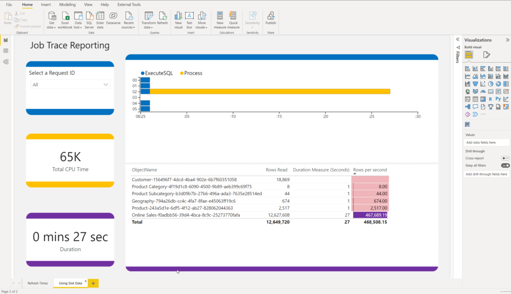
This is awesome! I can immediately see a bunch of useful information to help me quickly understand where the potential bottlenecks are. One important remark here: this pbix file is not a magic wand that will somehow automagically offer you a solution for the slow data refresh process. It will provide you with all the relevant information, but it’s then up to you to find the way (if there is any) to optimize the refresh performance.
For example, you may see that table X takes more than 90% of the total data refresh process time. But, it may happen that table X is extremely large and simply requires more time to refresh. So, it doesn’t necessarily mean that there is a problem with that table.
Execute SQL represents the time from when the query has been issued, until the first batch of rows had been returned from the data source, while Process displays the time needed for Analysis Services to process the data and perform various tasks, such as data compression. The difference between these two metrics MAY give you food for thought – if the blue bar is long, you may want to try to optimize the performance of the data source (more on optimizing tips and techniques in the next article).
On the flip side, a long yellow bar may be caused, for example, by the physical limitations of the machine where the on-prem gateway is installed, or by the complex Power Query transformations that are being executed on the on-prem gateway machine.
Conclusion
Identifying potential bottlenecks is one of the most challenging tasks in the data refresh process optimization. It is of paramount importance to understand various areas of the workflow, and “critical” points, BEFORE you can pull your sleeves up and jump into the action of applying one (or more) techniques from your performance optimization toolbox.
In this article, you’ve learned different ways to troubleshoot a slowly performing data refresh process. Stay tuned, as in the next article we’ll expand on this and I’ll share with you multiple optimization tips and tricks that can make your data refresh process run smoother and faster.
If you’re interested to learn more about this topic, I strongly suggest watching this fantastic Chris Webb’s session at SQL Bits.
Thanks for reading!
Last Updated on April 10, 2023 by Nikola


