This article is the part of the series related to mastering DP-500/DP-600 certification exam: Designing and Implementing Enterprise-Scale Analytics Solutions Using Microsoft Azure and Microsoft Power BI and Implementing Analytics Solutions Using Microsoft Fabric
Table of contents
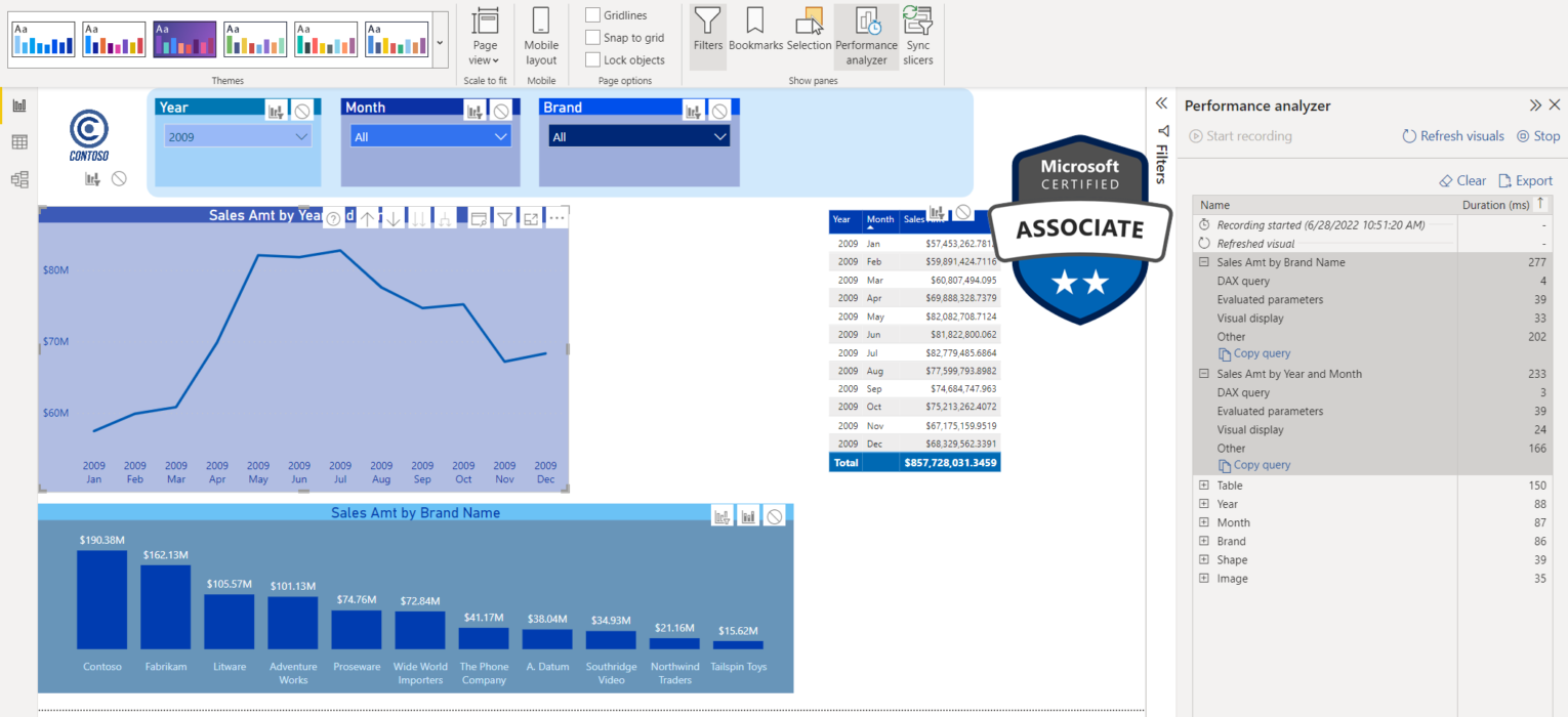
Can you spot the difference between the following two report pages?
Yeah, neither do I!
But, there is a huuuuuge difference between those two reports! What if I tell you that the report on the right is 5x faster than the one on the left? Would you believe me? No? Then keep reading and I will show you how’s that possible…
How it all started…
I was reading a great blog post by Chris Hamill, where he explained how to substitute some visuals in the report while keeping the same visual look. So, I was immediately tempted to try to apply a similar technique to one of the reports I previously created.
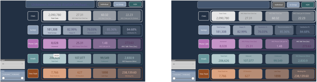
The report page which you see on the left side in the illustration above displays some figures related to the performance of the customer support center. There are a whole bunch of metrics related to chats, surveys, phone calls, emails, etc.
However, this report page needs a hell of a lot of time to render and load. The main culprit is the big number of card visuals (21 in total). Since Formula Engine behind the Power BI works single-threaded, as explained in detail in this article, for every single Card visual, a new query is being generated and can’t be executed until the previous one is completed!
That is best reflected in the times captured by the Performance Analyzer. Performance Analyzer is a quite powerful built-in feature within Power BI, that gives you a good insight into what’s going on behind the scenes. You can also use external tools for getting report metrics, such as DAX Studio.
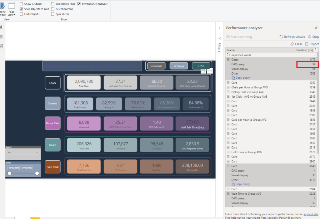
Let’s turn on Performance Analyzer and see what is going on under the hood in the original report version:
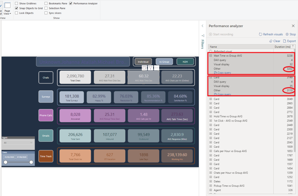
This report page took more than 3 seconds to render! That’s unacceptable for not so large volumes of the data. Let’s sort the individual timings by Total time in descending order and see what makes our report slow.
You can see that 2 of our card visuals hold the top with 3238 and 3149 ms respectively. However, once we expand to see the details of these numbers, we can notice that the “Other” part of the visual takes almost 99% of the total time!
What does that “Other” even mean?!
The “Other” shows how long a specific visual had to wait in the execution queue for other actions to complete before that visual could have been executed! Because my report contains more than 30 visuals, 21 of which are card visuals, some of them have to wait for others to complete before they are able to perform any action.
So, DAX queries are not a problem here, as you see that both these visuals took only 4ms to execute their DAX query. Even if I sort timings by DAX query, I can see that the longest DAX query took just 34ms:
Optimizing the report
I can’t stress enough how important it is to follow the blogs of all the great experts in the Microsoft Fabric and Power BI community and try to learn from them as much as possible.
Chris Hamill’s blog was an inspiration for me to try to optimize my original report. Now that we identified the root cause of the slow rendering using the Performance analyzer, the starting point was to try to reduce the number of visuals on my report page. Since I confirmed that DAX queries were not a problem, the idea was to reduce the “Other” timings.
Create a background with shapes
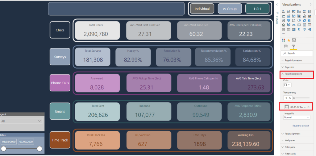
The first thing I’ve done was to remove all of my shapes from the report (rectangles, etc.). How can you achieve this? You can simply create your background layout in PowerPoint and save it as an image!
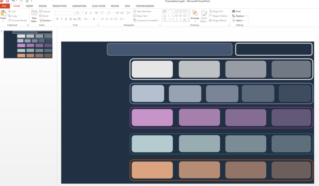
Don’t forget – each element on your report page requires some time to render! So, even though these shapes are usually rendered quickly (10-20ms), and this may not look like something you should care about, imagine having 20 of them on the page:
15ms x 20 = 300ms = 1/3 second!
Essentially, you’d be wasting a third of a second on the report elements that don’t provide any business value! Once I’ve saved this design as an image, I can set it as a background image for my report page, thus having only one element instead of 25!
Here comes the magic…
Now comes the most entertaining part…How can we replace existing card visuals, while at the same time keeping the “look and feel” of the original version?
That’s the point where Chris’s trick gets on stage. I’ve simply put my calculations in Matrix visuals, replacing separate card visuals with one single Matrix visual. And, with some tweaking and formatting, got (almost) the same report look!
Fasten your seatbelts!
Now, let’s check the most important thing – don’t forget that we started whole this process in order to improve the performance of our report.
So, I will turn on Performance Analyzer again, now on my revamped report, and check the metrics:
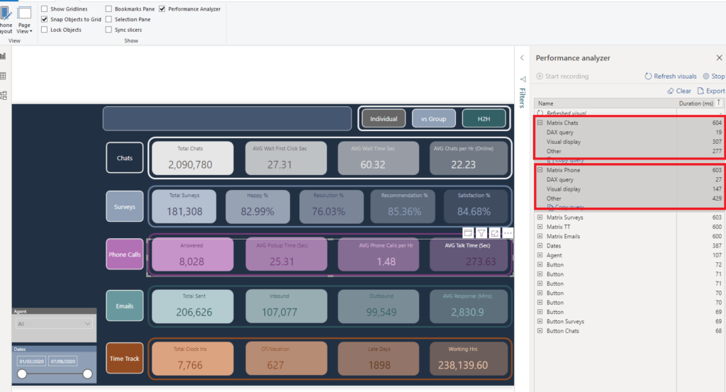
Oh, my God! The two slowest visuals in my report now took around 0.6 seconds to display! Compared to 3 seconds in the original version, that’s 5x faster!!!
Now, you can notice that “Other” timings sank from approx. 3000 ms to under 300! And finally, the number of visuals in our report was significantly reduced by moving a bunch of them into the background image created in PowerPoint.
But, the key takeover here is: we practically didn’t change the original look of the report – we’ve just dramatically improved the underlying processes, by leveraging “DAX fusion” enhancement of the engine! In simple words, the engine was able to generate one single DAX query for all the matrix elements, instead of creating a separate query for each measure, as was the case with card visuals.
The same outcome can be achieved by using a new card visual in Power BI, where you can place multiple measures within the single visual (similar to a matrix we used above), or free custom visual “Card with States” from OkViz.
Therefore, everything is the same for our users, except they will see the numbers much faster now! And you know what it means when your users get the results faster – “USERS-WILL-LOVE-YOU”:)
Conclusion
Here is the list of general rules you should keep in mind when you identify performance issues with visuals rendering in your Power BI reports:
- If your report runs slow, there are multiple ways to check the cause: use Performance Analyzer or DAX Studio to determine if you can apply some additional steps to improve the report
- Reduce the number of visuals on your report page – if you don’t need a visual, simply remove it from the page. Also, having multiple non-data-related objects, such as shapes or text boxes, will also impact the rendering time. Therefore, if you plan to have a lot of shapes, images, icons, etc., consider using PowerPoint. There, you can create your desirable page design with all the shapes, icons, and text boxes, save it as an image, and then set this image as a page background in Power BI
- Reducing the number of visuals on your report page also means that, like in our example, if you have a possibility to satisfy the business request by generating one DAX query instead of 5, you should tend to do it whenever possible
- Try to display data at a high level of granularity. VertiPaq excels in vertical aggregations, but performs much worse on a detailed level reporting. With that in mind, if you have, let’s say a table with 50.000 rows, and some measures being calculated for each row, you should be better off keeping this low-level detail by taking advantage of the drill-through feature. So, display aggregated data in the table by default, and then give the user a possibility to drill through to a specific row if necessary
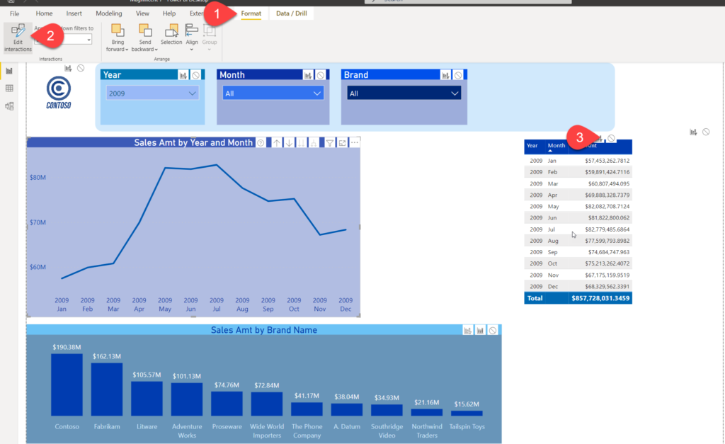
- If you have a lot of visuals on the page and don’t necessarily need mutual interactions between them, such as cross-filtering, you should simply disable that option:
Thanks for reading!
Last Updated on January 7, 2024 by Nikola