

Recently, I’ve came across request to deliver a report which will enable end users to choose if they want to see data filtered by specific year/month or as Year-To-Date calculation. I wrote about 5 useful tips and tricks which can boost your Power BI development, but I thought that this one deserves separate post.
First thing that came to my mind was to play around with buttons, actions and bookmarks, but I’ve decided to apply different approach in tackling this.
So, let’s switch to Power BI and I will show you how to achieve this dynamic filtering. I’m using Contoso database for this example.
First steps
First step is creating a measure for Sales Amount, and it’s pretty straightforward:
Sales Amt = SUM('Online Sales'[SalesAmount])
Since I also need a measure which will calculate Year-To-Date Sales Amount (YTD), let’s create it as:
Sales Amt YTD =
               CALCULATE(
                         [Sales Amt],
                         DATESYTD(Dates[Date])
                )
Here, we are simply using built-in DAX function DATESYTD, which will automatically evaluate expression and return desired values. So, when I drag a table to Power BI Desktop canvas and select for example year 2009, I’m getting following numbers for our newly created measures:
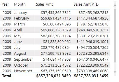
As you can see, Sales Amt shows figures for every selected month, while Sales Amt YTD simply adds those figures to display YTD values.
Party starts here…
Ok, that was simple. Now, I need to find a way to enable users to see one of the specific values, based on their selection. As I mentioned in the beginning, this can be achieved using buttons and bookmarks, with hiding and showing visuals based on user’s selection, but let’s try with slightly different approach.
Let’s first create a new table, which will hold data for our dynamic filter:
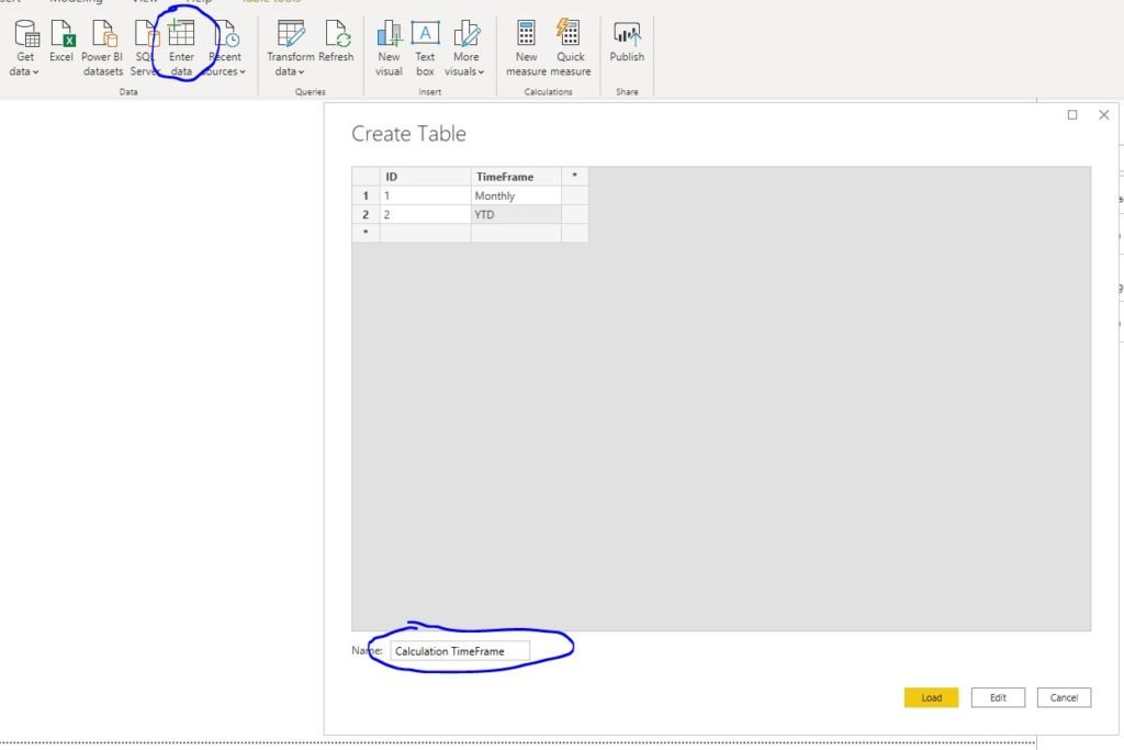
Under Enter Data, I’ve just created plain simple table called Calculation TimeFrame, with 2 columns: ID and TimeFrame. Of course, you can define as many options as you want, depending on your needs. After I loaded this table into a model, I need to find a way to somehow connect this table with my existing model.
First of all, I need to know what user selected to display, therefore following measure needs to be created:
Selected TimeFrame = MIN('Calculation TimeFrame'[ID])
This measure will return minimum ID value of user selection. In case that no value is selected, option with ID = 1 (Monthly) will be displayed.
The next step is the most interesting, since it puts the user’s selection in the context of the existing data model. Within the Online Sales table, I create the following measure:
Sales Amt Selected = SWITCH([Selected TimeFrame],
                        1,[Sales Amt],
                        2,[Sales Amt YTD])
Let me shortly explain what this measure does: It takes ID value from user selection, and based on that value, display respective calculation. It is easily done with the SWITCH function. To translate what this function does: if user choose ID 1 (Monthly), return me Sales Amt value. If he chooses 2 (YTD), return YTD value. Simple as that.
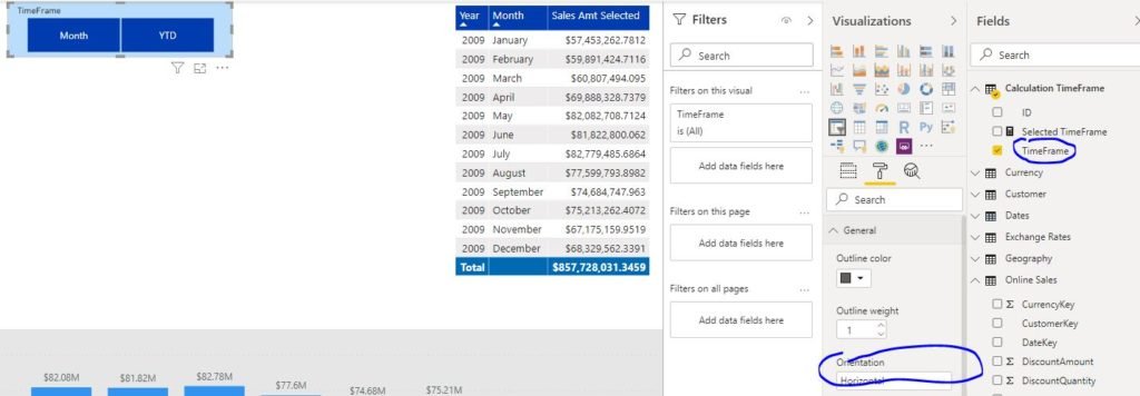
The final touch is to create a filter for this. Simply drag Slicer visual and put Time Frame field. Make that Horizontal, so it looks bit nicer:
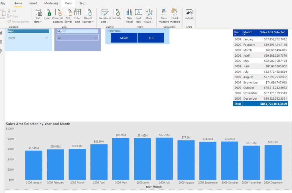
As you can see, by default Monthly time frame will be displayed:
However if you click on YTD slicer button, visuals will perform differently:
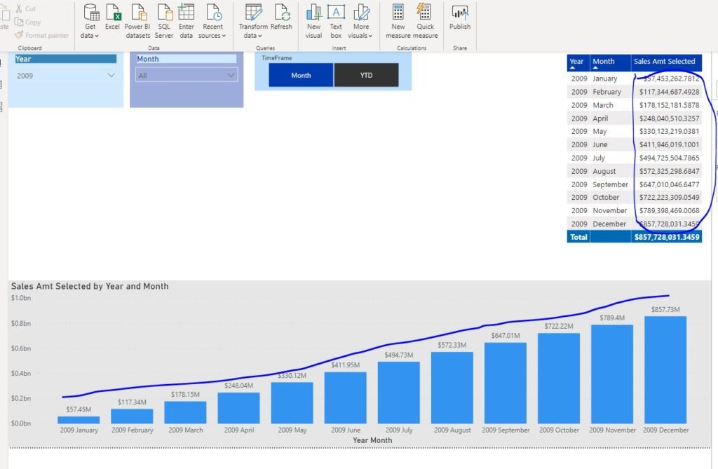
Now, visuals show YTD values:)
Conclusion
This is a neat trick how to avoid using buttons and bookmarks for some usual users’ requests and still keep everything tidy. Key thing is to define proper measures and to link your custom tables with data model, after that it’s up to you to define limits for usage of this technique.
Last Updated on July 7, 2021 by Nikola

Marius
Or you could just use calculation groups in TE!
Thats a game changer 🙂
Nikola
Great point Marius, thanks!
Jon
Love it.
Can you make a blog post on how to calculate Mode (most frequent values) in different granular detail? Such as by order, by product, by category, by the whole, assuming the order qty is whole number. Each order can have multiple lines for the same product or different products.