Using custom visuals in Power BI report creation gives you perfect opportunity to extend built-in visual capabilities above and beyond. There are literally hundreds of custom visuals in Appstore and I advise you to check them when you want to enrich your reports with non-standard visuals.
Chiclet Slicer
Recently, I came across specific request to enable slicing customers based on their last names. They were sorted in alphabetical order, but request was to see only customers whose last name starts with, let’s say, R.
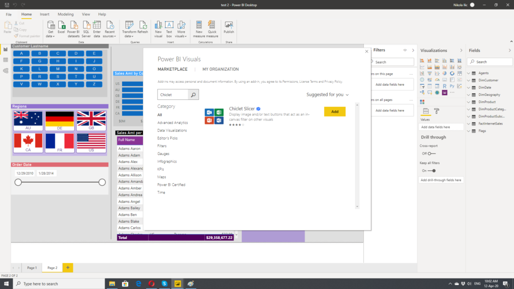
Step 1 was to import Chiclet Slicer visual from marketplace. Click on three dots under Visualizations pane and choose Import from AppSource.
In search field enter Chiclet and, once you see it, click Add.
Now, you are ready to go and use Chiclet Slicer in your report. Next step is to extract only first letter from customer’s last name. I will use Adventure Works 2017 database for demo purpose.
Since I want to see customer’s full name, I will first create a new column within DimCustomer table and concatenate customers’ last name and first name:
Full Name = DimCustomer[LastName] & " " & DimCustomer[FirstName]
Next step is to extract first letter from this column and the easiest way to do this is using LEFT function:
Cust Lastname 1st = LEFT(DimCustomer[LastName],1)
Number 1 tells function to leave only one character on the left side of the text and remove everything else.
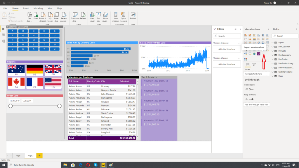
As soon as I did this, I can drag Chiclet Slicer on the report and put my newly created column Cust Lastname 1st as a category for slicing:
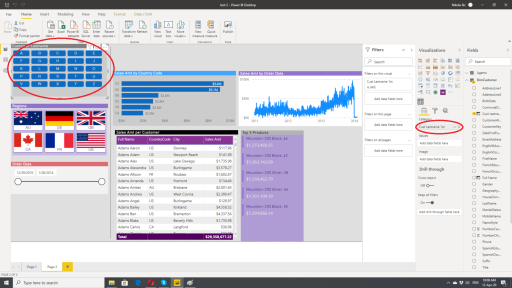
Now, I can select only those customers whose last name starts with specific letter(s) and all other visualizations will be also filtered accordingly.
You can use “first letter trick” also for other categories, like product, country, etc.
Enhancing slicer with images
Chiclet slicer also offers you nice feature of using images as slicers. To demonstrate this, I will use flags of specific countries which exist as regions in Adventure Works 2017 database.
I’m using web URLs from Wikipedia, but you are free to choose whatever source you want. You can create additional column in DimGeography table and insert web URL for every respective country. But, in that case, your data model will get larger, because you mustn’t forget that calculated columns are part of data model and, therefore, takes memory space.
To avoid that, I normalized data into separate table, using country region codes from DimGeography and web URL. Power BI is smart enough to recognize relationship between these two tables:
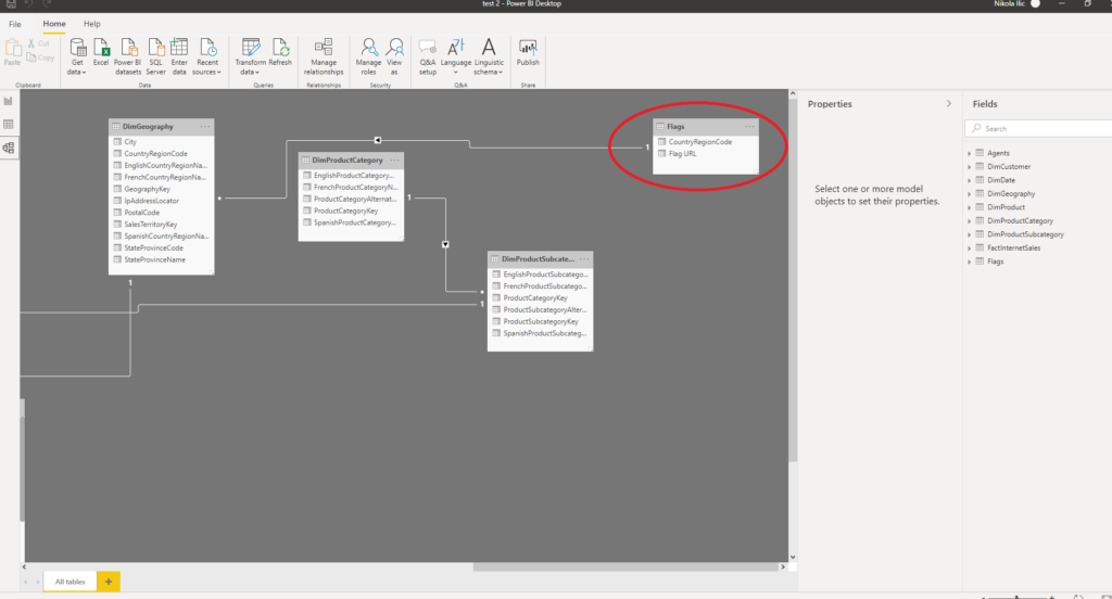
Now, very important step is to mark images’ URLs properly, so that Power BI can handle it as images. You achieve that by clicking on column Flag URL and categorizing this column as Image URL (Data Category dropdown menu under Column tools tab).
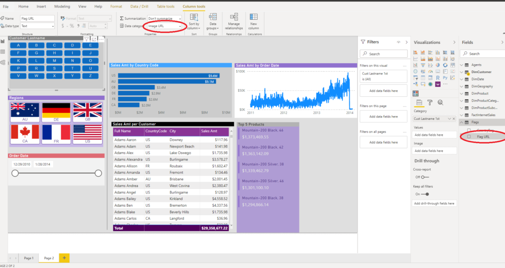
Now, it’s time to drag Chiclet Slicer again to our report. Put Country Region Code as a Category and Flag URL as Image.
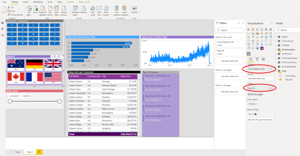
Then, under Format pane, you can play around and try different customizations of various attributes. I’ve set Image split value to 80, so that both Category and image are visible, but you can also opt to see image only if you like, by enlarging this value to 100.

As I said, experiment with different numbers until you get look and feel that best suits your report.
Conclusion
Chiclet Slicer is another interesting tool under your belt, which gives you possibility to enhance your reports, by extending standard visualizations. However, be careful and not overuse it. The most important thing is to find right balance and use it in some specific scenarios where it makes sense.
Last Updated on April 12, 2020 by Nikola