Dear reader, before you proceed, keep in mind that the following example was a real-life use case! Of course, numbers and metrics in this article were adjusted not to discard the real client’s data, but the structure and overall idea is 100% identical as it was in reality!
Just recently, I was dealing with the task of improving the report for one of the clients. The current setup was the following: Excel report, built on top of a huge CSV file (aggregating the data from it), with 18 tabs and 21 tables in each of those 18 tabs! Something like this:
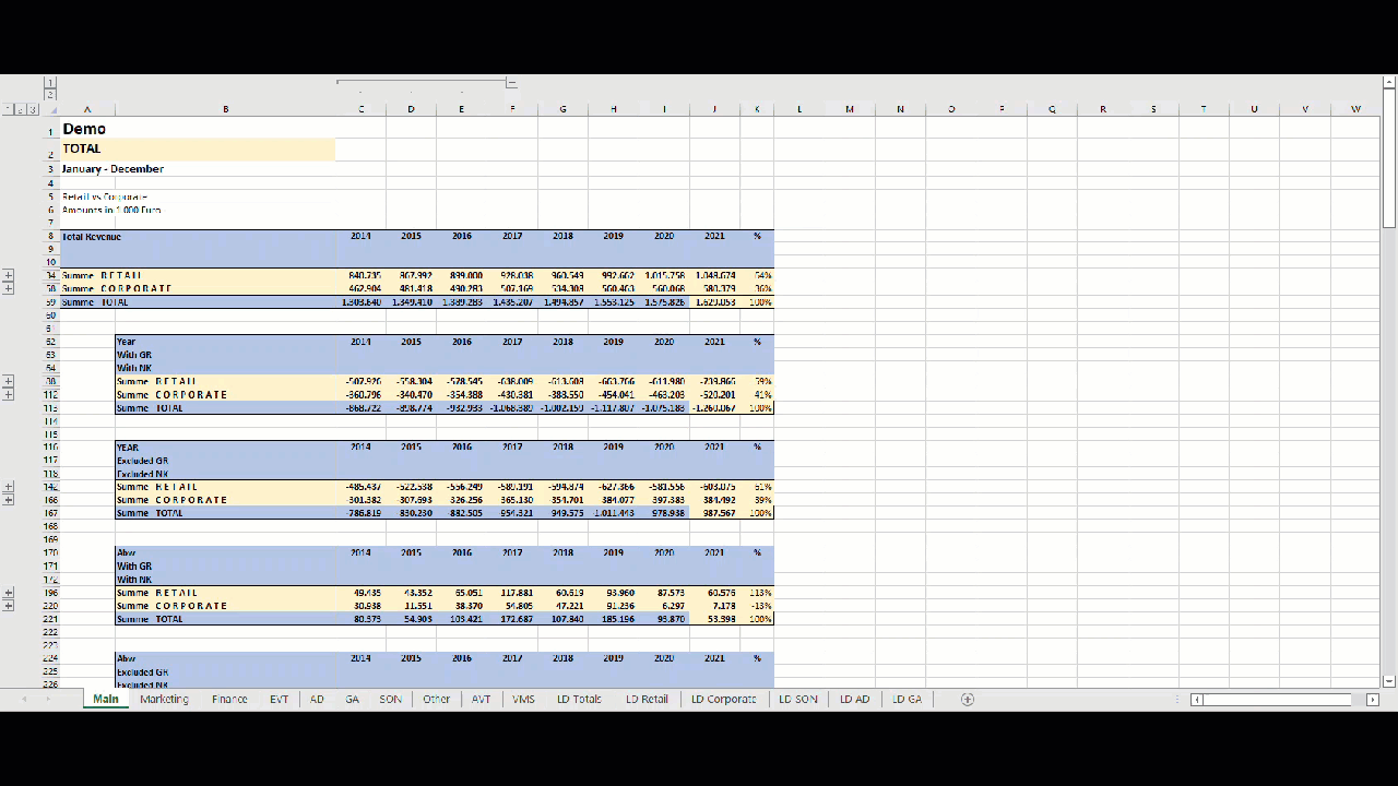
As you may see, there are 21 tables in the Main sheet. Each table contains only one single metric (broken down per year and Retail vs Corporate)…The same applies to Marketing sheet – it contains exactly the same metrics, the only difference is that the figures are filtered to include only data relevant to Marketing department. And, guess what: every subsequent sheet contains same group of measures, relevant to a specific line-of-business. The Main sheet combines the data from other sheets, displaying totals for the whole company.
Now, if you ask me, this is a terrible solution, as majority of the data is redundant and it’s damn hard to find any insight, let alone perform basic comparisons between departments! Scrolling up and down in 18 separate sheets, while trying to align figures – don’t get me wrong, but it has to be a more optimal way to do it!
Setting the stage – introducing Power BI
As I’ve already described in one of the previous articles, the first and most important step when designing an efficient analytic solution is to understand the business problem! Once you identify the key business questions that need to be answered, you may shift your focus on trying to find the most optimal tool and techniques.
After the initial talk, we conclude that Power BI should be preferred tool of choice, instead of Excel. Fine, we checked one box, but the next obvious question is: what is the most optimal way to present the same data to a consumer? Which technique or feature should we leverage to get the best out of the existing crop of data? I mean, we could’ve simply copy/paste the logic from Excel to Power BI, maybe adding some cool visualizations along the way…But, is this the best fit for our users?
What if I tell you that the final solution has 1 single report page…And, one single table on it! Let me do the math for you: instead of 18 sheets with 21 tables in each sheet (which is ca. 380 tables in total), we will use one single table on one single report page to achieve the same outcome! Don’t trust me?! Just keep reading…
Choosing the right tool for the job – Calculation Groups
After some tinkering, I’ve decided to try with Calculation Groups. For those of you who are not aware, it is an extremely powerful feature of the Tabular model (so, it’s not Power BI exclusive feature, as you may also take advantage of it in Analysis Services Tabular).
Explaining Calculation Groups and the way they work is out of the scope of this article, but I strongly recommend to check Marco’s and Alberto’s article on that topic, or one of the many fantastic posts written by Bernat Agullo from Esbrina, where you can also find some implementations of Calculation Groups that go beyond basics.
So, the idea is the following: as we are basically using the same set of calculations in each Excel sheet (current year value, previous year value, comparison between the current and previous year), why not create a calculation group to handle all the necessary calculations, and then give user a possibility to choose on which metric to apply the calculation (revenue, costs, provisions, etc.). Based on user’s selection, the respective metric with all its calculation items will be displayed in the table…Sounds confusing? Trust me, it’s easier than you can imagine…
Building a solution
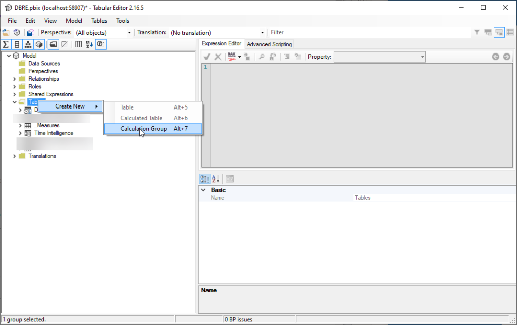
The first thing you’ll need if you want to work with Calculation Groups is Tabular Editor, as at this moment, it’s not possible to create Calculation Groups from Power BI Desktop. I sincerely hope that you are aware of Tabular Editor and that you’re using it, not just because of the Calculation Groups, but also because of bunch of other extremely useful features that makes life of Power BI developer much easier:)
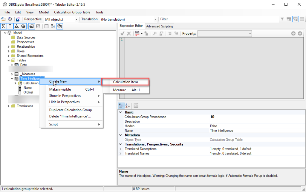
Once we open Tabular Editor (I’m using free version of Tabular Editor for this demo), the first step is to create a new calculation group. Right-click on Tables and choose to create a new Calculation Group:
I’ll give my Calculation Group name “Time Intelligence”, and let’s go now and define our calculation items within the Calculation group. Right-click on the Calculation Group and choose to add new calculation item:
The next step is to define the Current value of the selected calculation. Here, I’ll simply use the following syntax:
SELECTEDMEASURE()
Let me stop for a second and explain what this SELECTEDMEASURE() means. This will be used as a reference to a measure that is currently in context. It can be Sales, Order quantity, and so on…In our scenario, this will be Total Revenue, Total Costs, Provisions, etc.
Next, we want to calculate the value of the measure in scope for the previous year. So, I’ll create another calculation item, called Previous, using the following formula:
CALCULATE(
    SELECTEDMEASURE(),
    SAMEPERIODLASTYEAR('Date'[Date])
    )
The third calculation item we need in our report is comparison between the current value and previous year:
SELECTEDMEASURE() - CALCULATE(
    SELECTEDMEASURE(),
    SAMEPERIODLASTYEAR('Date'[Date])
    )
Finally, we’d like to display this difference as percentage too, so let’s create the fourth Calculation Item:
DIVIDE (
    SELECTEDMEASURE (),
    CALCULATE ( SELECTEDMEASURE (), SAMEPERIODLASTYEAR ( 'Date'[Date] ) ),
    0
) - 1
For this one, we also need to make sure that it’s properly formatted, so under Format String Expression property, I’ll set this to show percentage:
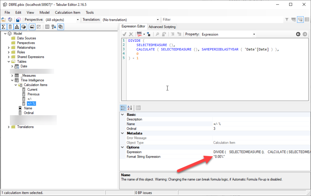
You can also re-arrange the order of the items within the group, setting the value of Ordinal property. In the illustration above, you may see that “+/- %” item has Ordinal value of 3, while previous items are assigned 0, 1 and 2 respectively – that means, the “+/- %” item will be displayed last within the group.
Now, as we want to enable our users to choose which metric to display in the table, I’ll create additional Calculation Group and name it Measure Selector. I’ll then define Calculation Item for each metric, something like this:
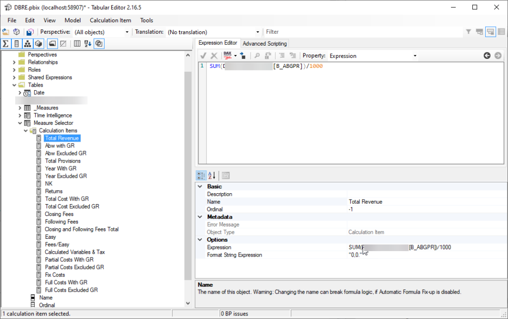
You may see all our metrics here, so I’ll now save the changes to data model, close Tabular Editor and go back to Power BI Desktop to build the report:
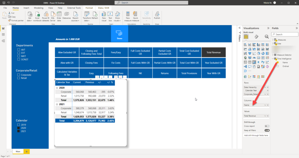
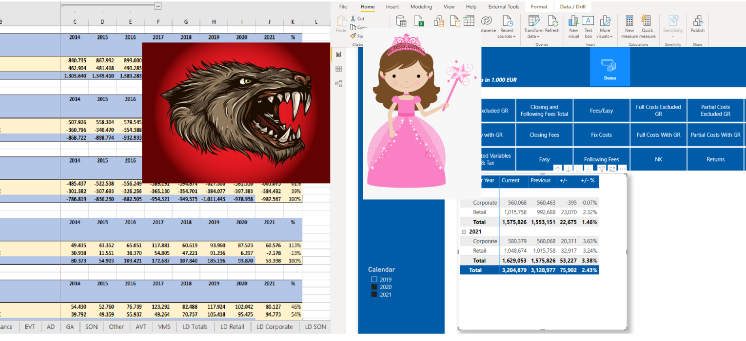
As you may notice in the image above, I’ve dragged Name from Time Intelligence Calculation Group as columns on my matrix visual, placed my Total Revenue measure as a value, and put Calendar Year and Corporate/Retail on rows.
Additionally, the slicer above (yes, this is a regular slicer visual formatted to remind of buttons) contains all the calculation items from the Measure Selector Calculation Group.
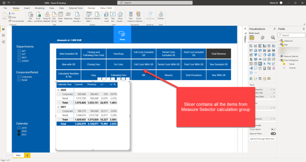
On the left side, I’ve created a slicer pane, where the user can easily switch between departments or corporate vs retail. The user can also select specific year(s) from the Calendar slicer.
Finally, let’s see what happens if I select different metric within the slicer:
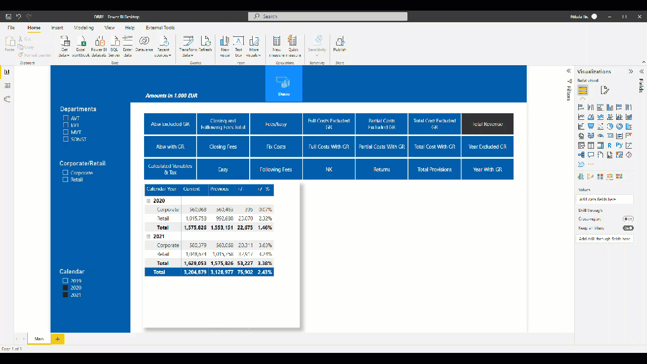
THIS-IS-AWESOME!
As you see, once I select different metric in the slicer, numbers are changing in the table (and in other visuals that I’ve omitted from the demo file). If you carefully look, there are 21 items in the slicer – one for each table in every Excel sheet. So, instead of having 21 tables, we have only one!
Filters on the left replace need for creating separate sheets – as now data can be sliced and diced in the scope of the current report page!
Conclusion
How would you call going from 380 tables in 21 sheets, to one table on a single report page?! Magic? Miracle?
By leveraging Calculation Groups feature within the Tabular model, I was able to build a solution that significantly reduces complexity and enables report users to quickly and easily unlock insights from the underlying data.
Not to mention scalability – just imagine that we need to add 10 new metrics or add a new filter (i.e. department) – instead of creating 10 additional tables in each of the sheets, or introducing additional sheets for new departments, we could simply go and expand the existing Calculation group and continue using our one-page reporting solution!
Thanks for reading!
Last Updated on March 3, 2022 by Nikola