When I talk to people who are not deep into the Power BI world, I often get the impression that they think of Power BI as a visualization tool exclusively. While that is true to a certain extent, it seems to me that they are not seeing the bigger picture – or maybe it’s better to say – they see just a tip of an iceberg! This tip of an iceberg is those shiny dashboards, KPI arrows, fancy AI stuff, and so on.
However, there is a lot more to it, as the real thing is under the surface…
In this series of articles, I’ll show you how Power BI can be used to create a fully-fledged analytic solution. Starting from the raw data, which doesn’t provide any useful information, to building, not just nice-looking visualizations, but extracting insights that can be used to define proper actions – something that we call informed decision making.
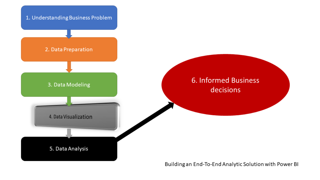
Good news, folks – slowly, but steadily, we are nearing our goal – to build an efficient end-to-end analytic solution using Power BI only! After we emphasized the importance of understanding business problem BEFORE creating a solution, performed some simple data cleansing and transformation, in the previous part we learned why Star schema and Power BI are match made in heaven, and why you should always strive to model your data that way.
Now, it’s time to build some compelling visualizations that will help us to tell the data story in the most effective way and provide insight to business decision-makers – in the end, based on those insights, they will be able to make informed decisions – decisions based on the data, not on a personal hunch or intuition!
DISCLAIMER: I consider myself as a person not aesthetically talented, so my data visualization solutions are mostly based on the best practices I’ve read in the books (this one, for example), blogs, and inspired by some amazing community members, such as Armand Van Amersfoort, Daniel Marsh-Patrick, Kerry Kolosko, Ried Havens, Andrej Lapajne (Zebra BI), or folks from powerbi.tips.
Data Visualization – my top list
Before we pull up our sleeves and start to visualize our data, I would like to point out a few best practices regarding data visualization I picked along the way.
1. One dashboard to rule them all
This one applies not to data visualization exclusively, it’s more of a general rule. There is no single solution to satisfy each and every business request! Period! As a first step, you should determine the purpose of the dashboard – operational dashboards provide time-critical data to consumers. I like to think about operational dashboards as of cockpit in the car or plane…On the other hand, analytical dashboards focus more on identifying trends and patterns from historical data and enable better mid to long-term decision-making.
In our case for this blog series, we are building an analytical dashboard.
2. Picking the right visualization type
Uh, this one is probably the most complicated to define. There are literally hundreds of blog posts, books, videos from established authors, explaining which visualization type to use for specific data representation. Based on what kind of insight you want to provide – for example, comparison between two data points, distribution of specific value, relationships between different data, changes over time, parts of the whole, and so on – there are certain visual types that SHOULD be used.
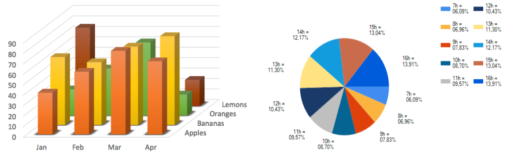
I’ve intentionally used the word SHOULD, as no one can prohibit you from using, let’s say, gauges, pie-charts, 3D-charts in your dashboards, even though a lot of recognized experts advised against that – just be careful and mindful in which scenario to use what visual type.
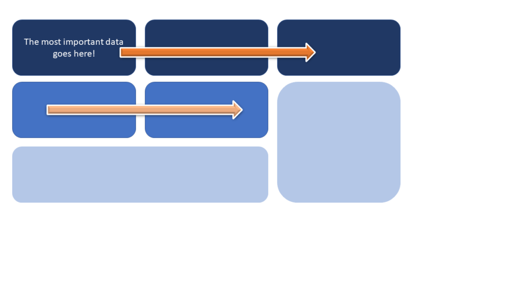
3. Define the most important data points
Obviously, some data points have higher importance than others. If your overall revenue is 50% lower than in the previous month, it’s definitely way more significant than looking at the chart showing individual numbers per product color. With that in mind, try to place all key data points in the top left corner, as most of the people on our planet read from left to right, and from top to bottom (imagine reading a book, or newspapers), and that position will naturally catch their attention right away.
4. Be Consistent!
This is one of the key things to keep in mind! What does consistency mean? For example, sticking with a defined layout and design, putting related information close to each other, or using similar visual types for a similar type of information – you don’t want to use a pie-chart to display Sales Amount by Region in one dashboard part, and then use a column bar chart to display, let’s say, Total Orders by Region.
5. Remove the distraction
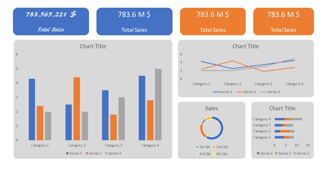
I’ve already written about one specific case of removing distractions from the Power BI report. There are a lot of possible distractors in your dashboards. Let’s start with fonts: tend to use standard fonts instead of artistic ones, as they are easier to consume:

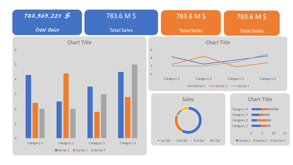
The illustration above demonstrates the easier readability of the card on the right, which uses one of the standard fonts (Calibri). It also demonstrates another point to consider – shortening numbers is also a good way to remove distraction from your dashboard.
In addition, take care of the proper alignment and give your visuals some space in between:
I assume we can agree that the dashboard on the illustration above is way more readable than the one below:
There are many more best practices, tips, and recommendations when it comes to data visualization. As I’ve already stressed, I don’t consider myself a “data viz” wizard, but I’m still trying to stick with some of the general rules mentioned in the previous part of this article.
Finally, even though that for many dashboard creators the first step is to set the overall dashboard design and then fit data elements in the predefined template, I prefer doing the opposite: first, I create all data elements, and then based on the story I want to “tell” with these elements, I’m building a final solution…
Visualizing vehicle collisions data
Ok, now as we identified some of the general data visualization best practices, it’s time to get our hands dirty and use Power BI to tell the story about the vehicle collisions in NYC.
This is how my report looks like. In this part, we won’t go deep into the details about each visual, but let me just briefly introduce the overall concept. There are two pages – Main page contains the most important data points, such as the number of collisions, deaths, and injuries. There are also a few “classic” visuals, like the Line chart and Column Bar chart, that will help us to extract the insights looking at the data from different perspectives. Multi-row card visual quickly illustrates who is the most endangered in the traffic.
Time of day is one of our key analytic categories, so report users have full flexibility to switch between different metrics on the same visual (Collisions, Deaths, Injuries) – keep an eye on the dynamic title – this enhances the overall user experience!
Remember, we defined a set of questions here that we’ll try to answer using this report. Data can be sliced from a calendar perspective using a Date slicer.
Details page gives a possibility to dive deeper into the details about accidents – introducing additional slicers for Borough and ZIP Code. Small Multiples visual nicely breaks down figures by two categories – person type and borough, while other elements extend the logic from the Main page.
Conclusion
We’ve covered a lot in this part of the series. Not that we just built our own report to visualize the data from the original dataset, I’ve also shared with you some of the general best practices when it comes to data visualization, and recommendations from proven experts on this topic.
I’ll repeat this: I consider myself far from being talented to be a “designer”, and I’m sure that many of you can create a better-looking Power BI report. However, the end goal is to effectively communicate the key data points to report consumers, and enable them to make decisions based on the insights provided by this communication.
With that in mind, I believe that we built a solid foundation to wrap everything up in the final part of the series – we’ll try to extract some meaningful information from the report we’ve just created and recommend certain actions in accordance with the findings.
Thanks for reading!
Last Updated on October 17, 2021 by Nikola