Numbers are what drives business! How many units of product X did we sell? How many customers left us in the previous month? How are the sales department doing comparing to the previous quarter? Those are just a few common questions that your report needs to answer.
There are two main characteristics of a good report – numbers MUST be correct, and they need to provide an insight in the most effective way! Now, we can easily agree about the first point and its meaning (numbers’ reliability). But, it’s extremely hard to define the most effective way, as this is usually a personal perception of things.
What should I (not) put in this report?
When you are trying to communicate the numbers with the business stakeholders, it’s not just that you need to emphasize important points, but you should also try to remove distractions. How many times did you see a report with all kinds of key figures, but their understanding was diminished by using many colors, or weird fonts? Or, showing too many numbers in the small space?
That’s why important to keep in mind that sometimes it makes more sense to identify distractions and think about how to exclude them – instead of trying to include too many things…

Providing a context
Context is the key when you are creating a report! When I say a report, I don’t necessarily mean a Power BI report – but any kind of information that needs to be communicated to consumers. Of course, it’s easy to get lost in Power BI with all these shiny visuals and hundreds of different possibilities to format and customize everything.
Therefore, tame that “wild artist” in you and always keep in mind that the context is what matters…
Use-case for providing a context
Just recently, I’ve been assigned the task of migrating the old existing SSRS report to Power BI. For all of you who are familiar with SSRS…Well, I guess you know how “generous” is the offer of visuals in this tool. A bar chart is the “top of the notch” when it comes to visualizing data from the matrix!
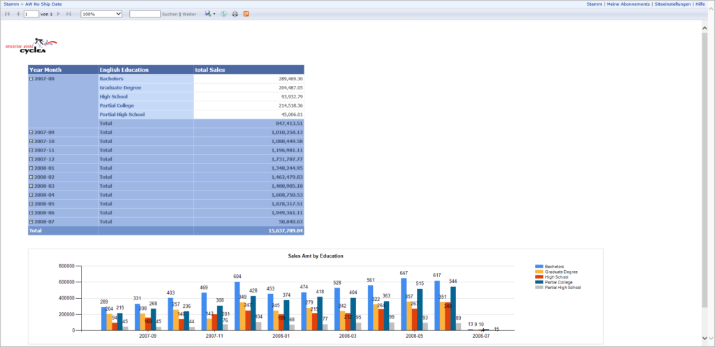
This is our starting point – SSRS report showing total sales amount per education level. For this example, I’m using the Adventure Works database, but the original report pretty much reminds of it. The request was to migrate this report from SSRS to Power BI, preserving the original “look and feel”.
Deal done! Let’s go to Power BI and re-create this page.
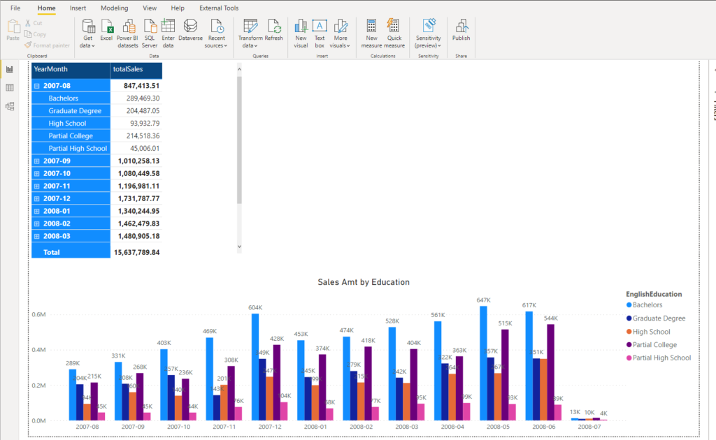
That looks better, isn’t it? No! If you ask me, this report page is quite useless, except the matrix on the top. Even the matrix is questionable in this form.
Remember the two key characteristics of the good report – numbers have to be correct – and this prerequisite was obviously satisfied. But, does this report generate insight in the most effective way? I would strongly disagree with anyone who claims that.
Let’s do some face-lifting of this Clustered column chart visual, remove distraction from it, so that report consumers can absorb data and get insights from the underlying figures.
Raising the bar
Generally speaking, when you want to follow the trends over time while dealing with multiple categories, Clustered column chart is not the best way to visualize your data. To follow the trends over time, it usually makes more sense to use a Line chart. Let’s switch our data points to a Line chart and check how it looks:
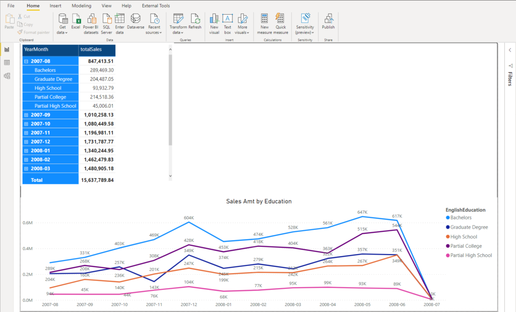
Ok, that’s already slightly better and enables us to easier spot the trends or identify outliers. However, it still looks cluttered and I will apply some additional steps to make it more consumable.
At first glance, these numbers in the Line visual cause huge distraction when looking into it. Therefore, I’ll remove them and slightly modify the visual’s background:
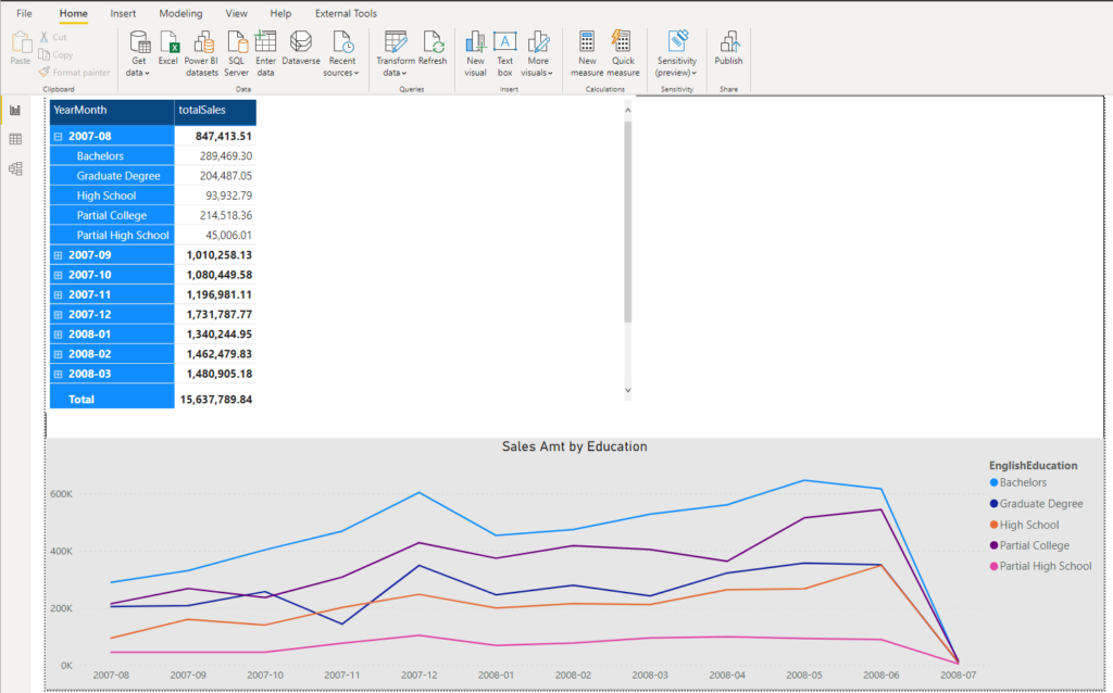
Now, you can expect that the report user would come to your office and ask: “Where are my numbers down there?! Wasn’t it clear that I want exactly the same report like I’ve had previously in SSRS?”
So, let’s prevent this kind of potential trap and adjust the report page to answer all of the user’s questions in the most effective way…I won’t touch Line visual, but I will present the numbers within the matrix in a more readable way:
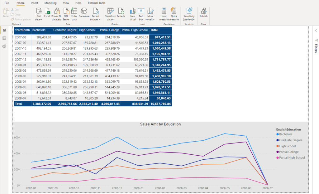
Since we have fixed number of categories (in our case, five of them), we can safely move them to columns. By doing this, we achieved two things: first, user doesn’t need to use scroll bar in the matrix to see all the numbers. Second, the new-look matrix nicely complements the Line visual with all the necessary numbers.
To push this report page to an even higher level, I’ll add a Median line, that will enable my user to quickly identify how each of the group performs comparing to a median value:
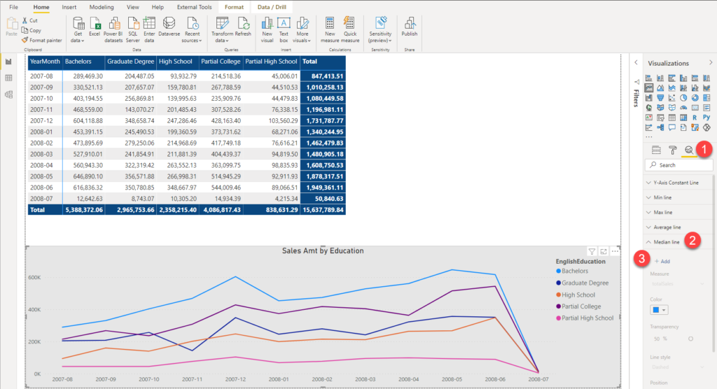
And once I’ve done this, here is the final look of my report page:
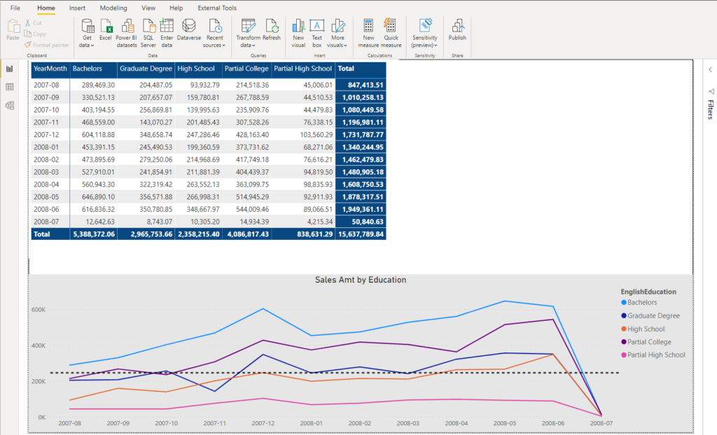
Now, if you compare this with our starting SSRS report – well, I assume you will agree that the newly created report communicate the data in much more effective way.
Essentially, what we got here in the end: instead of having 60 bars in one visual, we now have 5 lines (+1 line for Median value, which is not mandatory to have). There is no doubt that this change significantly simplifies information processing.
General rules for distraction removal
To conclude, here is the brief list of the general rules you should keep in mind when dealing with various data-distraction challenges:
- Not all of the data has equal importance – think thoroughly before putting everything on the report canvas
- If you don’t need low level of detail for specific visual, summarize the figures
- Ask yourself a question: what would happen if I remove this visual/figure? If the answer is: nothing…Then, remove it!
Thanks for reading!
Last Updated on April 19, 2021 by Nikola


