

I like Power BI, because it offers a whole range of visualizations and out-of-the-box solutions to transform almost every business request into a shiny looking report. Don’t get me wrong, Power BI is much more than data visualization tool – it can be used in many scenarios as a comprehensive ETL solution.
However, Power BI certainly has some limitations when it comes to specific user requests. In those situations, some workarounds and tweakings are necessary in order to achieve desired functionalities.
Expand/Collapse Functionality
One of them is Expand/Collapse functionality in visuals other than Matrix. Even in Matrix visual, it was not possible to use the “+” sign for expanding until November 2019 update.
For us coming from the SSRS world, this was so strange and unexpected. Ok, matrices are covered now, but what if we want to apply this same functionality to other visuals, for example, Card visual.
Stay tuned, I’ll show you a workaround, so you can achieve that. As usual, I will use the Contoso sample database for demo purposes.
Scenario
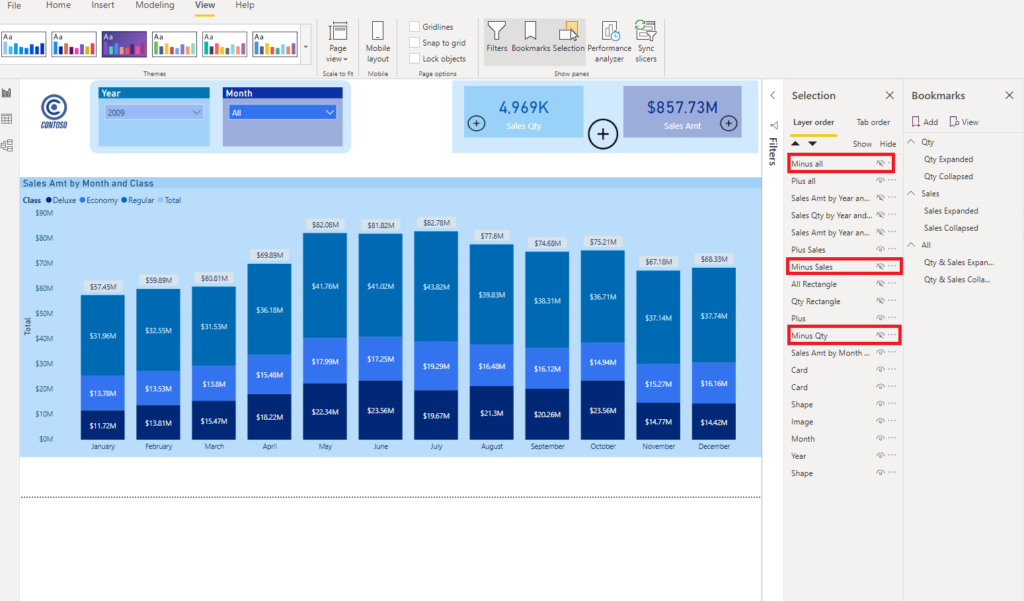
Let’s say I have report page showing a stacked column chart in the middle and two card visuals in the upper right corner, showing Sales Quantity and Sales Amount:
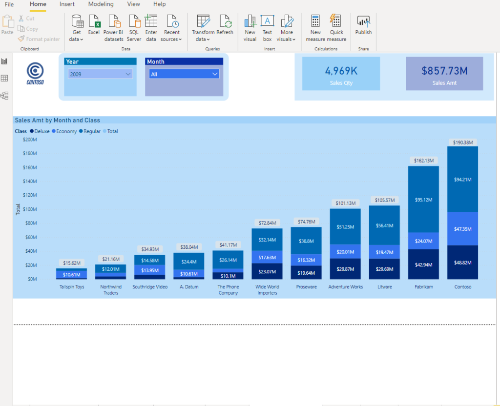
Now, let’s say I want to give my users the possibility to get more insight into details that form these figures. Using the Tooltip page, which I described in this article, can be an easy and quick solution. But, Tooltips are static and they only show underlying data, without giving the opportunity to interact with it.
Therefore, I decided to play with bookmarks in order to mimic expand/collapse functionality. Bookmarks are a very useful technique in Power BI and I’m using them quite often.
Simply said, bookmark captures the current state of the report page (with all visible visuals on it) and you can navigate between different bookmarks using buttons/images, by setting Action property to Bookmark.
Broader explanation on Bookmarks is out of the scope of this article, so just keep in mind that Bookmarks are a quite useful technique to customize your reports and improve overall user experience.
Step 1 – Insert images and create bookmarks
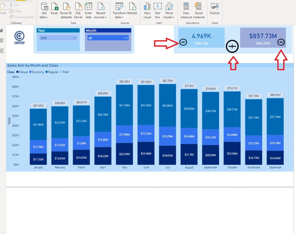
The first thing we need to do is to give our users a hint of what they can do with the card visuals. I’ve imported two transparent icons for “+” and “-” signs and I believe that it will be intuitive enough.
Put both icons one over another, as in the following picture:
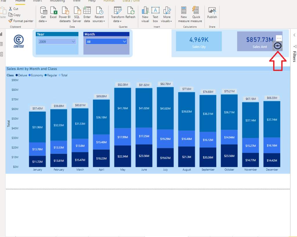
Do the same for Sales Qty Card visual and we will also put another pair in the middle, between the cards. This icon will enable the user to expand/collapse both cards at the same time, while the small icon will handle that specific card.
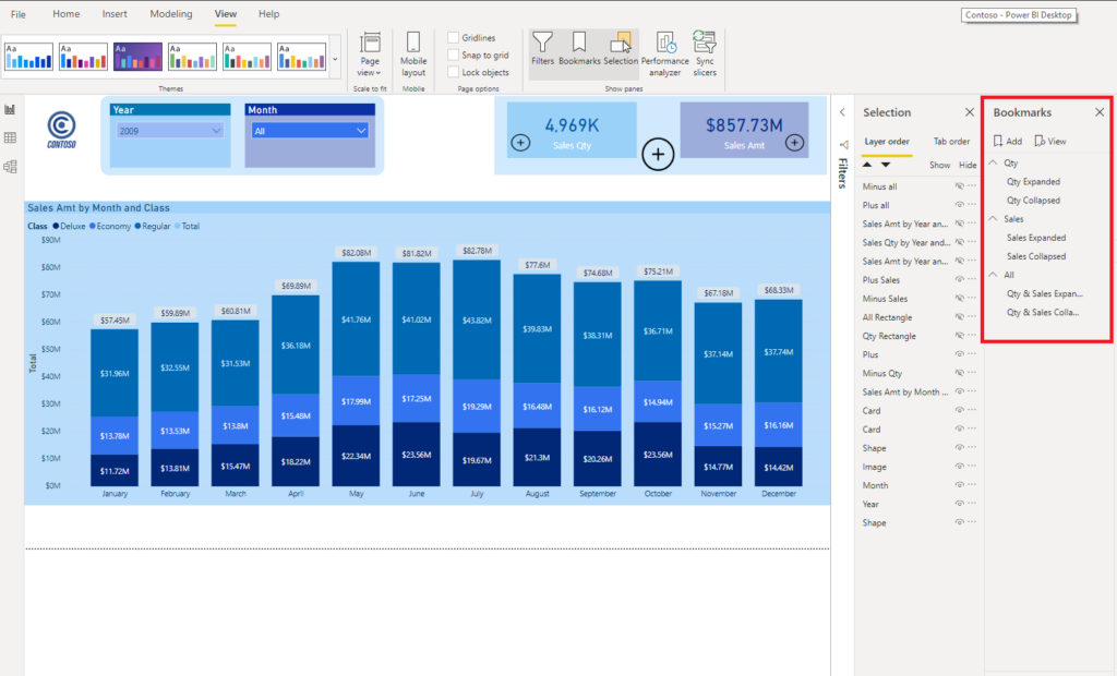
Now, real magic needs to be created. Under the View tab, enable Bookmarks and Selection panes. We will need two bookmarks for every single scenario: expand/collapse Sales Qty card only; expand/collapse Sales Amt card only; expand/collapse both cards.
Here is the screenshot of bookmark pane I’ve created:
Step 2 – Setting visibility within bookmarks
Now, we need to define the look of every single bookmark. That means, when I open the report page, only “+” icons should be visible (which means that I need to hide “-” icons).
After that, you need to set Show/Hide property for all visuals depending on the user’s selection. It would take a lot of time and pictures to illustrate every single step, but let’s just show for Sales Qty (logic stays the same for Sales Amt).
Turn the Action field on, choose Bookmark under Type and select Qty Expanded bookmark. That way, we “told” this icon to navigate us to a specifically created bookmark which shows captured status of the report page we need to show.
Once you do CTRL+click on “+” sign, you will see that report page changed:
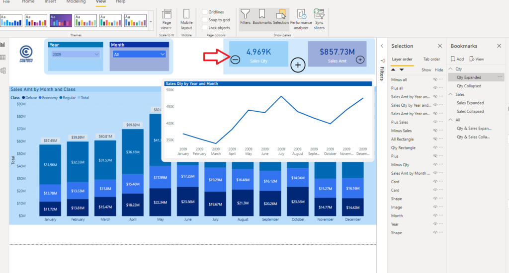
The first thing you’ll notice is new Line Chart visual which shows Sales Qty broken down per month. Additionally, the “+” sign disappeared, and “-” icon is there instead, suggesting the user that he can click on it once he decides to collapse this extended visual.
Step 3 – Playing around with bookmarks
Now, if user clicks on Sales Amt “+” icon, following thing happens:
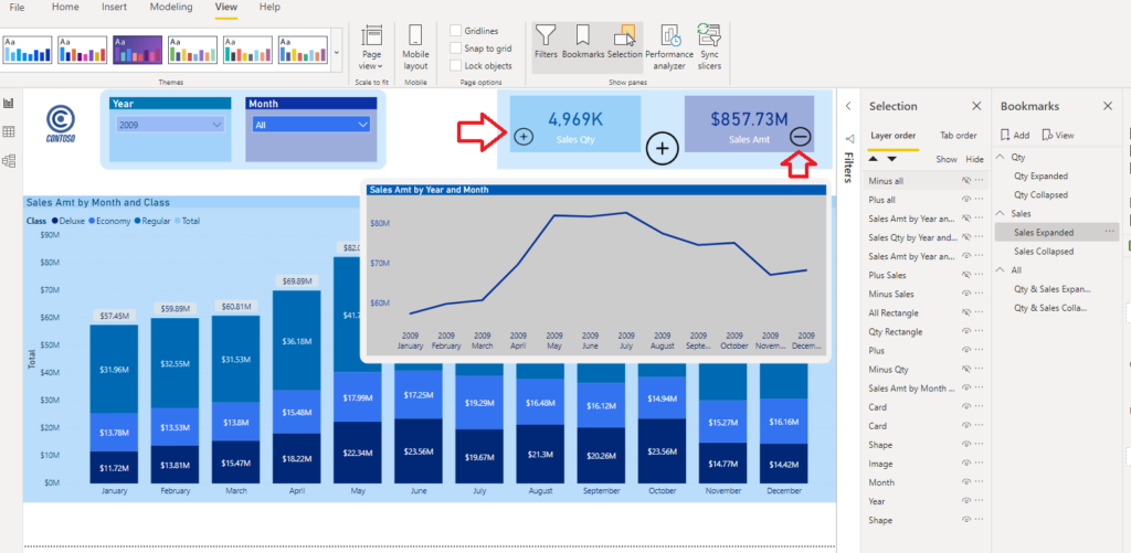
Visual has changed to show the Sales Amount figure per month! Also, “+” and “-” icons were synchronized to follow the user selection.
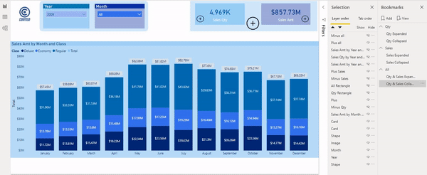
Finally, if the user wants to expand both card visuals with one click, he can do it by clicking on big “+” sign between the cards:

Pretty cool, ha?
Finally, here is the final solution in action:
Conclusion
As I previously mentioned, you can give more insight to users with Tooltip pages, and that’s also a legitimate solution, but they are static. With clever usage of bookmarks, you can set different types of additional visuals to appear on the user’s request. Moreover, these visuals can be used like regular visuals for cross-filtering or drilling down and that’s the greatest advantage of this technique.
Last Updated on June 10, 2020 by Nikola


Lee
I’ve been using bookmarks as navigational tools on paginated reports but never considered using books marks in place of static tooltips. This is definitely going to raise my visual game, thank you!
Nikola
You’re welcome, I’m glad if you find it helpful!
CHRISTOPHER MAJKA
Nicely done! Will definitely be able to use this technique in our reporting. Thanks
Nikola
Thanks Christopher, great to hear that!