
A few weeks ago, I was working on performance tuning of the Power BI report for one of my clients. The report page was rendering super slow (15+ seconds). To provide you with a little background: the report uses a live connection to a tabular model hosted in SSAS Tabular 2016.
What if I tell you that I managed to speed up the performance of the report page more than twice, without changing a single line of DAX code behind the calculations?!
Keep reading and you’ll see why very often the devil is in the detail and how thinking outside of the box may help you become a true Power BI champ:)
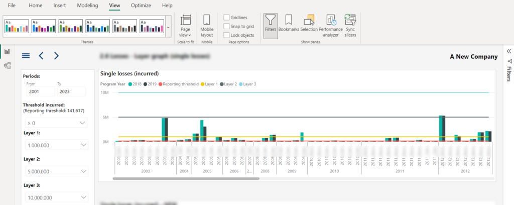
Let me quickly explain the illustration above. There is a Line and clustered column chart visual, where the four lines represent the user choice from the slicers on the left (Reporting threshold and three layers), while the columns are the total sales amount. Data is broken down per year and product. Each of the lines is calculated using DAX (by the way, there is no SELECTEDVALUE function available in SSAS 2016😉).
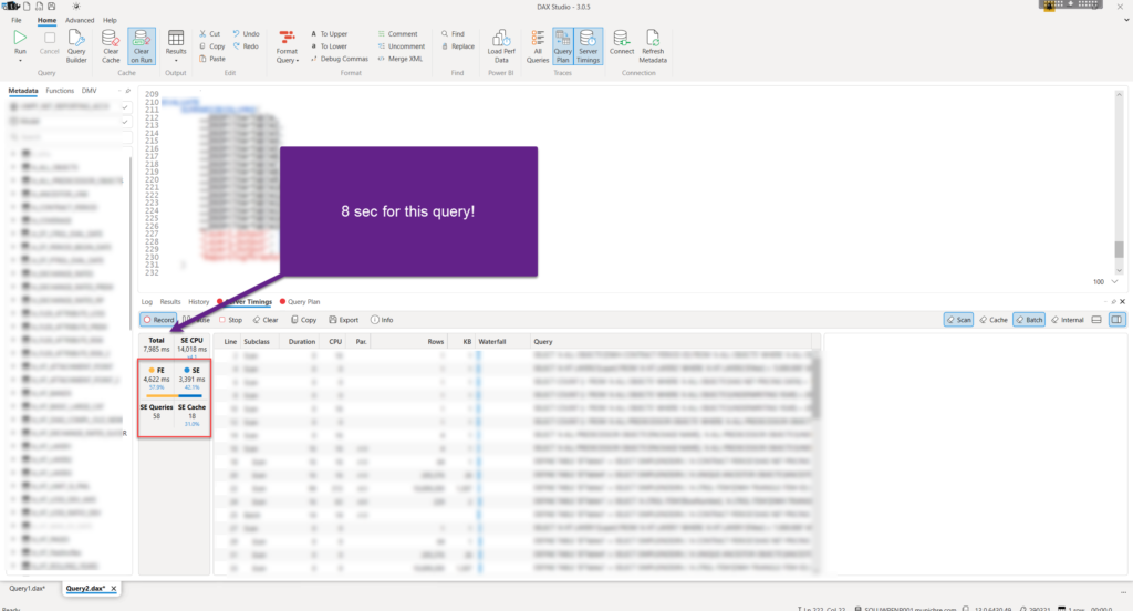
I’ve turned on Performance Analyzer, grabbed the DAX query and executed it in the DAX Studio:

As you may see, the query takes 13.5 seconds to execute (with cache cleared before run), whereas most of the time was spent within the Formula Engine (76%). This is important, because we’ll compare this result with an improved version of the report page.
So, what would an experienced Power BI developer do to optimize this scenario? Rewrite DAX? WRONG!
Let’s see what can be done without changing the DAX logic!
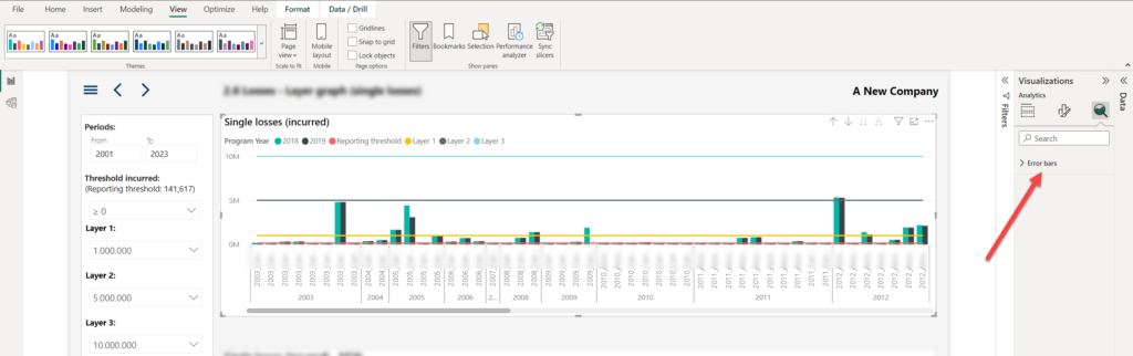
In case you didn’t know, Power BI offers you an undervalued feature, or let’s think of it as an “unsung hero”, which is called the Analytics panel.

Most of us obviously spend the majority of our Power BI development time in the other two panels – data and format. So, you would be surprised how many Power BI developers are not even aware of this third panel, or even when aware, very rarely using it.
Without going deep into details, this panel lets you add additional analytic ingredients to your visuals – such as Min, Max, Average, Median lines, error bars, etc. Depending on the visual type, not all options are available! And, this was important in my use case.
Once I opened the Analytics panel, only Error bars were available:
Essentially, the idea here is, since these four lines are not changing based on the numbers in the visual itself (they have constant value based on the slicer selection), to leverage the Constant line feature from the Analytics panel. Since no Constant line is available with Line and clustered column chart visual, let’s duplicate our visual and change its type to a regular Clustered column chart.
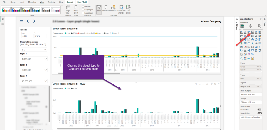
As you see, the “numbers” are here, but we are missing our lines. Let’s switch to the Analytics panel and create 4 constant lines, each based on the DAX measure produced by the slicer selection:
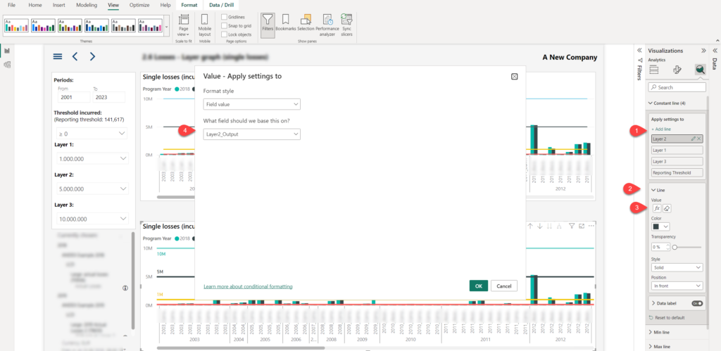
The first step is to add a constant line. Next, expand the Line property and as a value, choose the “fX” button, which enables you to set the value of the constant line based on expression (in our case, that’s the expression generated by the DAX measure). Repeat the process for all four lines.
I’m reminding you once again, please be aware that I haven’t touched the DAX code at all!
Once I turned off the Y axis, this is how my “twin” visual looks:

Pretty much the same, right?
Ok, let’s now check the performance of this visual:
It’s more than 5 seconds faster than the original one! If you carefully compare the previous DAX Studio screenshot, you will notice that the number of Storage Engine queries is exactly the same as in the previous case (and SE time is practically the same), which means that the Storage Engine has exactly the same amount of work to do to retrieve the data.
The key difference is between the Formula Engine times – unlike in the original visual, where 75% of the total query time was spent in FE, this time it’s reduced to below 60%!
I was curious to see why is that happening and what is the main difference between the two query plans generated by the Formula Engine.
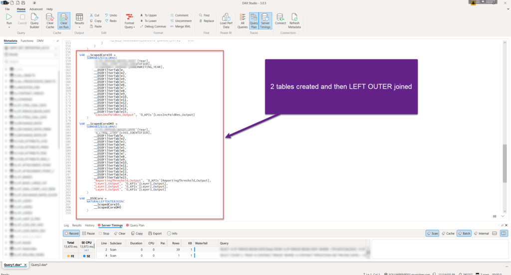
The “only” difference between the two query plans – in the slower version, two virtual tables were created: one to calculate the value of the “column” in the visual (_ScopedCoreI0), and another to calculate the value for the lines in the same visual (_ScopedCoreDM0). Finally, these two tables were joined using the NATURALLEFTOUTERJOIN function.
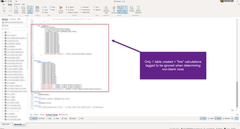
In the faster version, there is no second table that calculates the lines’ value. Additionally, measures that calculate the lines’ value were wrapped with the IGNORE function, which tags the measure(s) within the SUMMARIZECOLUMNS expression to be omitted from the evaluation of the non-blank rows.
Conclusion
As you have witnessed, changing the visual type, combined with the usage of the “unsung hero”, Analytics panel, ensured a significant performance improvement in this scenario. It’s not by coincidence that people say that “the devil is in the detail” – therefore, more often than not, thinking outside of the box will lead to some creative solutions.
Thanks for reading!
Last Updated on June 7, 2023 by Nikola