

Just recently, I’ve came across a question on LinkedIn platform, if it’s possible to create the following visualization in Power BI:

Since one of the common business requests is to perform different comparisons between various time periods, I would say that Power BI has a lot to offer in this regard. I’ve already explained some basic calculations related to Time Intelligence, but there are obviously a significant number of users who are not quite familiar with them.
First of all, I would like to emphasize a great feature called “Quick Measures”, where you get out-of-the-box solutions for multiple commonly used calculations, such as: Year-to-date total, Quarter-to-date total, Month-to-date total, Year-over-year change, Rolling Average, etc.
In order for Quick Measures to work, you need to have a properly defined Date table.
However, we will not use Quick Measures here to achieve our original goal, so let’s switch over to a Power BI Desktop and get into the action! As usual, I will use the Contoso database for demo purposes.
Creating base measures
First step is to create a base measure to calculate Sales Amount:
Sales Amt = SUM(FactOnlineSales[SalesAmount])
I will straight away create another measure, which will calculate same figures, but shifting one month back:
Sales Amt PM = CALCULATE([Sales Amt],
                        DATEADD(DimDate[Datekey],-1,MONTH)
                        )
There are multiple different ways to calculate this measure, but I prefer using DATEADD() function since it gives me more flexibility with shifting periods (that’s an official excuse:)…In reality, I’m coming from the SQL world, where DATEADD() is one of the most important functions when working with dates).
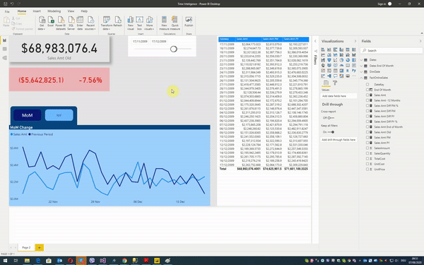
Now, when I choose dates between November 17th and December 17th, I can see how my numbers correlate between themselves:
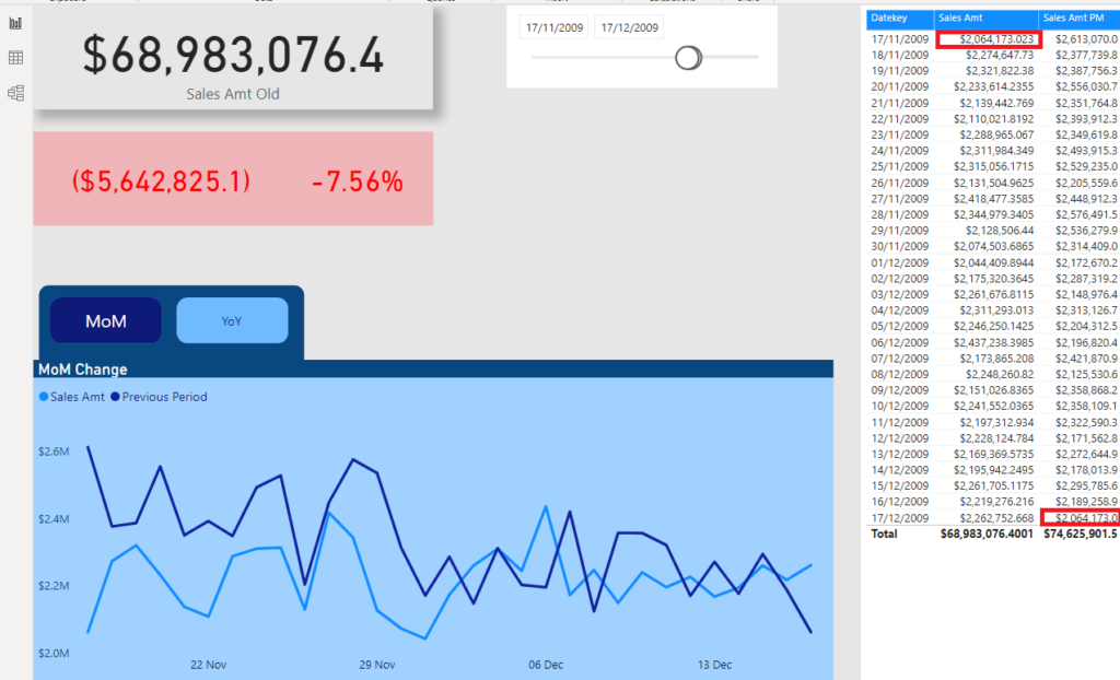
As you may notice, our formulas work well – as intended, we see that Sales Amt PM for December 17th, matches Sales Amt for November 17th. Also, our Line chart nicely visualizes trends for easier comparison, while Card visuals in the upper left corner show Sales Amount for the selected period and difference between two periods which we are comparing.
For those differences, I’ve created two additional measures:
Sales Amt Diff PM = [Sales Amt] - [Sales Amt PM]

Sales Amt Diff  PM % = DIVIDE([Sales Amt],[Sales Amt PM],BLANK()) - 1
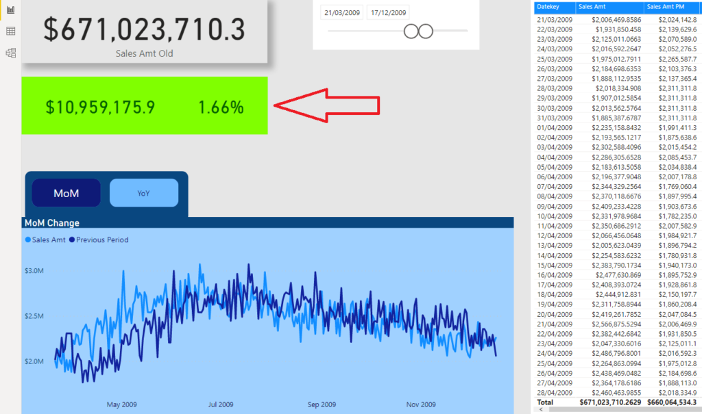
Lower Card is conditionally formatted based on the values, so it goes red when we are performing worse than in the previous period, while it shows green when the outcome is opposite:
Adding more ingredients
Now, that’s fine and you saw how we could easily answer the original question. However, I wanted to add some more ingredients here and enable our users to choose between MoM (Month-over-month) and YoY (Year-over-year) comparison.
In our example, if we choose again dates between November 17th and December 17th, instead of showing me values from the previous month (comparing December 17th and November 17th), with YoY comparison I want to compare December 17th 2009 with December 17th 2008!
So, let’s create a measure for this. Again, you can use different functions to achieve this, like SAMEPERIODLASTYEAR() function, but I want to keep consistency and therefore I will again use DATEADD():
Sales Amt PY = CALCULATE([Sales Amt],
                        DATEADD(DimDate[Datekey],-1,YEAR)
                        )
Same as for MoM calculations, two additional measures are needed to calculate differences for YoY fugures:
Sales Amt Diff PY = [Sales Amt] - [Sales Amt PY]

Sales Amt Diff PY % = DIVIDE([Sales Amt],[Sales Amt PY],BLANK()) - 1
I will then create two bookmarks, so that users can navigate to MoM or YoY, by clicking on respective buttons:
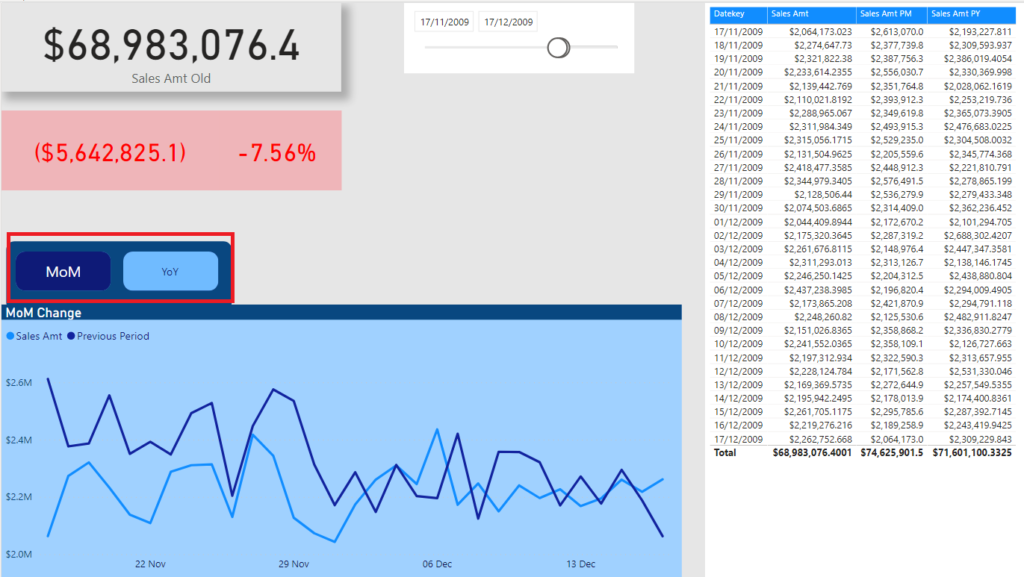
By default, they should see MoM comparison, but as soon as they click on YoY button, report will look slightly different:
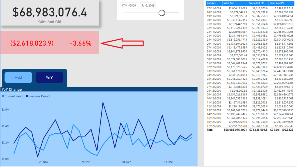
You can notice that numbers in the card visuals changed to reflect YoY difference calculation, while Line chart also shows different trends!
Before we conclude, here is the final behavior of our report:
Conclusion
As we saw, Power BI is quite a powerful tool when it comes to time intelligence calculations. Basically, all kind of comparisons between different periods can be created – most common ones even without needing to write a single line of DAX!
If you need to expand on built-in Quick Measures, there is a whole range of useful Time Intelligence functions. You can check all of them in more depth here.
Thanks for reading!
Last Updated on August 7, 2020 by Nikola


mobile legends hack
Pretty! This was a really wonderful article. Thanks for providing this info.
Sohail Imtiaz
Nice article. Thanks for sharing this.
Nikola
You’re welcome, glad that you liked it!
Alex
Can you share me the pbix file