If you follow my blog on a regular basis, you should have noticed that I’m often trying to enhance built-in visualizations provided by Power BI. In my opinion, there are certain scenarios when you, as a Power BI developer, can go above and beyond, and push your users’ experience to a new level, using simple tricks.
Not so long ago, I was working on creating a report solution for our customer support department. Basically, support agents perform four different types of interactions with the customers – chats, emails, phone calls, and surveys. And, managers need to have a report to measure the number of interactions per specific type, so they can identify peak times and assign agents to specific tasks.
Setting the stage
For this example, I’ll keep things simple. There is a single table containing interaction unique id, date of interaction, and type of interaction. The first step is to create an explicit measure that will count the number of interactions.
Total Interactions = COUNT(Sheet1[Interaction ID])
And, here is how my visual looks at the moment:
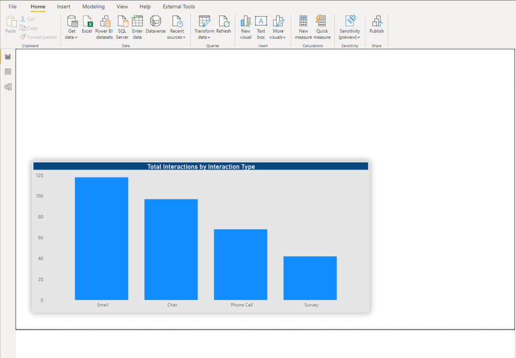
As you see, nothing special here, “classic” column bar chart. So, let’s try to bring some life into it. I’ve already written about UNICHAR() function in DAX, and how you can take advantage of this function in some scenarios. This function returns the Unicode character, as a representation of the numeric value you provided.
Now, the idea is to substitute text values: chats, emails, surveys, and phone calls, with visual representations of these words. There is a whole range of different symbols that can be expressed as Unicode. Here is the very comprehensive list of the symbols, together with their Unicode values.
Substituting textual values
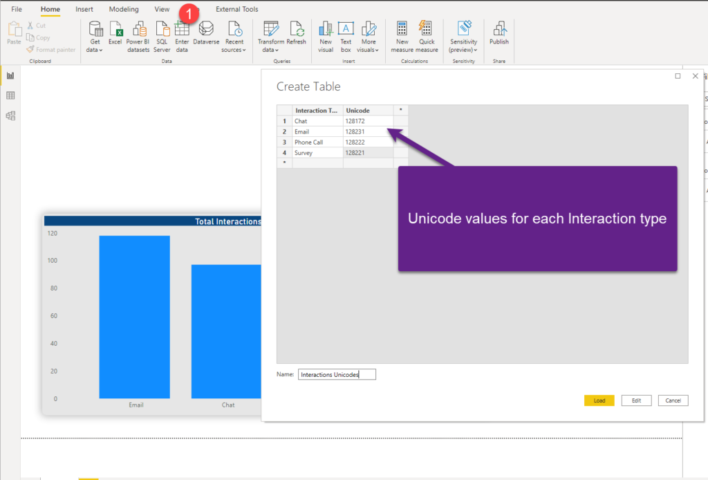
The first step is to create a new table in Power BI data model, that will hold data about Unicode values.
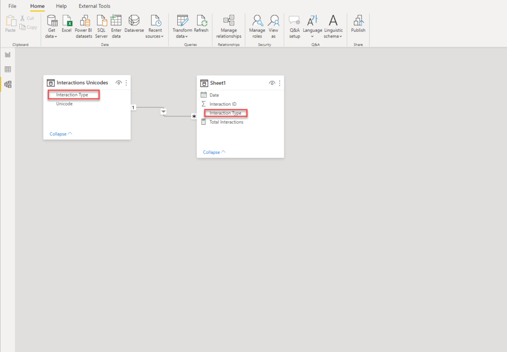
After I’ve loaded the table into the data model, I’ll switch to Model view and establish a “one-to-many” relationship between this table and my original table:
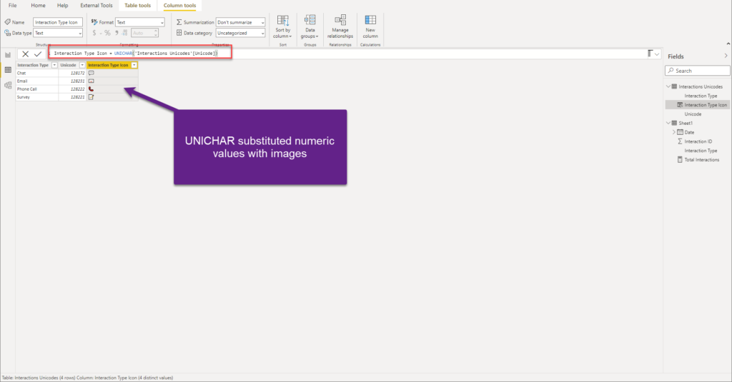
After that, I’ll go and create a new DAX column within my Interaction Unicodes table. And, here is where the magic happens – we will use UNICHAR() function, and as an argument, we will provide the value from the Unicode column:
Interaction Type Icon = UNICHAR('Interactions Unicodes'[Unicode])
And, voila, look at the values in this column now!
As we established a relationship between the tables, let’s grab this column and put it on the x-axis of our column bar chart:
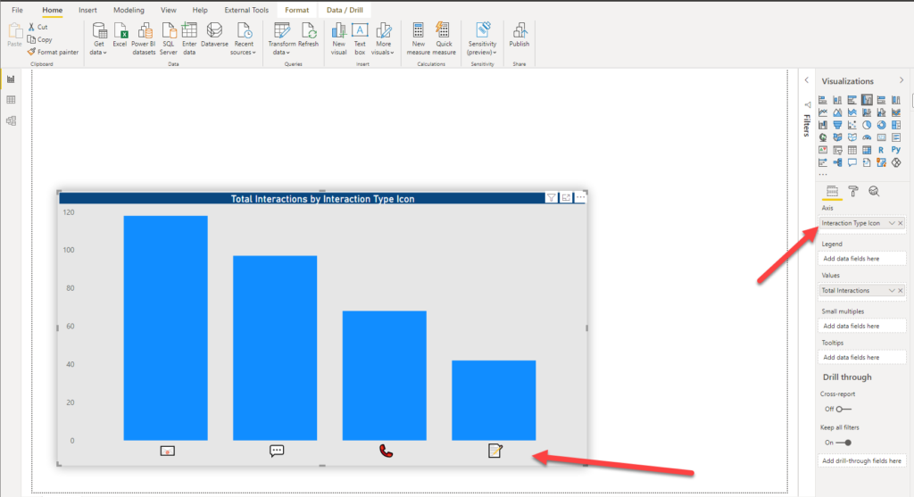
That looks cool, right? You can increase/decrease the font size of the x-axis, same as you would do with the “normal” text – and your icons will be resized!
Moreover, we can use these icons as slicers too! Let me show you how this can be used to enhance your users’ experience.
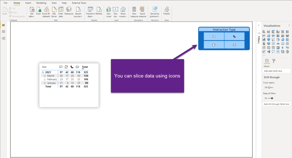
As you see in the illustration above, I’ve nicely formatted the slicer to look like a group of buttons (by using Horizontal orientation), so I can now slice my data by clicking on it! I’ve also created a Matrix visual and you see that our icons are there, behaving like regular text columns. In the end, UNICHAR() function will return text value, and you can handle it like you would handle normal text.
Conclusion
The key thing to keep in mind: don’t let this trick become the main “modus operandi” when you’re creating Power BI reports! Of course, in most cases, you should stick with traditional way of displaying values in your visuals. However, there are some certain situations when applying this technique can enhance the user experience.
In my opinion, two things are of key importance if you decide to use this trick:
- A limited number of categories to deal with – as you saw in my example, there is a fixed number of possible categories (chats, phone calls, emails, and surveys), so there is no danger of the axis/slicer becoming cluttered with too many icons
- Icons MUST provide the context of the “regular” text value – the user has to unambiguously understand what each icon represents. If that’s not the case, your report will cause confusion instead of clarity, and that is another valid reason to think twice before using this technique
As usual, try to find the right balance between enhancing your user’s experience and additional overhead that can be caused by using these non-standard techniques.
Thanks for reading!
Last Updated on July 5, 2021 by Nikola