I’m a big fan of Power BI and I’m not hiding it! One of the things that I really like about Power BI is the extremely large collection of visuals, both built-in, and especially custom visuals from the App Source marketplace.
Honestly, it would be really hard to imagine a scenario for your data story that can’t be supported by Power BI visuals! However, I’ve recently come under a request, that I’ve had an idea of how I want to tell the story to users, but I couldn’t find a proper way of communicating numbers!
Yes, that’s the truth! And, my idea was to use something like one of the visuals from the Google Analytics dashboard, that looks quite simple, but at the same time powerful:
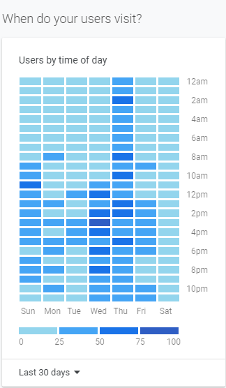
This visual gives you quick insight in the most relevant trends. No numbers, nothing – just something like a “heatmap”, so you can spot in literally a few seconds when your website had most visits!
I’ve already written how you can transform plain old Matrix visual to something like this, but this time I needed an additional layer for my story.
Scenario
The request was to show which brand class (Deluxe, Regular, or Economy) made the most sales at a specific time of the year. But, as an additional layer, report consumers need to see figures broken down by gender – and, based on results, create special marketing campaigns that will target respective genders during the selected period of the year.
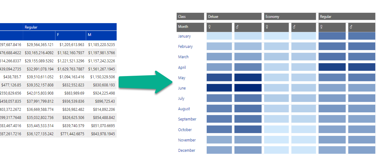
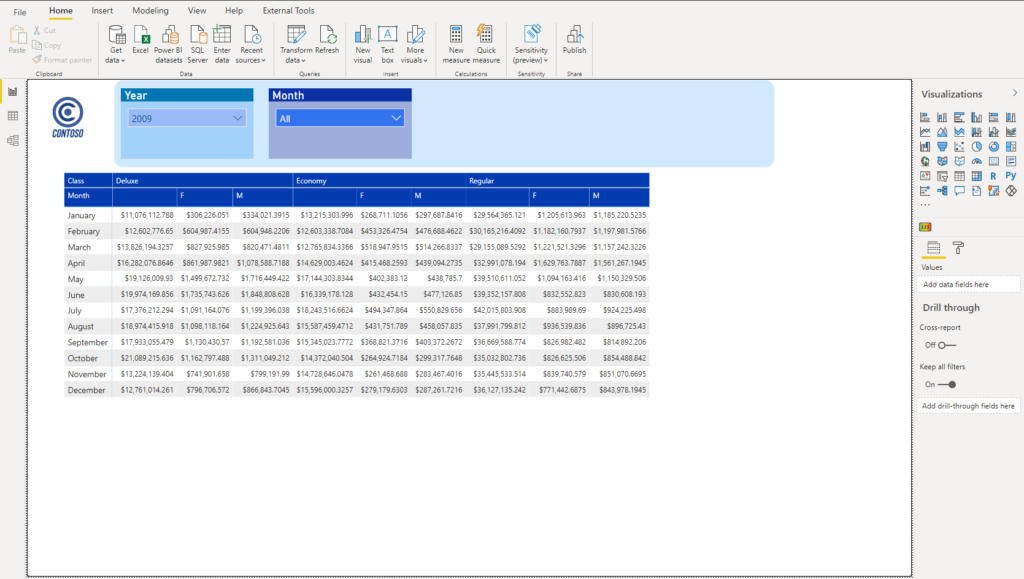
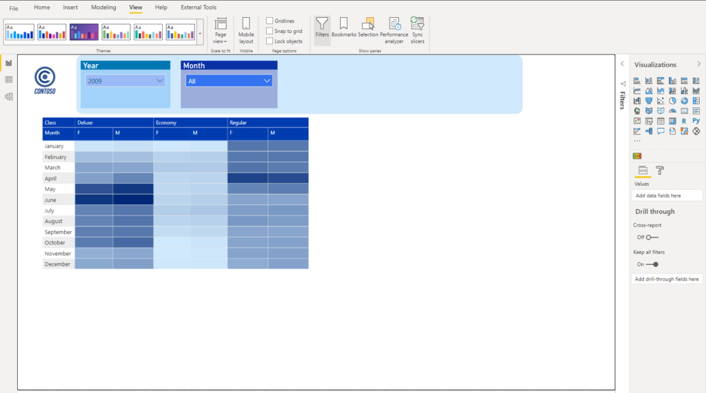
Let’s use a sample Contoso database to illustrate the real use-case. This is how it all looked in the beginning:
Building a solution
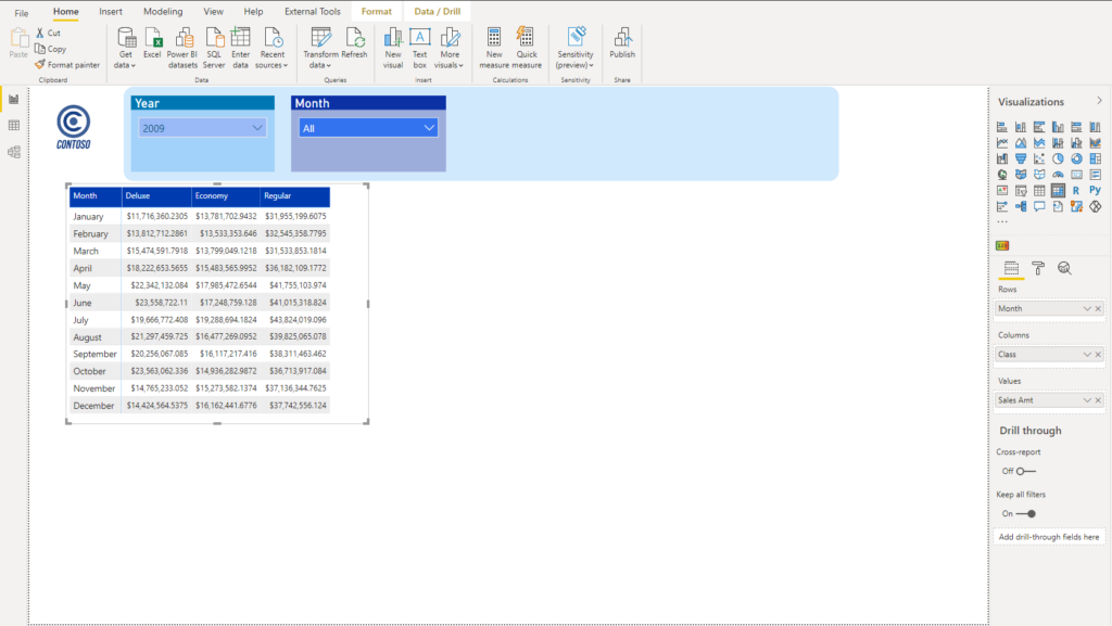
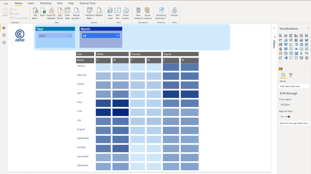
As you see, it’s just a plain old Matrix, showing the total sales amount for every single month, broken down by brand class. Let’s first add gender info to our matrix, and see the numbers from that perspective:
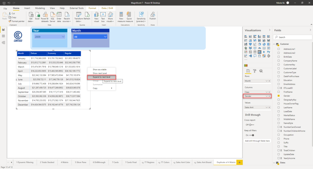
I’ve added Gender in Matrix’s Columns, but in order to see them in the visual itself, I need to right click on the Matrix and choose Expand to next level. Once I did it, I was able to see figures broken down by gender, within each of the brand classes:
Ok, now we are ready to do some magic:)
The first step is to exclude blank gender from our report (this can be easily achieved with filters) open the Format pane, go straight to Conditional formatting, and toggle on Background color property:
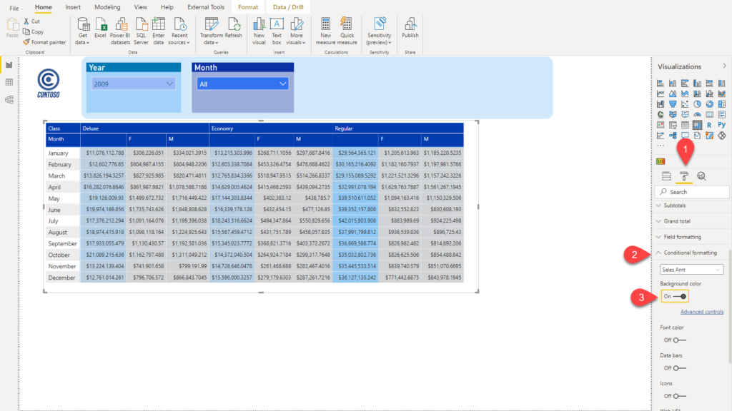
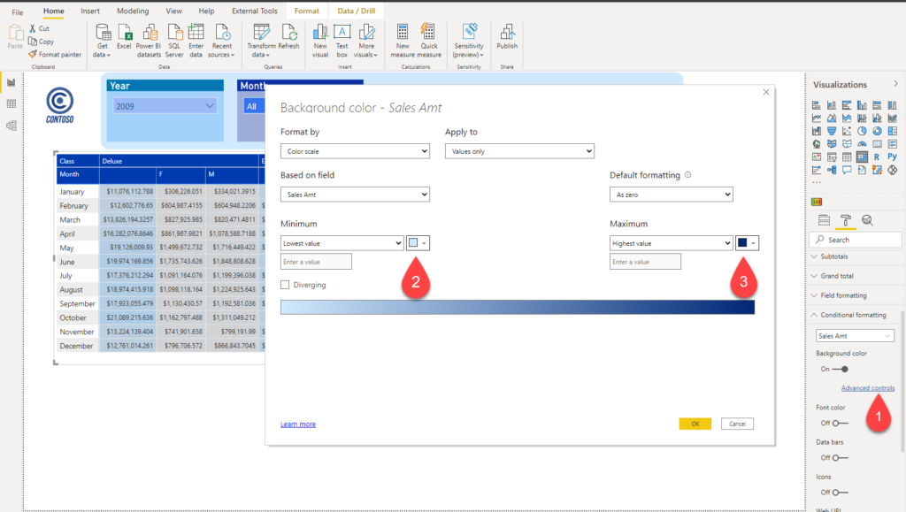
As soon as you turn on Background color, Power BI will automatically apply some gradual coloring, but we need more control over it, so we will go to Advanced controls, and define our colors for Lowest and Highest value:
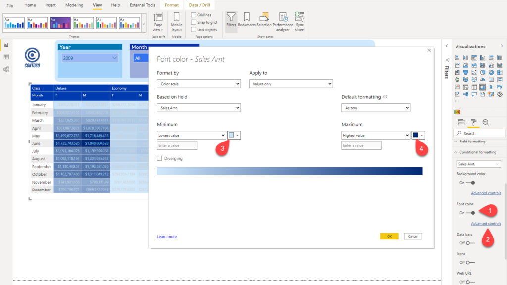
The next thing we need to do, is to apply exactly the same steps for the Font color property:
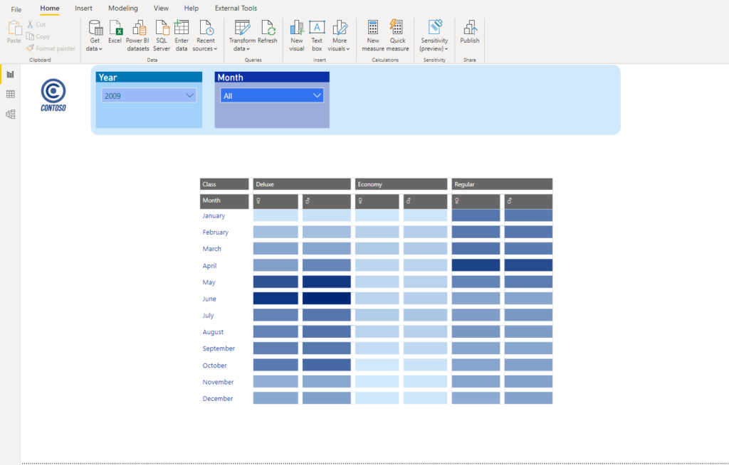
Boom! We are close to a Google Analytics visual we want to replicate (or mimic, if you prefer like that):
Polishing the solution
First, let’s make sure that all our columns will be of the same length, no matter which values occur in the matrix cells. To achieve this, I will use this very cool trick from the Power BI guy.
The trick is to create a dummy DAX measure to hold fix number of identical characters, make sure that Auto-size column width under Column headers property is turned-on, then put this measure in the Matrix rows, then turn-off Auto-size column width, and finally remove the dummy measure!
Dummy = REPT("0",10)
REPT function will just repeat the text you pass, a number of times you specify in the second argument. In my dummy measure, I am putting 10 zeroes:
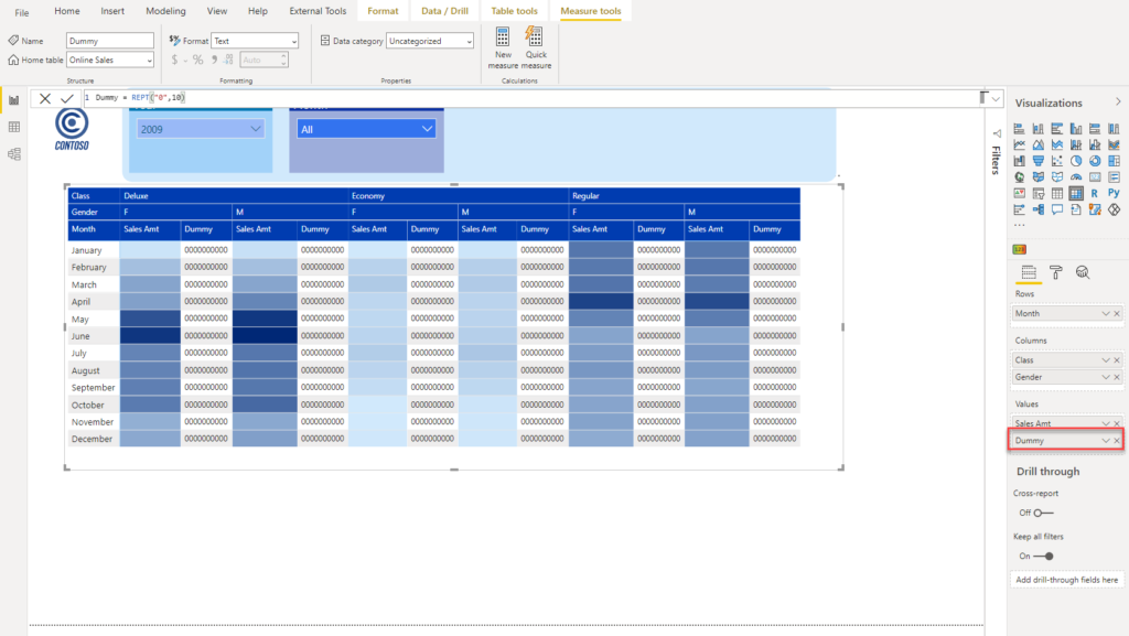
Now, I need to turn on Show on rows property under Values:
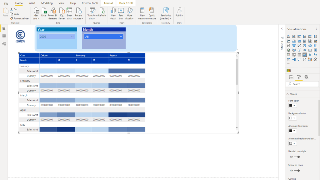
I know it looks weird, but don’t worry – we will fine-tune it quickly! Go and turn off Auto-size column width and simply remove the Dummy measure from the matrix:
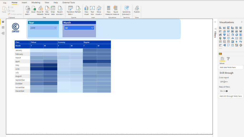
We are now 100% sure that our columns will be of the same width, nevertheless of the values in individual cells!
Let’s now create some space between those cells! Go to Grid, turn on both Vertical and Horizontal grid and increase the grid thickness (I’ve put 8, but you can adjust it according to your needs). Now, my visual looks almost exactly the same like in Google Analytics dashboard:
How cool is this! I can quickly identify trends, and immediately draw some conclusions: for example, May and June are rocking months for Deluxe class, while Regular class performs pretty well in the first half of the year! And, the best thing – I could identify these trends in literally 3 seconds!
Let’s do one more beautifier, and instead of letters F and M for the genders, create nice icons. How can you achieve that? Go to Customer table (or whatever table holds your data for gender) and create a new column:
Gender Icons = IF(Customer[Gender]="M","♂","♀")
The trick here is to use icons instead of letters: for the female icon, just press ALT+12 on your keyboard, while for the male icon, you need to press ALT+11. Simple as that! IF function will check the value of the Gender column and, depending if the condition is met, assign appropriate icon.
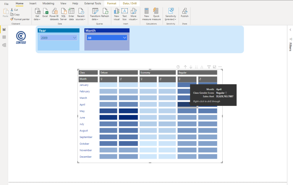
And here is our final solution:
If you ask me, that looks waaay more cool than our starting report page! Not just that it looks more fancy and modern, it allows you to tell a data story in a few seconds! Of course, if your users need to check exact figures, numbers are still there and if you hover over those nice blue data bars, you will see that tooltip will work like a charm:
Conclusion
To be honest, I’m little bit disappointed that Power BI doesn’t offer you out-of-the-box visual that would bring this same experience like Google Analytics visual. Or, at least I’m not aware that it exists:)
However, with little creativity, and a few tweaks here and there, we were able to replicate the “look and feel” of the Google Analytics visual. Or, let me be brave and say: we’ve just created a custom Power BI visual🙂
Thanks for reading!
Last Updated on February 22, 2021 by Nikola