

One of the greatest strengths of Power BI is extremely large collection of visuals, both built-in and custom visuals from AppSource. Honestly said, almost every business scenario can be visually handled in proper way.
However, there are some really neat and simple tricks where you can transform native Power BI visual to look like a custom visual. And more than that, you can laud that it was created personally:)
Plain old Matrix
Let’s switch to Power BI and I’ll quickly show you how to transform plain Matrix visual to something that looks like custom visual.
As usual, I’ll use Contoso sample database for demo purposes. Let’s say that we want to show total sales amount per month for every single brand:
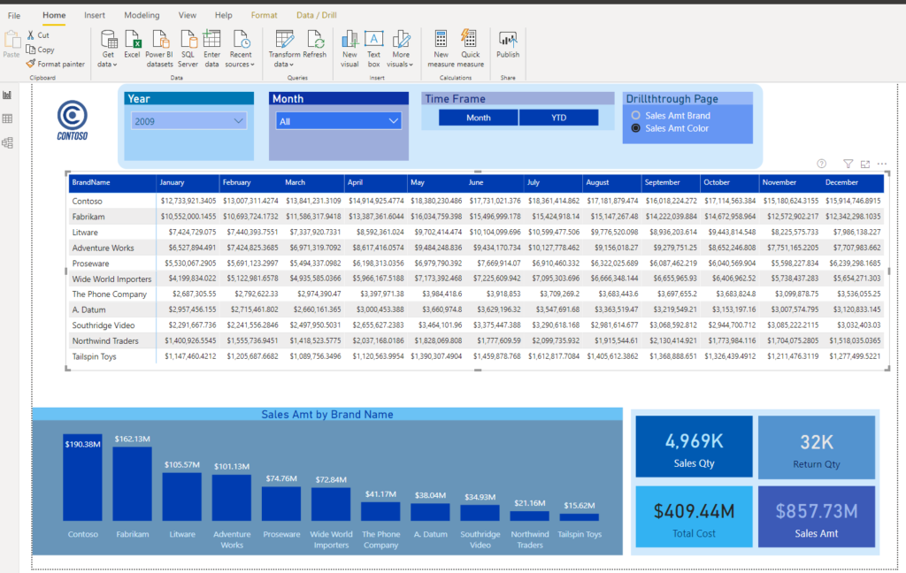
As you can see, nothing special about this matrix. Bunch of numbers, so it’s not so easy to spot highs and lows at first glance and without going deeper into analysis.
Customizing visual
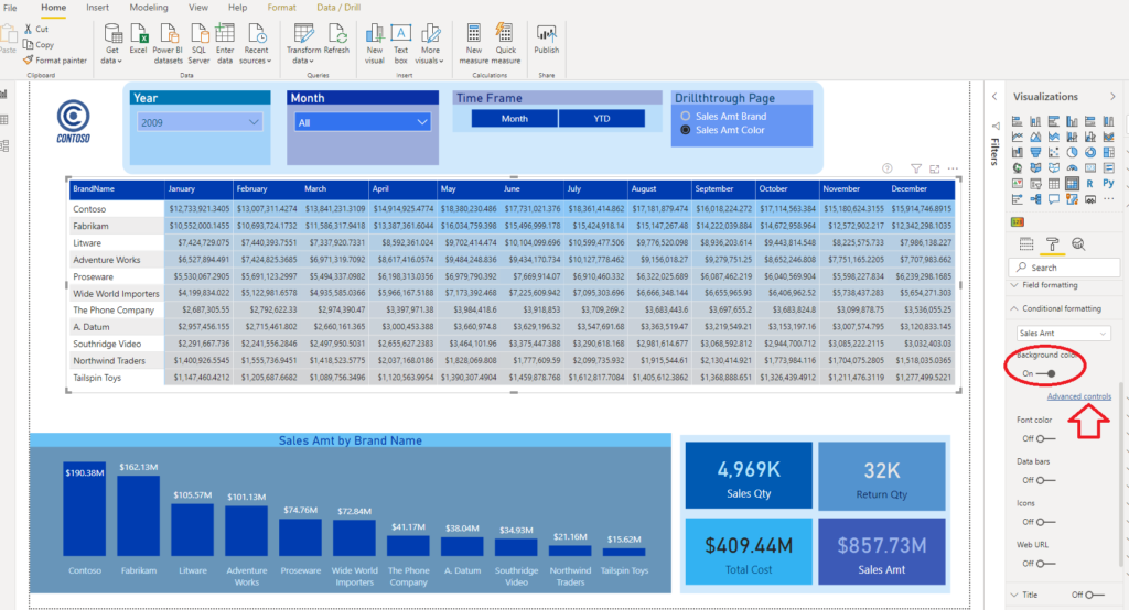
In order to enable our users to immediately spot what is going on, we will go to Conditional formatting option under Format pane and choose Sales Amt as a measure to apply formatting.
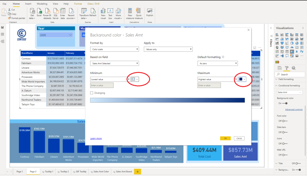
First thing we format is Background color. So, I’m turning this on and go to Advanced controls:
You can see that Power BI automatically applied some gradual coloring, but we want to customize it further. Since my whole report is based on blue colors, I will apply “blueish” tons for this also.
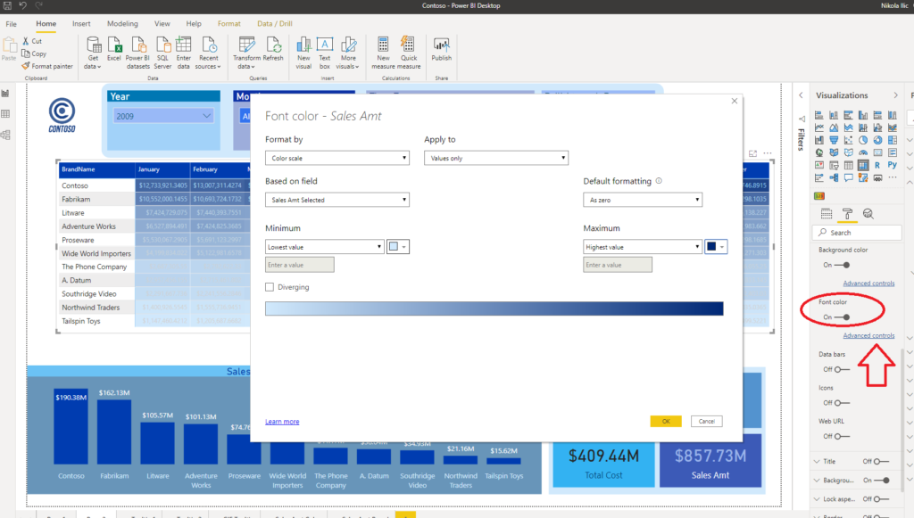
You can notice that background color of the cells changed to reflect differences in values for Sales Amt figure, but numbers are still there. Therefore, next thing we should do is to apply same formatting on Font color property.
Again, go to Advanced controls and set same color saturation as for Background:
And look what we’ve just got – “Treemap”-like visual, but without limitations related to “Treemap” visual and without need to apply complicated formatting of it:
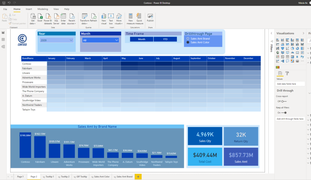
So, in just a few clicks, we transformed plain old Matrix to modern looking custom visual! How cool is that!
This way, we enabled our users to easily spot that, for example, Contoso and Fabrikam sales amount rocks between May and July, and also that worst month of Contoso is better than any month of any other brand other than Fabrikam!
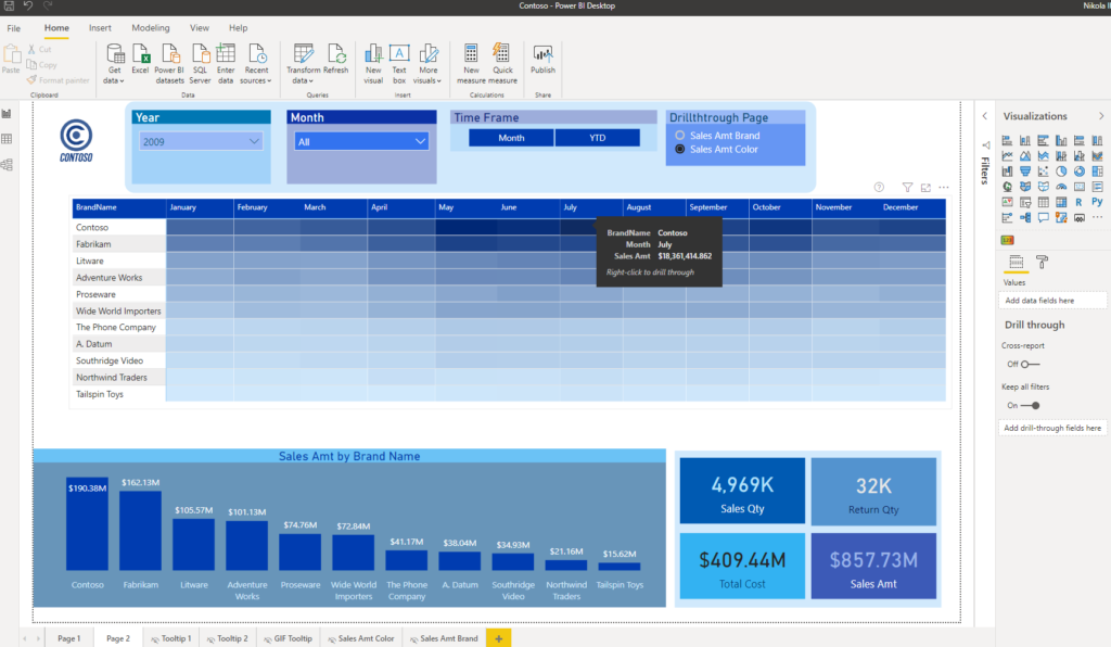
And the most important thing – we can easily spot these trends in 2 seconds, without getting deeper into numbers. Of course, numbers are still there and if we want to check specific figure, tooltip will work as a charm:
Conclusion
Don’t blindly use this trick for every matrix in your report. There will still be many more scenarios where you want to stick with traditional way of displaying data.
However, you will definitely face some situations when this technique can be beneficial (especially in “wide” matrices with lot of numbers). And applying this trick would undoubtedly enrich your users’ experience.
Last Updated on May 24, 2020 by Nikola


