

Tables, tables, tables…Love them, or hate them, we, Power BI developers, can’t live without them. Our users too. How many times did you hear from your users, a sentence like this: Hey, those charts are cool, and these colors look nice…but, give me my data in the table. You know, I’m an “Excel person” and love to see my figures in rows and columns...
And that’s completely fine – don’t feel upset when you get a request like this. However, who says that we must give our users “normal” tables. What if we can fulfill their request, but with little creativity and magic, at the same time push their table experience to a whole new level?
Give me my table…
So, here is the business scenario. We have data about customers who signed up for our service through the referral program. We also have data if and when those customers made their first money deposit for our services, so we can easily follow up in case that customers signed-up, but haven’t made a deposit – our customer support department can contact them and check if they faced any issues after signing-up.

In my example, data comes from the Excel file, but in real life, it’s being stored within the SQL Server database.
We can create a whole range of visualizations in Power BI, based on the numbers you see in the illustration above, but our user is stubborn and wants his table. Ok, there you go:
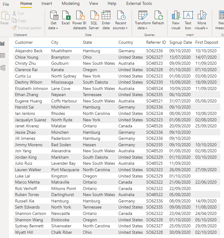
If you ask me, that looks slightly nicer than in Excel, but it’s still – ugly! I mean, we can apply some formatting to a table and add some colors, but it would still be a plain old table.
Abrakadabra – make this table shine!
As I already mentioned, with some imagination and creativity, we can make this table stand out. So, let’s first add some logic to the underlying data. I will open Power Query Editor and under the Add Column tab, I will choose Custom Column:
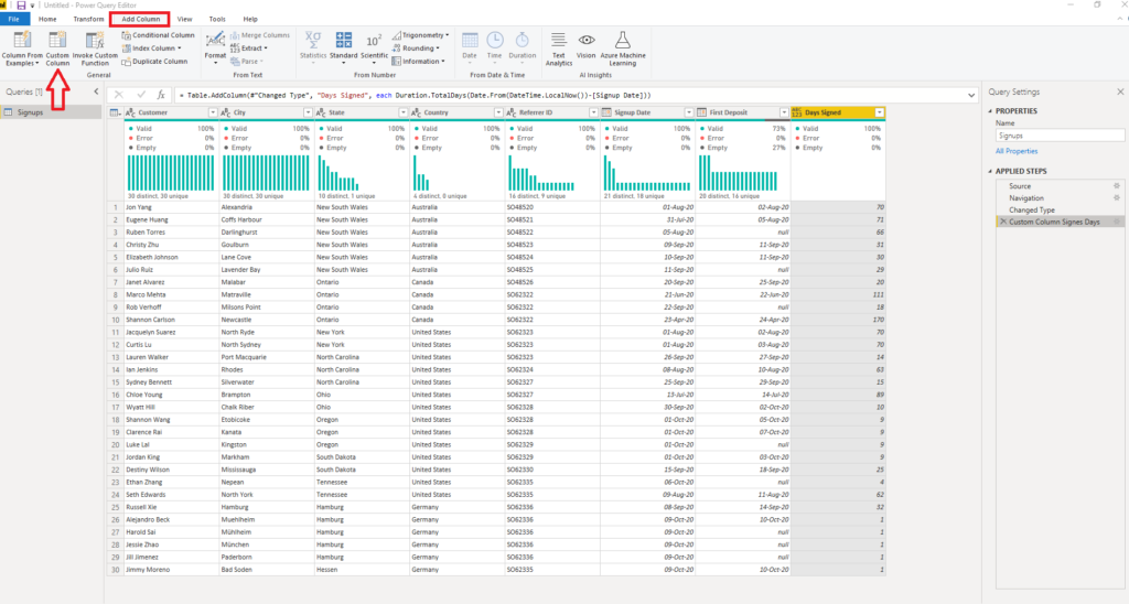
Then, as we already learned some basic time operations in Power Query, I will write the following M formula to calculate the number of days between today’s date and the date when the customer signed up:
Duration.TotalDays(Date.From(DateTime.LocalNow())-[Signup Date])
Additionally, I want to calculate the number of days between signing-up and placing the first deposit. That can be done by using the following M statement:
Duration.TotalDays(Date.From([First Deposit])-[Signup Date])
Now, as I’ve expanded my data model with two additional columns, I can perform a whole range of different calculations, such as the average number between the sign-up date and the first deposit date. Moreover, I can use those columns as slicers in my report, and check, for example, only those customers who haven’t made a deposit between 3-6 days after they signed up!
Let’s now focus on enhancing our original “ugly” table. We’ll need to apply some specific formatting, both regular and conditional, in order to make our table more “user-friendly”.
I will first create a column that will hold text value for the number of days since the customer signed-up:
Signup Text = IF(Signups[Days Signed] = 1,
            "1 day ago",
            Signups[Days Signed]&" days ago"
)
This formula will help us to handle plural vs singular text definition. I will need another calculated column to keep track of the customer – if he deposited or not:
Signup vs Deposit = IF(Signups[Days Deposit] < 1 && Signups[Days Signed] < 3,
                        2,
                        IF(Signups[Days Signed] >= 3 && Signups[Days Deposit] < 1,0,1)
)
Basically, the idea is to have three levels of marking: the first one are the customers who deposited, no matter when. The second level is the customers who signed up in the previous 2 days, but haven’t made a deposit yet. And, finally, the last group are the customers who signed-up more than 2 days ago and still didn’t make a deposit. And this group should be easily identified by our customer support, so they can quickly isolate those customers and contact them.
This formula segregates those three levels, assigning to each of them a number (0, 1, 2), that will be later used for conditional formatting.
The first step is to set Sparse under Style and turn-off Vertical grid. Short disclaimer here: you can format your table however you like, you don’t need to follow all of my chosen styles.

Now, the most important part is to conditionally format our fields based on specific values. First, I will format my Signup column, to use some gradual coloring, so it’s immediately visible when the customer signed-up:

Here is how my table looks now:
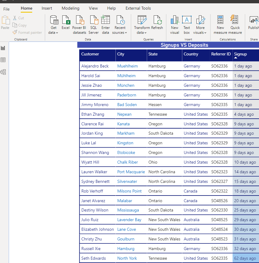
It already looks better, and this color gradient for the number of days since customer’s signed-up adds additional quality to our table.
Now, the final touch is to mark the “target” customers. To achieve this, we will again use Conditional formatting, this time for our column with 0, 1, 2 values. Turn on Icons and under Advanced controls, define the icons for every specific value:
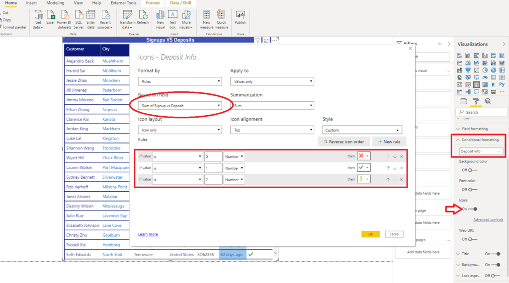
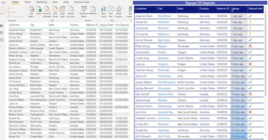
Finally, our table looks like this:
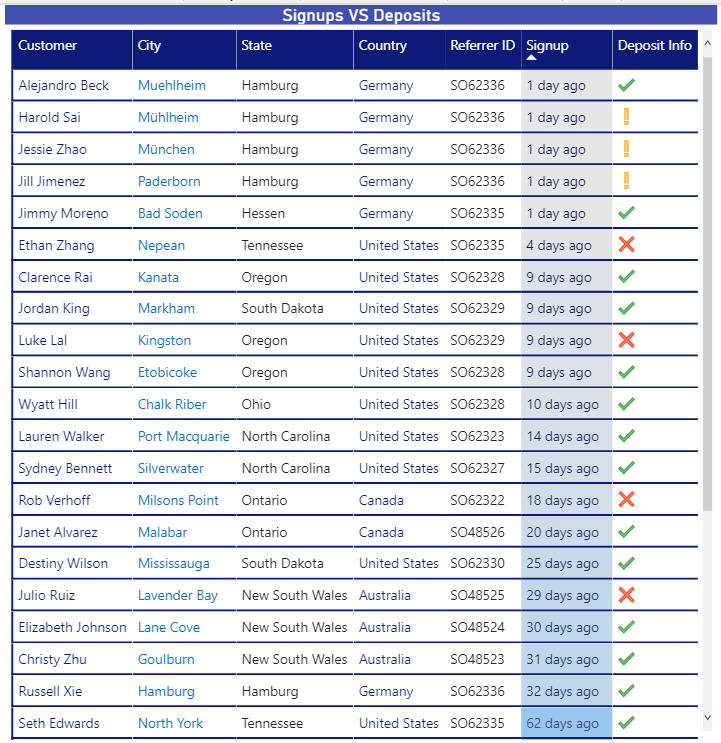
The Green symbol means that this customer made a deposit. A yellow exclamation mark signals that the customer is yet to make a deposit, but he signed-up in the previous two days. Finally, our “target” group is a customer with a red symbol, who signed up a while ago, but still hasn’t deposited.
As you may see, this is still a table, but it is much more user-friendly than the one we started with. Of course, we can add some additional logic to our report, by enabling our users to manipulate the data with the slicers:
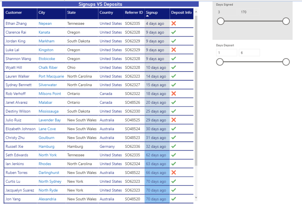
This way, our report users can easily filter the data which is not of interest for analysis and focus on their goals.
Conclusion
As you see, your Power BI tables don’t necessarily need to be old-fashioned boring visuals. With some little tweaking and applying conditional formatting on different properties, you can create shiny tables that will stand out. And even more, they will definitely enrich your users’ experience.
Thanks for reading!
Last Updated on November 28, 2020 by Nikola


Bharath
Nice article. Agree with the way you mentioned here. What happens when user says they want the same conditional formatting in the exported Excel as well??
Nikola
Good question! Unfortunately, at this point in time, conditional formatting doesn’t work when exporting data from the Power BI report to Excel.
Ben Connelly
Yeah, unless MS finds a brilliant way to unify how conditional formatting works and is written in both pieces of software, it seems like that may never happen unfortunately. Even the Export to Excel feature is only squeezing out the data only… Excel wouldn’t be able to read how PBI encodes its calculation engine.
Don’t get me wrong, Excel has through Power Pivot the wherewithal to understand all that, but it doesn’t appear MS is interested in wiring all these similar systems together. I hope I’m wrong. I hope they come out with Excel 2022 and say: “Hey, we’re merging Excel and Power BI’s differing functionalities into one… Power Excel BI!!!”
Nikola
Completely agree with you, Ben. Let’s hope that MS hears our prayers before 2022:)!
By the way, Power Excel BI – sounds awesome:)!
Rhonda
I love this! Great example of a real world scenario, and gives me ideas to get away from the boring tables!
Nikola
Thanks Rhonda, I’m glad if you find the article useful!
Kishore M
good
Nikola
Thank you!
2021 Week 33 | Power BI: Create Magic Tables – Workout Wednesday
[…] https://data-mozart.com/magic-tables-in-power-bi/ […]