

What is the first thing that comes to your mind, if someone asks you to explain what are the benefits of proper data analysis? Finding the top-selling product? Discovering your most loyal customers? Identifying the periods when your business hit its highs/lows? Comparing the performance indicators between two points in time?
Obviously, all of these represent a core set of business requests, that are part of almost every reporting solution. However, there are some certain metrics that are not just simple numbers or percentages – but they are also enormously important to help your business make the right decision!
Why no one answers my call?!
One of those “non-directly-measurable” figures is your customer’s satisfaction. Let’s say that you are selling product X, or providing a service Y…Your customers must be able to reach you, in case they need some additional information, have a complaint, or simply want to praise you:). You’re assuming right – you need to provide a way to handle interactions with your customers.
Easier said, than done, right? How many people do you need for this type of task? If you delegate an insufficient number of the crew, you’ll probably face questions such as: “Why no one answers my phone call?!”, “Do I need to wait for another 5 days to get a response to my email?!”, “I’m waiting in the chat queue for more than 20 minutes…”. On the other hand, if you assign too many people to handle this task, they’ll probably get bored, feel useless, etc.
How to perform a proper staff planning?
In order to make an informed business decision, you need to have a proper set of data to support you with different types of insights. In my case, I need to identify the peak business hours – simply said, find out when most of the customers try to interact with our customer support team. Based on the insights we get from the data, managers can assign a certain number of employees to this task.
Setting the stage
My data model for this example is fairly simple: I have a fact table containing around 9.3 million rows about the chats performed by our customer support team. One of the columns is the information about the date and time when chat started:

Let’s drag this column on the report canvas and create a simple explicit measure that will count the number of the chats:
Total Chats = COUNT(factChat[chatID])
And here is what we get:
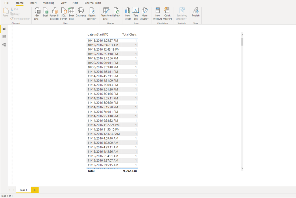
This is not useful at all for any kind of data analysis! As the granularity of the data goes to the second level of precision, we can’t spot any trends or patterns, since we have one single chat per row. So, how do we make some sense from this data and unlock the insights?
Grouping and binning in Power BI
Whenever you create a visual in Power BI, data will be aggregated into chunks that exist in the underlying dataset. For example, you may have your products defined in the data warehouse in one way, but for your reporting solution, you want to adjust it – let’s say that you want to display product X, product Y, and product Z together, as one single chunk of data instead of three. That’s where the grouping feature helps, as you may group these three products into one entity and treat them as a single unit!
On the other hand, binning feature in Power BI enables you to define your own data chunks, instead of relying on the default ones! Binning can be applied to numerical and time fields from your data model. It’s also important to keep in mind that bins can be created on calculated columns, but not for measures.
In our case, instead of having a chunk in form of MM-DD-YYYY HH:MM:SS, we will create our own bins, and each bin will span exactly one hour!
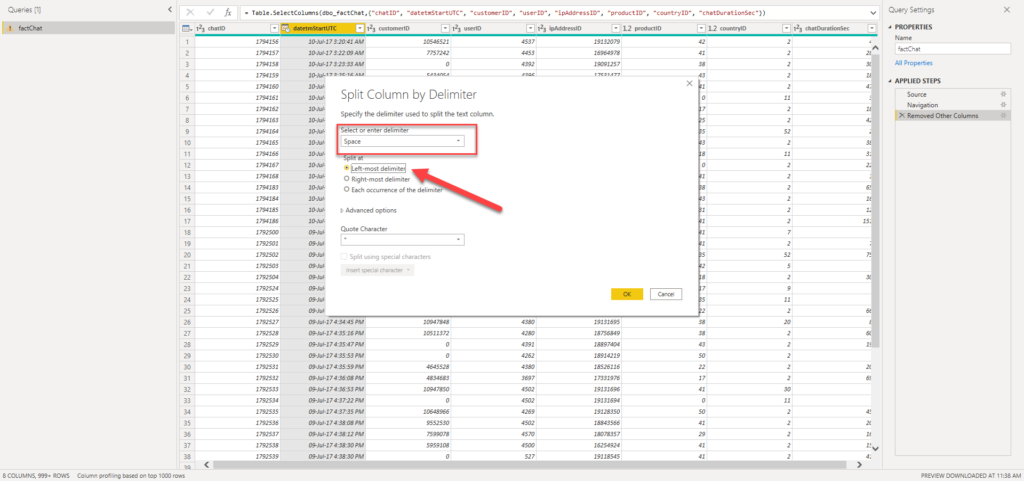
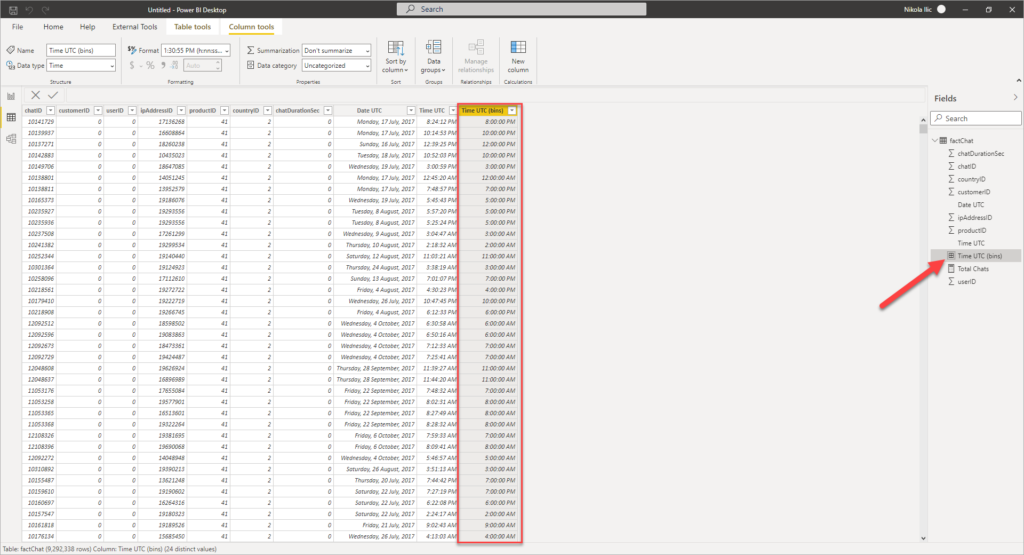
As a first step, we need to separate date and time part from our original column:
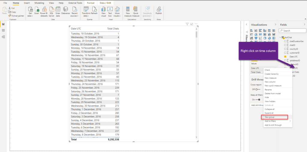
Now, I will right click on the time column, and choose to create a new group:
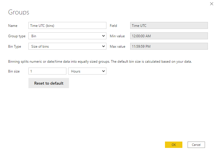
Once the dialog window opens, you can further customize your bins. In my case, I’ve set Bin size to 1 hour – basically, all chats that started between 00:00:00 and 00:59:59 will be assigned to 00:00:00 bin, chats started between 01:00:00 and 01:59:59 to 01:00:00 bin, and so on…
Let me stop here for a moment and explain what happened in the background. Essentially, Power BI created a calculated column for you, which you can confirm if you switch to a Table view:
Making sense of data…
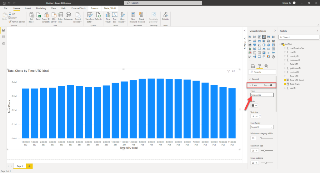
Now, we are finally ready to unlock some insights from the underlying data. I’ll drag the newly created bins column to a report, instead of the “normal” Date UTC column, and switch visual type to a column chart. As a final step, I’ll set the Type property of the X-axis to Categorical instead of Continuous:
Now this starts to give some meaning to a numbers. Let’s go and analyze a single brand within the dataset:
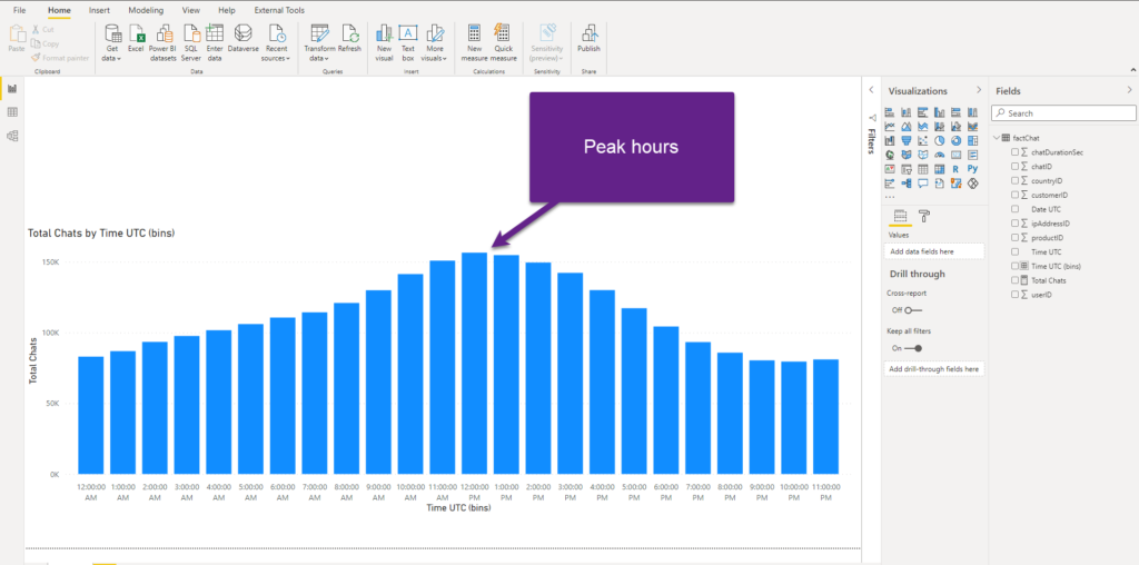
That’s it! Now, I can immediately spot that peak hours for this brand are between 11 AM and 1 PM, as we have double the number of chats comparing to night or late evening hours! Also, you can see that the number of chats slowly increase during the morning, and decreases steep in the afternoon.
Now, the managers can make informed decisions based on this insight, and for example, assign 4 persons to work on the chats between 11 AM and 1 PM, and only 2 persons working late in the evening! That’s the key benefit that we got from this!
Shaping up the solution
However, what happens if we want to expand on this, as probably not every day of the week is the same in terms of traffic. One would expect that weekend days are less hectic, so let’s enrich our data model and check if that’s the case.
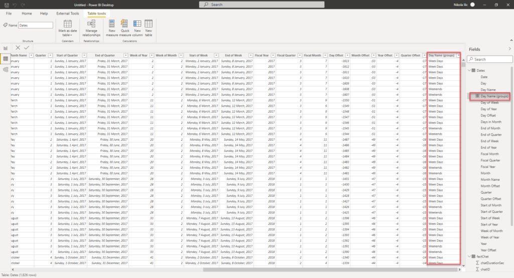
The first step is to create a proper Date dimension in our data model:
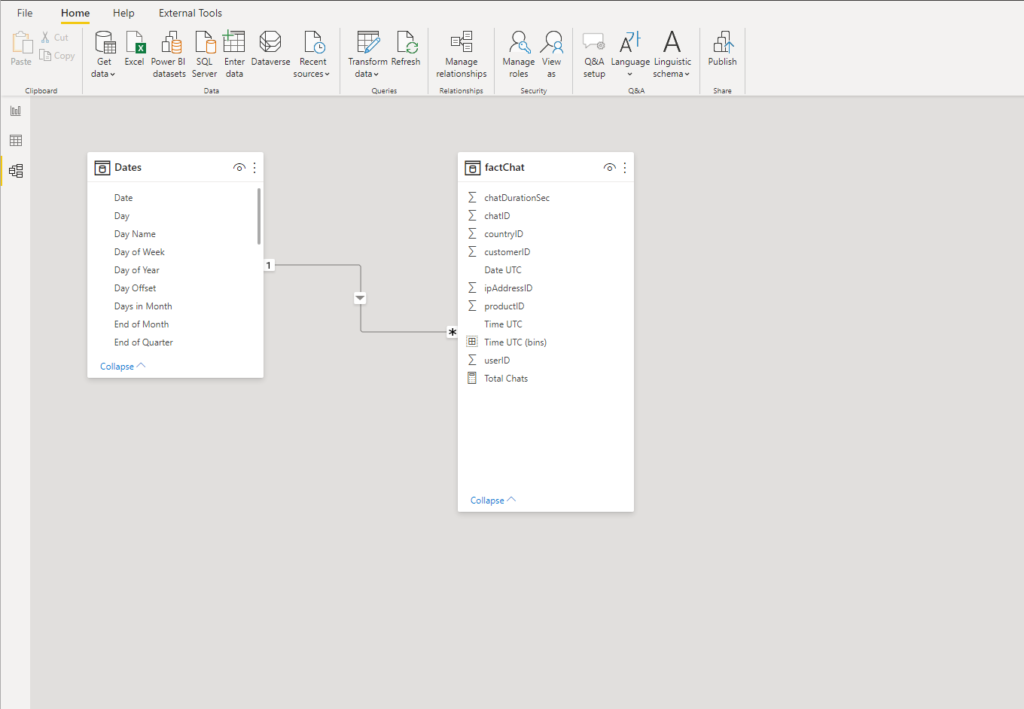
I’ve created a relationship between the tables and now I’m able to analyze data from different time perspectives – let’s say based on the specific day:
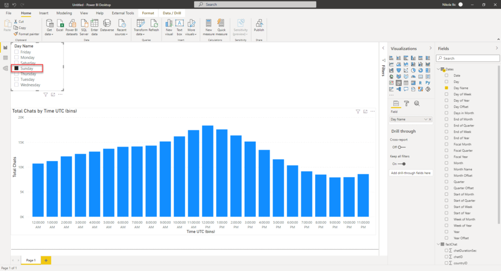
That’s super cool, but if I want to compare week days vs weekends. Not as single days, but as two units! Here comes the previously mentioned grouping feature in handy. So, let’s go and create two groups, based on the day names:

Once again, Power BI created a calculated column under the hood, as you can see in the following illustration:
I can now use this column as a slicer, or within the axis in my report. Additionally, I can create a measure to calculate the average number of chats per day, and then see if there is a big difference between regular week days and weekends. It can happen that the average number of chats is way lower during the weekends, so why overcrowding staff?!
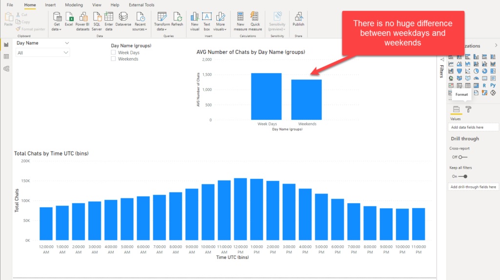
However, it appeared that there is no big difference in the average number of chats between weekdays and weekends (1545 vs 1331), which is also good to know – as managers need to plan a similar workforce for weekends like for regular working days!
Conclusion
I’m a big fan of Power BI not just because it gives you enormous number of ways to tell your data story, but more because it offers you a possibility to enhance regular experience and enrich your reports with more meaningful insights, that should in the end lead to making optimal decisions for your business.
As you witnessed, grouping and binning are very simple, yet powerful techniques that can enable decision makers to unlock more comprehensive insights from the underlying data.
Thanks for reading!
Last Updated on June 3, 2021 by Nikola


Leegeo George
Similar example, but i want to capture customer engaged time.
for example, if Harry was on call with customer from 01:00 to 02:30 and so does other data set is about, i want them to capture on top of other to get peak. actual time of engagement result in peak is graph i am looking for. Kindly help