When I talk to people who are not deep into the Power BI world, I often get the impression that they think of Power BI as a visualization tool exclusively. While that is true to a certain extent, it seems to me that they are not seeing the bigger picture – or maybe it’s better to say – they see just a tip of an iceberg! This tip of an iceberg is those shiny dashboards, KPI arrows, fancy AI stuff, and so on.
However, there is a lot more to it, as the real thing is under the surface…
In this series of articles, I’ll show you how Power BI can be used to create a fully-fledged analytic solution. Starting from the raw data, which doesn’t provide any useful information, to building, not just nice-looking visualizations, but extracting insights that can be used to define proper actions – something that we call informed decision making.
- Part 1 – Understanding the Business problem
- Part 2 – Preparing the data
- Part 3 – Data Modeling
- Part 4 – Data Visualization
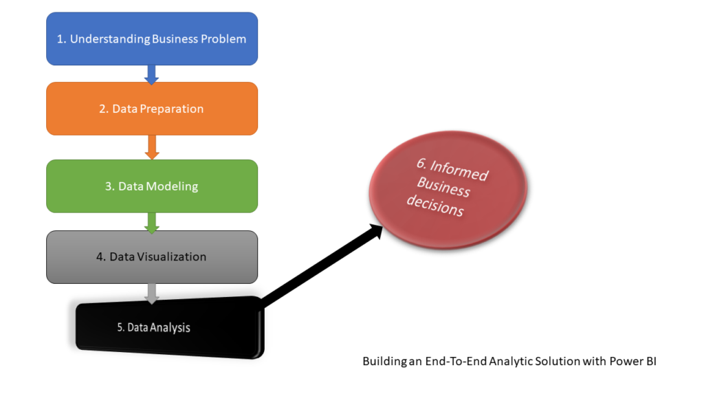
Here we are – after taking raw data in the form of a CSV file, defining a set of business questions that need to be answered using that data, then cleaning and shaping the original dataset and building an efficient data model (Star schema), in the previous part we’ve created compelling visualizations to provide different insights to business decision-makers. Now, it’s time to analyze insights and, based on the information we extract from these insights, recommend some actions!
Extracting the insights
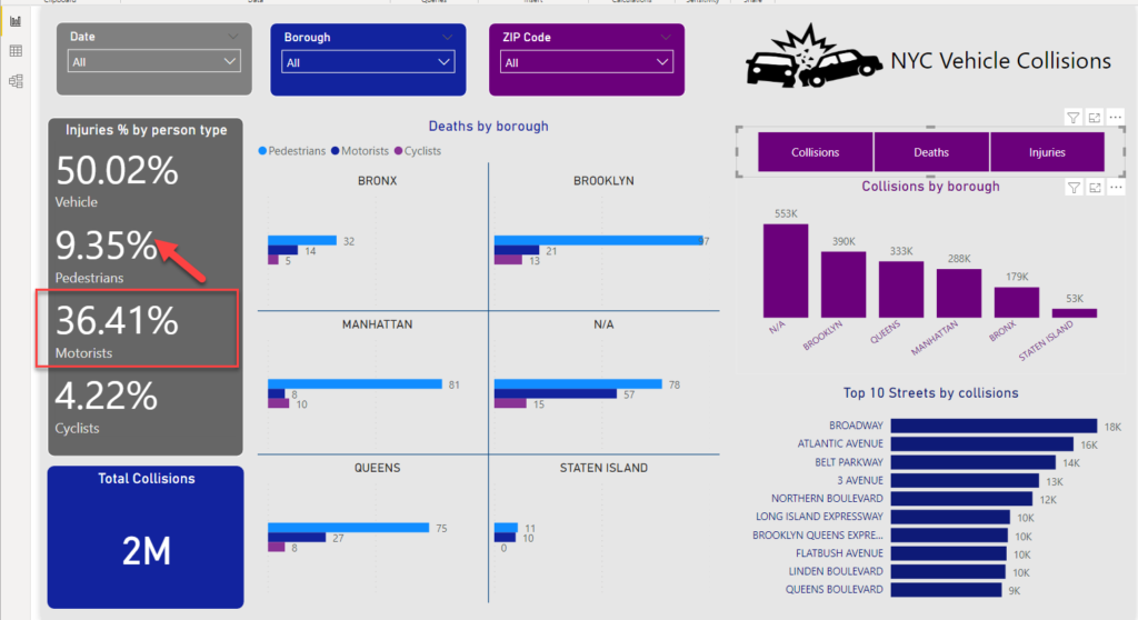
Let’s start by analyzing deaths caused by collisions. If we exclude persons that were in the vehicles themselves, we can see that the pedestrians are the most endangered traffic participants – almost 8x more pedestrians were killed, compared to cyclists!
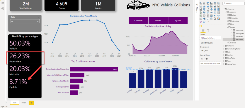
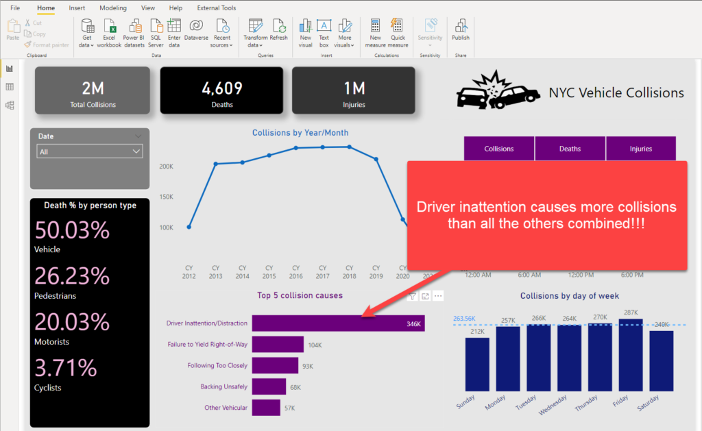
The next conclusion we can draw is that the main cause of the collisions is drivers’ inattention/distraction! If we take a look at the top 5 collision causes, you will see that all other causes combined are lower than the top one.
Moving on, and the next pattern we can spot is a significant spike of the collisions in the early afternoon hours, specifically 4 and 5 PM. This makes sense, as a lot of people are driving home in that period, returning from their offices:
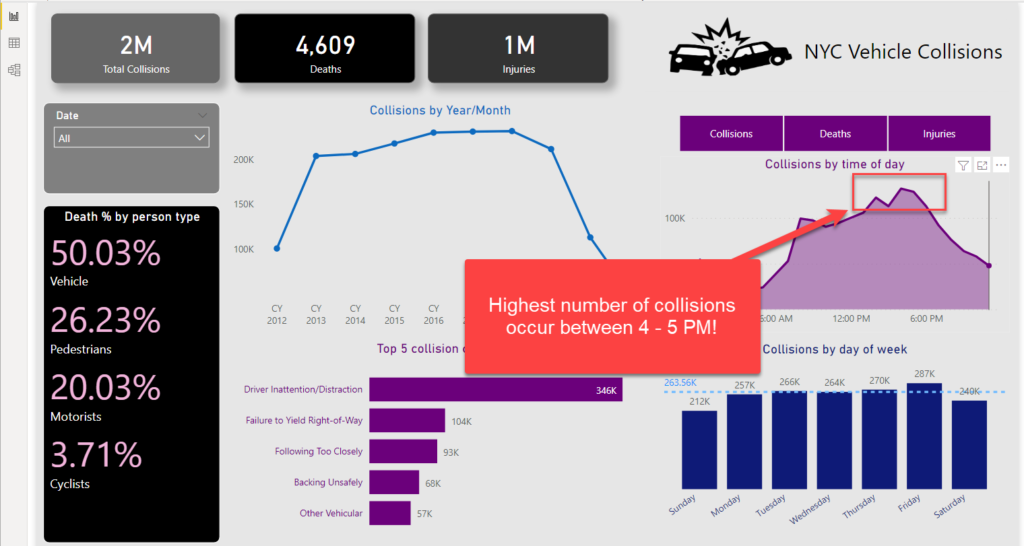
It’s approximately 30% higher than in the morning (8-9 AM) when traffic participants are probably not tired and distracted after a hard-working day.
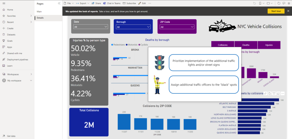
Let’s move on to a detailed overview of the accidents and try to identify “black” spots in the city. At first glance, most people are being killed in Brooklyn, and more or less, all other boroughs follow the pattern of the “death distribution” between the different traffic participants, except Manhattan, where more cyclists were killed than motorists.
If we analyze the percentage of injuries, the trend is quite different than with fatality rates: now, motorists are the most endangered (again, excluding persons that were in the vehicles) – almost 4x more motorists were injured than pedestrians!
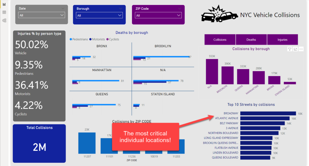
Further down, ZIP Codes with the most frequent collisions are 11207 and 11101 (one in Brooklyn, the other in Queens). If we focus on the specific street, we can see that Broadway (Manhattan) and Atlantic Avenue (Brooklyn, ZIP Code 11207) are the most critical spots in New York City!
Action, please!
Ok, now we have way more information to support our business decisions. And, since we already defined the set of questions that need to be answered, let’s focus on providing the proper recommendations for actions!
The idea is to show recommendations in the form of tooltips – when someone hovers over a specific visual, the respective action should be displayed! I’ve already written how to enhance your report using tooltip pages, and here we will follow a similar approach:
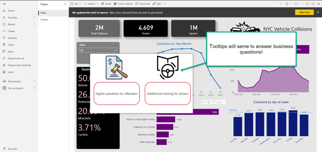
So, once I hover over a visual that shows the top 5 causes for collisions, certain actions will be recommended:
- Higher penalties for offenders
- Additional training for drivers
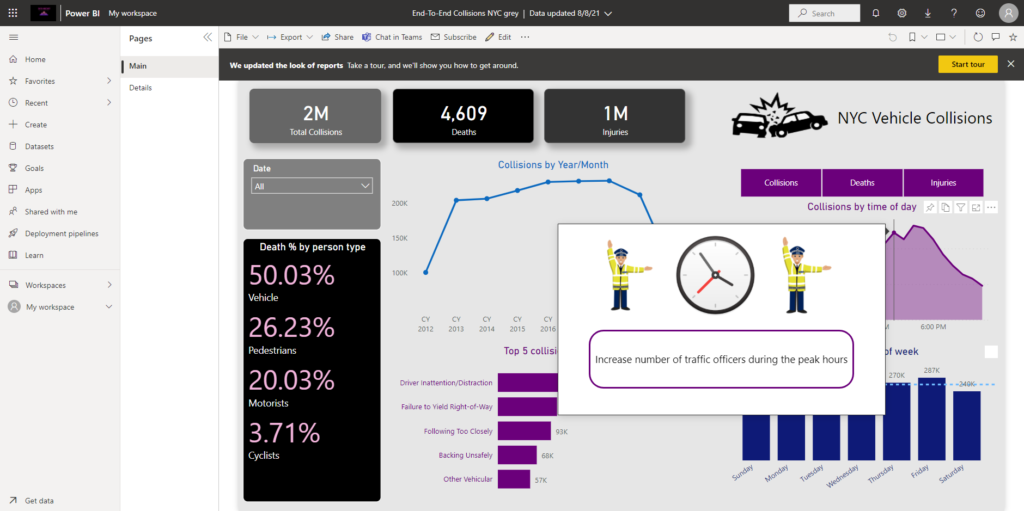
Similarly, if you want to act based on the time when most collisions occur, simply hover over that visual and you will see the suggestion to increase the number of traffic officers during these peak hours:
Further down, to be able to reduce the number of collisions and injuries/deaths in specific locations, we emphasized the importance of implementing additional traffic lights and assigning more traffic officers to “black” spots:

Before we draw an overall conclusion, you can find the final report version below. Feel free to play around and maybe unlock some additional insights, that will answer various business requests:
Conclusion
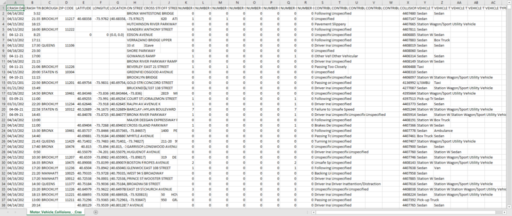
That’s a wrap folks! Just to remind you, this is where we’ve started:
And, this is where we finished:
Along the way, we cleaned and transformed our data, built a proper data model using Star schema, and visualized key data points. And, guess what – we did ALL of that using one SINGLE tool: Power BI! That’s the reason why I’ve called this series of blog posts: Building an end-to-end analytic solution with Power BI – and I believe we can agree that these articles proved that without exaggeration.
So, next time when you hear about “Power BI as a visualization tool only”, just remember what we were able to achieve using this tool exclusively, and draw a conclusion on your own!
Thanks for reading the whole series!