

When working with Power BI on a daily basis, from time to time I like to “challenge” the tool and see how it behaves in some non-standard set-ups. I mean, we all like when our task is done in a short period of time, and Power BI has a whole variety of features to help us achieve that, but sometimes I feel like changing the default behavior can enhance user experience.

Scenario
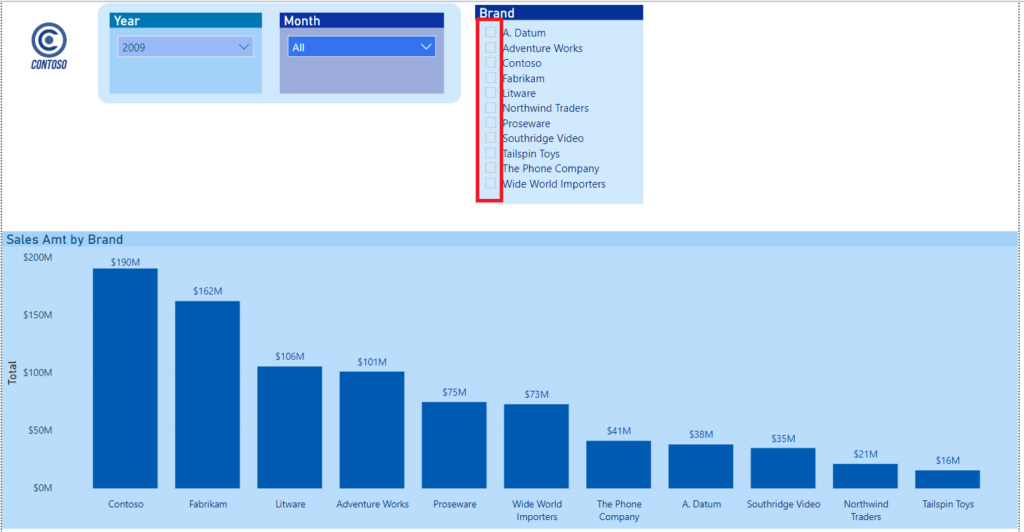
Let’s say that I want a create a chart that will show-up ONLY when at least one specific value is selected within the slicer. As usual, I will use sample Contoso database for the demo purposes.
As you probably know, by default, if no specific value is selected within the slicer, Power BI will show figures for all the slicer values:
Now, the idea is to hide these bars until at least one selection is made within a slicer. If that’s not the case, we want to show a blank chart. How can we achieve that?
DAX is your friend!
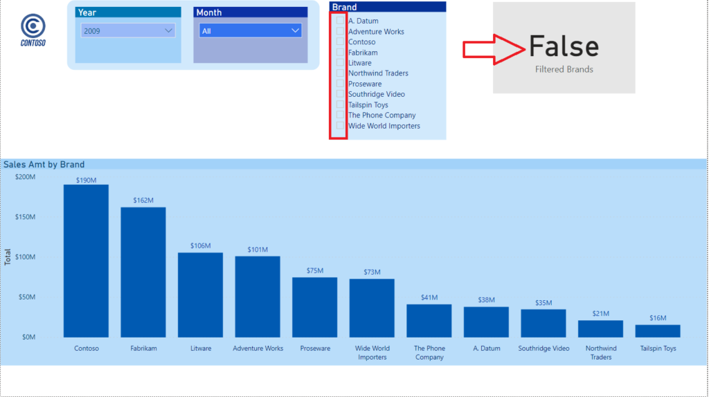
We will use ISFILTERED() function to check if the specific column is being directly filtered. In our case, it’s the column BrandName from the Product dimension. The result of the function is of boolean type (TRUE/FALSE).
Let’s write our measure:
Filtered Brands = ISFILTERED('Product'[BrandName])
I will put this measure in the card visual, just to check if everything works as expected:
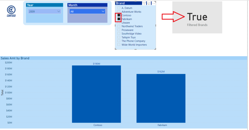
And once I select specific value within the slicer, my measure will return different result:
The next thing we need to do is to remove the current filter context. For that purpose, we will use ALLSELECTED() function. This is quite complex function, that can be used for various different things, so I recommend you to read this article from Marco Russo and Alberto Ferrari if you want to fully understand ALLSELECTED() function.
So, let’s expand our measure:
Filtered Brands = CALCULATE(
                        ISFILTERED('Product'[BrandName]),
                        ALLSELECTED('Product'[BrandName])
)
Basically, nothing will change in the current look of our report, but we’ve expanded the logic of our measure and laid the ground for the final goal we are trying to achieve.
3, 2, 1…Here we are!
Now, let’s create our final measure:
Filtered Sales Amt = IF(
                        [Filtered Brands] = TRUE,
                        [Sales Amt],
                        BLANK()
                        )
Let me stop for a moment and explain what are we doing here: by using IF, we can control the final result of the measure. Simply said, if the result of our previously created measure Filtered Brands is TRUE, we want to return Sales Amt measure value; if not, we are returning BLANKs.
Let’s check if that works:
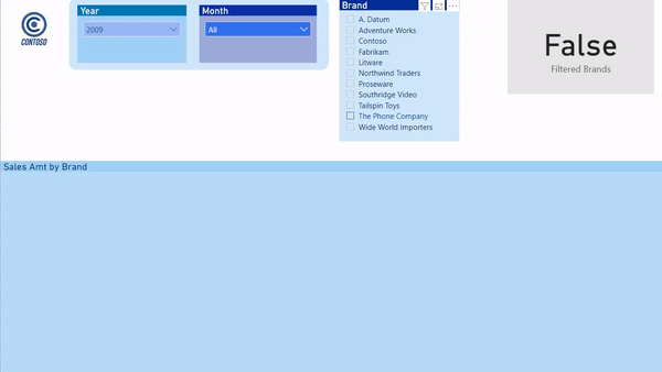
Looks good, I would say:)
Polishing for better experience
Even though we achieved our original goal, this may seem counter-intuitive at first sight. Imagine the user’s reaction when he opens a report and see a blank visual with the default slicer set-up! I bet you would get some calls, complaining that something is broken…
So, let’s make this final touch to make our users happy! The first thing I’m gonna do is to create a measure which will hold the message for my users:
Message = IF (
            [Filtered Brands] = TRUE,
            "",
            "Please select a value in BRAND slicer!"
            )
Again, IF function will allow us to define the flow: if the user made a selection within the slicer, it will return empty string; if not, it will display the specified text.
Now, let’s put a card visual on the report canvas, place our Message measure in it, and do some important adjustments in the Format pane of the card visual:
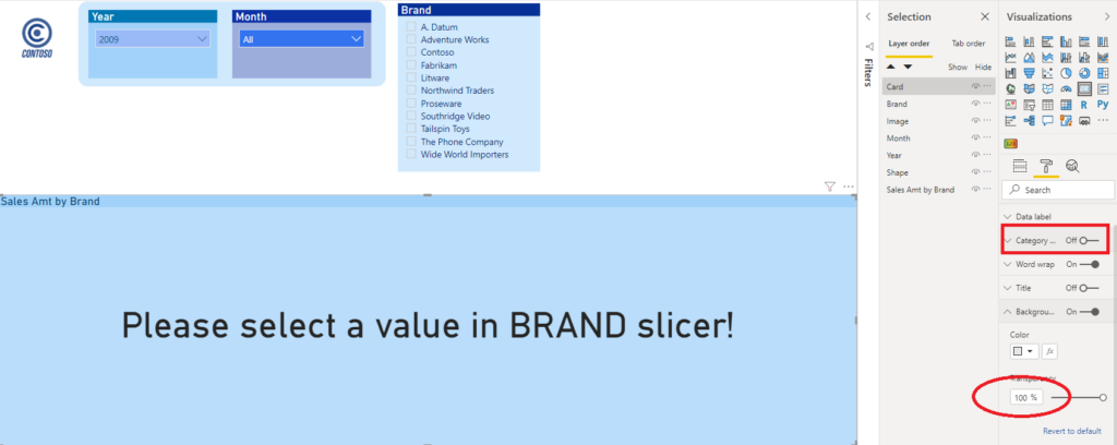
We will turn off Category and set Transparency to 100%. When I put the card visual over my Clustered Column Chart, I will see my message displayed over it, that instructs the user what he needs to do. Once he selects a value, or values, within the Brand slicer, he will see data bars appear instead of the message.
Let’s check if that works as expected:
Pretty awesome, isn’t it:)
Conclusion
As I always like to emphasize, Power BI is an amazing tool! It gives you a flexibility to tell the data story in multiple different ways. This example shown how you can easily change the default set-up and customize the look and feel of your report, depending on the specific business requests.
Of course, you should not use this trick in every single scenario – honestly, in 99% cases you should stick with the default behavior. But, it’s nice to have another tool under your belt, and that you know that you can use it to customize your Power BI reports.
Last Updated on September 4, 2020 by Nikola


Nichole Minnick
Hello Nikola, this is amazing! I have a couple of charts that will greatly benefit from this. However, when I try to apply the logic to a data point that is not a measure, it doesn’t work. Is there something I can do to convert the data to a measure or a different dax code?
Douglas de Brito
Hi Nikola, thanks for this content. On my scenario I need to let the user pick “Select All”, on this case the DAX functions like ISFILTERED or HASONEFILTER returns false instead of true. Any way to overcome this ? Thanks Doulglas