This article is the part of the series related to mastering DP-500 certification exam: Designing and Implementing Enterprise-Scale Analytics Solutions Using Microsoft Azure and Microsoft Power BI
Table of contents
Apache Spark – High-level overview
In one of my older articles, I covered the three analytic pools that are at your disposal when working with Synapse Analytics. In this article, our focus will be on the only “non-SQL” pool, even though it enables the usage of SQL language.
Explaining what is Apache Spark, its architecture, and the way it works is obviously out of the scope of this article. However, keep in mind that this is a parallel processing framework that supports in-memory data computations. Therefore, the Spark engine is capable of performing computations much faster than other disk-based solutions.
When it comes to integration within Azure Synapse Analytics, Spark is usually leveraged in the following tasks:
- Machine Learning – Spark brings MLlib library that you can use directly from the Spark pool in Synapse
- Data Science – Spark includes a special distribution of Python language, called Anaconda, that contains various data science related packages
- Data Engineering – when you’re building data pipelines for processing large volumes of data, Spark may help you by providing support for multiple programming languages, such as C#, Scala, Spark SQL, Python… And, their libraries for data processing tasks
Provisioning Spark pool in Synapse Analytics
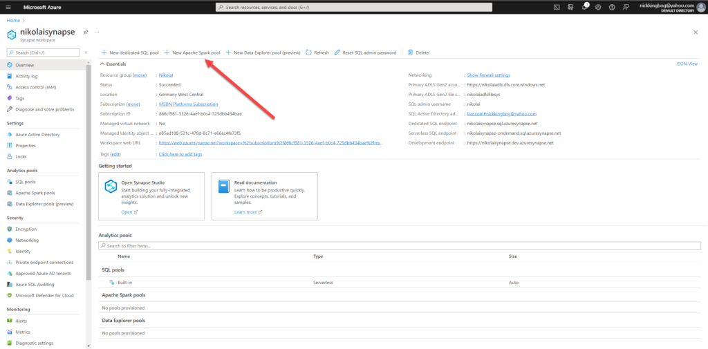
Spark pool is not included by default in your Synapse workspace (unlike Serverless SQL pool which is automatically provided). So, to be able to use Spark’s powerful capabilities, the first step is to provision a Spark pool within your Synapse workspace.
Once I find myself in my Synapse workspace, I’ll choose to create a New Apache Spark pool:
For this demo purposes, I’ll stick with a very low (and cheap) capacity:
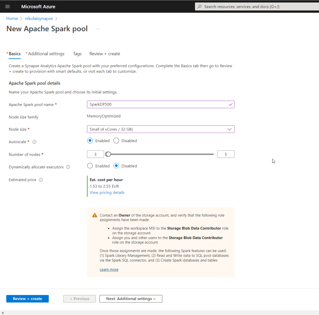
And, that’s it! Provisioning of Spark pool alone doesn’t cost you anything, as there are no resources running. But, let’s do some work with our newly created analytic pool!
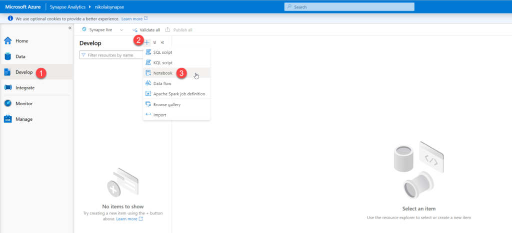
Creating a Spark notebook
In a nutshell, notebooks enable you to combine code, write text and markdown, or even perform some simple data visualization! Once I open Synapse Studio, under Develop tab, I’ll choose to create a new notebook:
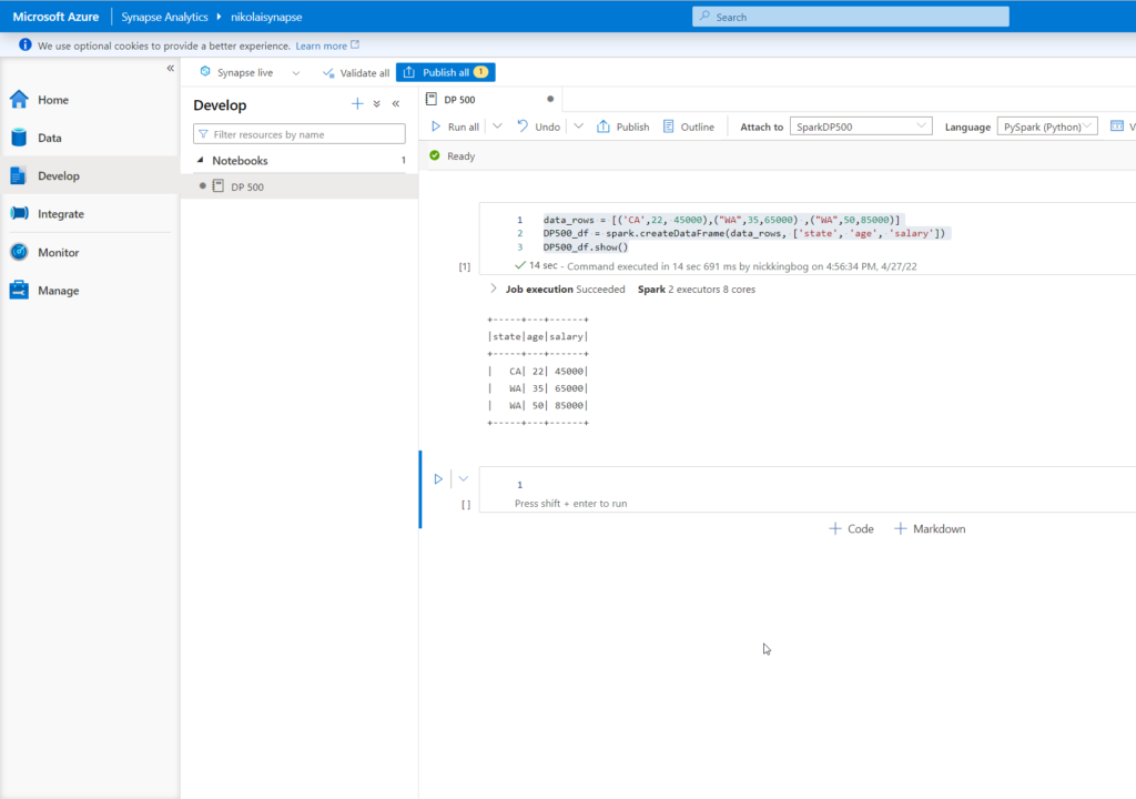
I’ll give my notebook a meaningful name and then I’ll select the proper language for my notebook. By default, PySpark is selected. As I’ll be using a combination of PySpark and Spark SQL, I’ll continue with the default choice.
I’ll add the following code snippet to create a dataframe object:
data_rows = [('CA',22, 45000),("WA",35,65000) ,("WA",50,85000)]
DP500_df = spark.createDataFrame(data_rows, ['state', 'age', 'salary'])
DP500_df.show()
Once you run this code, be patient and wait for a few moments for Spark pool to spin up and execute the code. When finished, our dataframe object is available for various use cases.
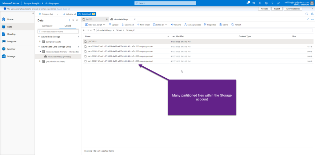
The first thing I’m going to do, is to create three different data objects, using the same dataframe: CSV file, Parquet file and Spark table:
DP500_df.write.csv('DP500_df', mode='overwrite')
DP500_df.write.parquet('abfss://<<StorageAccountFileSystem>>@<<StorageAccount>>.dfs.core.windows.net/DP500/DP500_df', mode='overwrite')
DP500_df.createOrReplaceTempView('DP500_df')
And, once I’ve executed this snippet, let’s take a look at what’s created within the Storage account:
Querying Spark pool using SQL
I can use well-known SQL syntax to run the queries against my Spark pool. The key thing is to include %%sql at the beginning of your code – that will instruct Spark that we are using a notebook in the SQL context:
%%sql
SELECT * FROM DP500_df
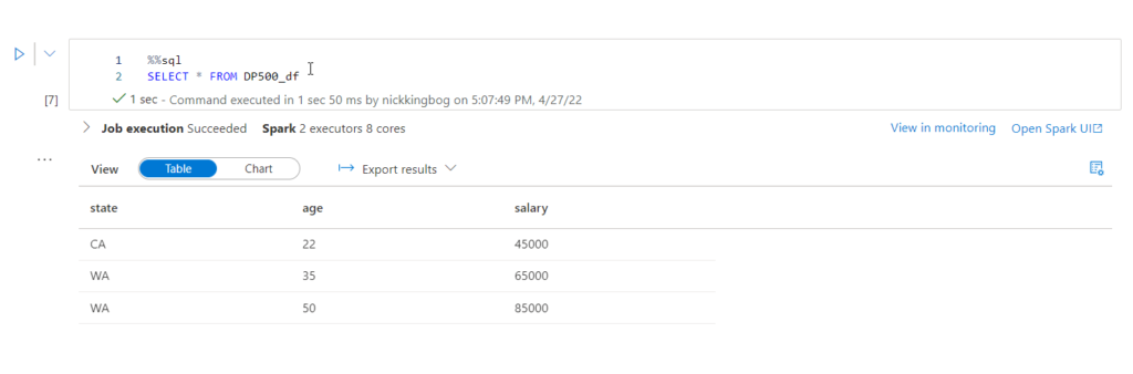
By default, results are displayed in a grid. However, you may choose to visualize results, by using the Chart option:
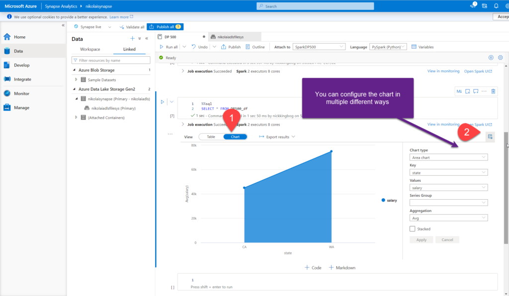
You can select between multiple chart types, such as Area chart, Column, Bar, Scatter, etc. depending on the data that you want to visualize. You can also configure other elements of the visual, and select desired aggregation type (Sum, Avg, Min, Max).
Obviously, this is not a fully-fledged data visualization solution, but it comes in very handy to get a quick insight into the underlying numbers and quickly identify possible outliers.
Visualizing data using Python
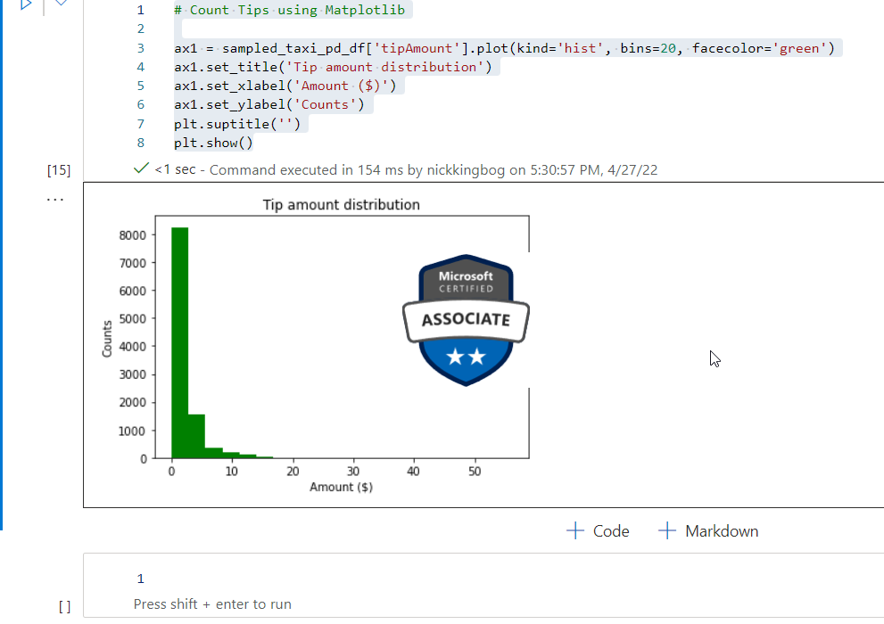
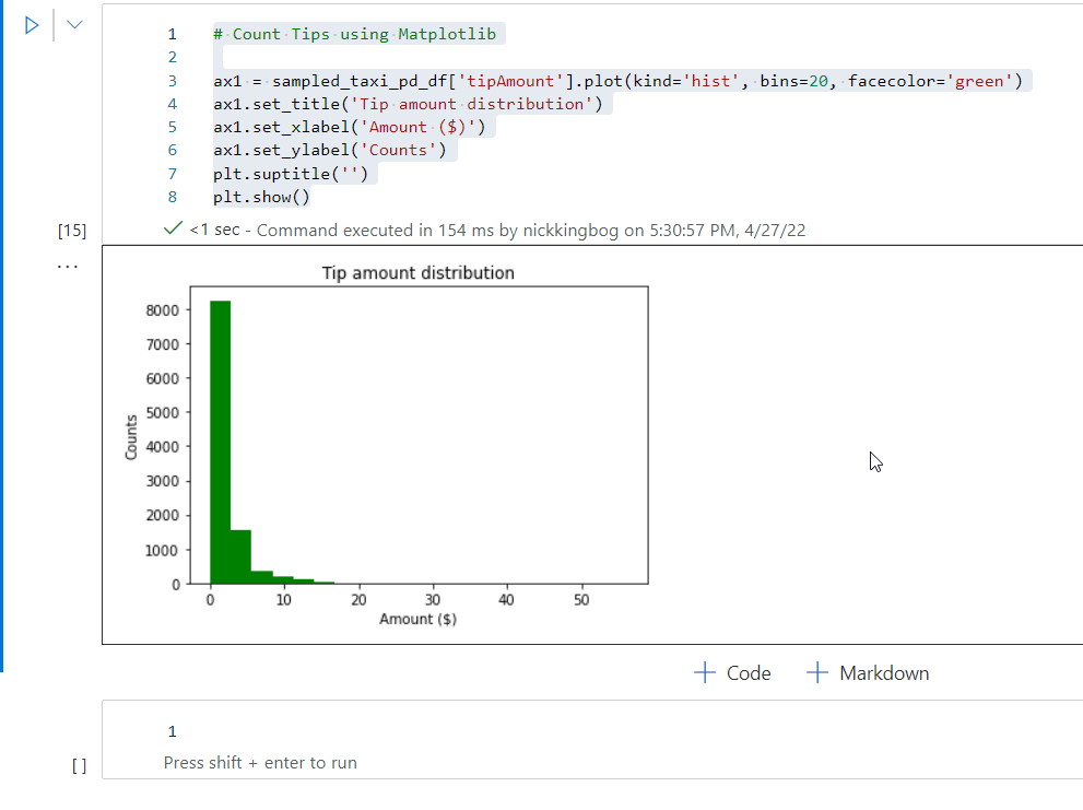
Other than visualizing the data using built-in charts in Synapse Studio, you can also leverage Python built-in libraries for the same purpose. The whole step-by-step tutorial on data preparation, and which libraries are needed, can be found here. In this article, I just want to show you how data visualization over the open “Yellow Taxi” dataset can be performed by using the Matplotlib library in Python:
# Count Tips using Matplotlib

ax1 = sampled_taxi_pd_df['tipAmount'].plot(kind='hist', bins=20, facecolor='green')
ax1.set_title('Tip amount distribution')
ax1.set_xlabel('Amount ($)')
ax1.set_ylabel('Counts')
plt.suptitle('')
plt.show()
And, once I execute this cell in the notebook, the results are nicely visualized:
Conclusion
Spark analytic pool is, of course, much more than a data visualization tool. However, it’s good to know that we have the possibility to visualize the data during the data exploration phase, either through native charts within Synapse Studio, or using special Python libraries, like Matplotlib and Seaborn, in Spark notebooks.
Thanks for reading!
Last Updated on January 20, 2023 by Nikola