
To be honest, I can’t remember that one Power BI feature caused so much hype as the Fields parameter, that was introduced in the May Power BI Desktop monthly update! Ok, the MS Build event a few days later brought some extremely cool and appealing features, such as Datamart or PowerPoint integration, which pushed Fields parameter aside, but still, I firmly believe that Fields parameter is one of the things that will forever change the way we are building user experience in Power BI.
I will not go into detail about the feature itself, and how it works behind the scenes, as my fellow community contributors already did a fantastic job explaining it. I suggest you start reading this wonderful article from my friend Tom Martens, or if you prefer watching videos, this one from SQL BI guys.
Additionally, there are already some very creative use cases of this new feature, such as this one by Kane Snyder.
However, in this article, I wanted to give you a quick heads up on how you can leverage Fields parameter to bring some additional life to your Power BI reports!
Setting the stage
My data model is incredibly simple: I have one fact table and three dimension tables – region, product, and date.

Let’s go and create field parameters for our data model:

As you may notice, I dragged two columns from each of my dimension tables, and once confirmed, I have a new slicer on my report page, enabling users to slice and dice the data in many different ways. And, no complex DAX in the background is needed!

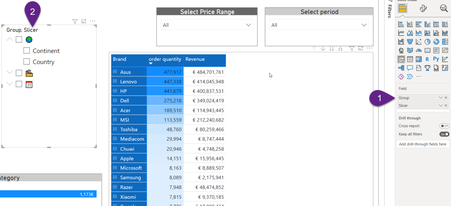
How cool is that! However, what if we want to group Fields parameter values based on certain criteria. For example, all product-related fields should belong to one group, geography-related fields to another, and so on.
I have great news for you! But, before I show you how to do this, let’s take a look at the underlying DAX code that was automatically generated by Power BI while creating the Fields parameter table:
As you see, it’s “just” DAX! And, once again, I’ll not go into detail, explaining the purpose of each code part, but understanding that this is “just” DAX opens up a possible room for customizing this table! So, let’s do this!
Make your data shine!
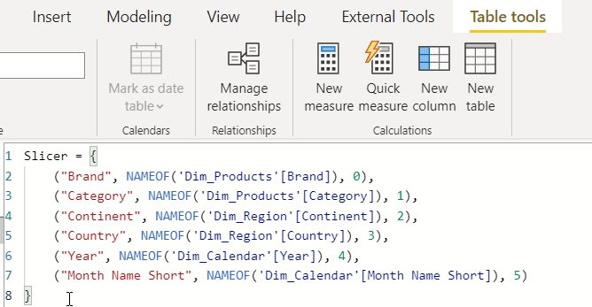
The idea is to group Brand and Category fields under one “umbrella”, Continent and Country under another, and finally Year and Month short name also under the third group. I can simply add a new column for each member of the DAX table definition, something like:

But, I have a better idea! Let’s bring some life to this, and display icons instead of text! I’ll use a well-known UNICHAR() function to provide the numeric value that should be converted to an icon, similar to what I explained in this article.
Slicer = {
    ("Brand", NAMEOF('Dim_Products'[Brand]), 0, UNICHAR(127981)),
    ("Category", NAMEOF('Dim_Products'[Category]), 1, UNICHAR(127981)),
    ("Continent", NAMEOF('Dim_Region'[Continent]), 2, UNICHAR(127757)),
    ("Country", NAMEOF('Dim_Region'[Country]), 3, UNICHAR(127757)),
    ("Year", NAMEOF('Dim_Calendar'[Year]), 4, UNICHAR(128198)),
    ("Month Name Short", NAMEOF('Dim_Calendar'[Month Name Short]), 5, UNICHAR(128198))
}
This is the DAX code after I’ve added an additional column. And, I’ve also renamed the newly created column from generic “Value 4” to “Group”:

It’s time to put our new setup into action! So, I’ll drag the Group column in the fields of the parameter slicer, just above the original Fields parameter values:
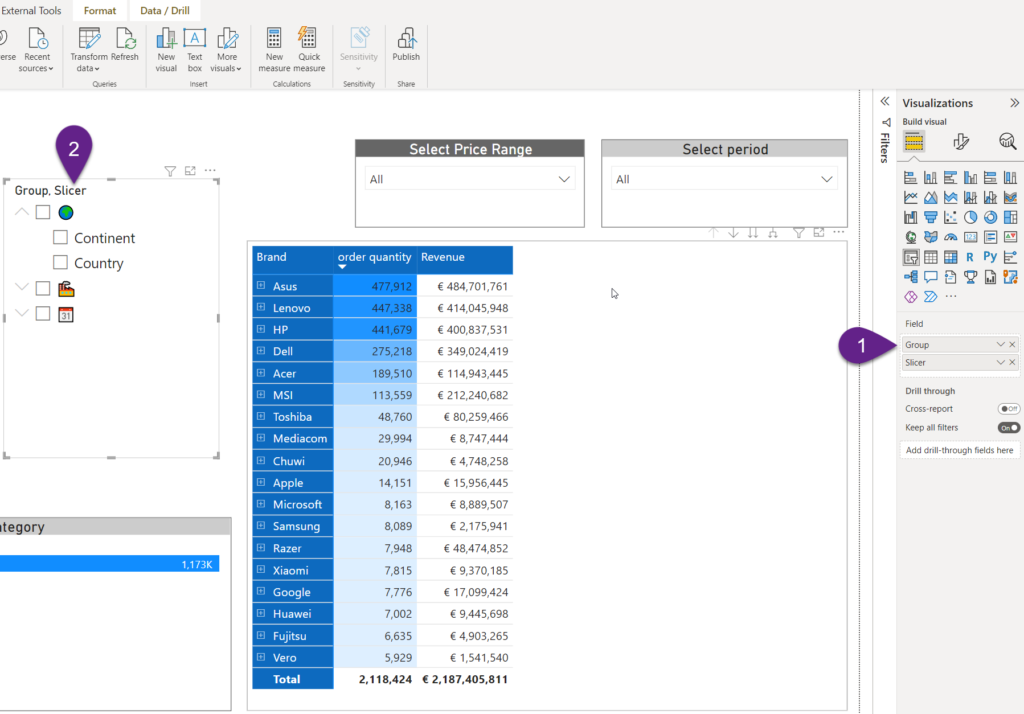
Wooow! Now, my Fields parameter values are grouped under these nice icons, so my users can easily understand various slicing options! They can still quickly slice the data based on multiple different fields, coming from different groups, but the data is much better structured and organized this way!

Final touch for an even better user experience
Let’s do some additional little magic to enhance the user experience even more!
I want to enable my users to choose on their own how they want to see the data in the matrix! In other words, to dynamically choose what is displayed in the rows vs columns!
I’ll go and create a duplicate of this Fields parameter table, but this time I’ll enable a Single select for my slicer, so that matrix doesn’t become too cluttered if nothing is selected:
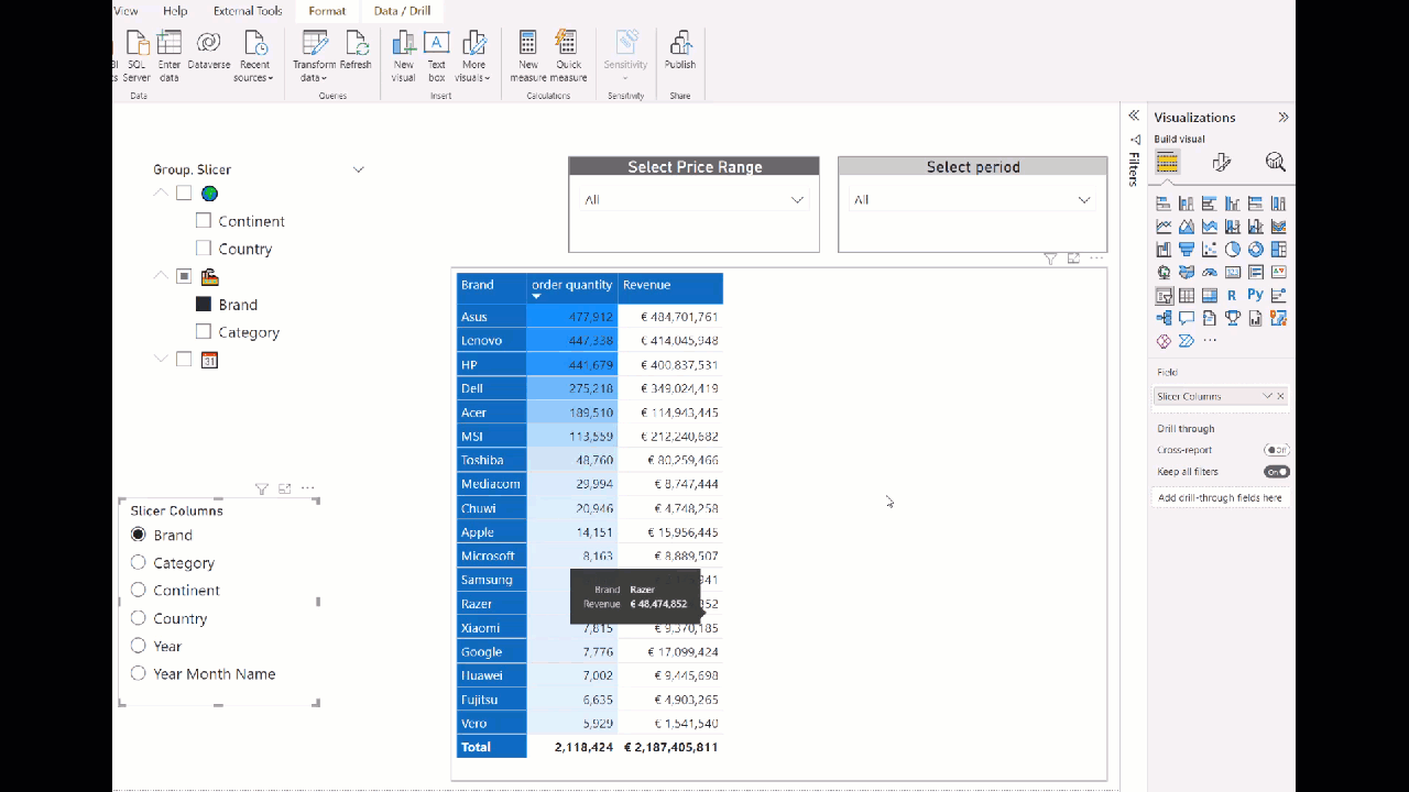
Awesome! Now, our matrix is fully customizable and users can dynamically choose how they want to see the data – switching between the rows and columns!
Conclusion
Fields parameter is one of those features you simply know will have a huge impact! Not just because it opens up literally an indefinite number of possible use cases, but also because of easy implementation and potentially extended customizations to answer business questions in a more efficient way.
Thanks for reading!
Last Updated on May 31, 2022 by Nikola


Ajit
Great article as always. Thanks Nikola.
DWIJEN BARUAH
Nice one
Can you send me the PBIX file?
When I am trying to put it matrix from two slicers it is not working
AndyWei
He said:“I’ll go and create a duplicate of this Fields parameter table” means that “using the[ field parameter ] to create a new table which equals the old field parameter
Power BI Field Parameters and Slowly Changing Dimensions - SharewarePile.com - Latest Web Hosting News
[…] You can find more info about Power BI field parameters in the official blog post, but also here, here and here. The use case I’m talking about is slowly changing dimensions of Type 2, you know, the […]