
“Hot take”…”Controversial opinion”…”The game has changed”…
Normally, I avoid using phrases like the ones above because I don’t like the hype. Any type of hype (oh, this rhymes)…But, this article will probably raise many eyebrows and spark a discussion (which I’d love to see, to be honest). So, let me put this as straight as possible.
Over the past few months, I’ve had variations of the same conversation more times than I can count. At conferences, on LinkedIn DMs, during client calls, even at dinner with fellow MVPs, the question keeps popping up: “Nikola, what do you think about the future of Power BI?”
Sometimes it’s more specific: “Is Power BI still worth investing in?” or “Should I be worried about AI replacing my dashboards?” or simply “What now?”
What I find interesting is not just the question itself, but who is asking it. These aren’t beginners looking for career advice. These are seasoned Power BI professionals: consultants, architects, developers, people who’ve spent years mastering DAX, building semantic models, and fine-tuning report designs. People who built their careers on this tool. And they’re genuinely uncertain about what the next few years hold.
So, I figured it’s time to stop answering this question one conversation at a time and put my thoughts on paper. Fair warning: I don’t have a clean, comfortable answer. But I do have an honest one.
First, let’s acknowledge what Fabric did to Power BI
Before we talk about the future, let’s talk about the present. Specifically, how Power BI has evolved since Microsoft Fabric entered the picture in 2023.
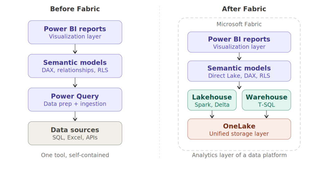
The short version? Power BI went from being a standalone BI tool to being the analytics layer of a much larger data platform. And depending on who you ask, this was either the best thing that ever happened to Power BI, or the beginning of an identity crisis.
On the positive side, Fabric gave Power BI things it desperately needed. Direct Lake mode eliminated the “import vs. DirectQuery” compromise that had haunted Power BI architects for years. OneLake gave us a unified storage layer where the same Delta tables that your data engineers write with Spark notebooks can be consumed directly by your Power BI semantic models. Yaaay, no more copying data around. The SQL analytics endpoint brought T-SQL people into the fold without forcing them to learn DAX or Power Query first.
But Fabric also changed what it means to work with Power BI. Suddenly, a Power BI professional needed to understand lakehouses, shortcuts, mirroring, capacity units, workload management, Real-Time Intelligence – concepts that would have been completely foreign to a Power BI developer two years earlier. The barrier to entry didn’t just rise, but the scope of the role expanded dramatically.
I’ve seen this firsthand with my clients. Power BI developers who were once self-sufficient now find themselves needing to collaborate with (or become) data engineers. The line between “BI developer” and “analytics engineer” is blurring fast, and many professionals are scrambling to figure out where they fit in this new landscape. I’ve written and presented about this transition, and it remains one of the most common topics I discuss with the community.
Meanwhile, something else was happening…
While the Fabric community was busy figuring out lakehouses and medallion architectures, a parallel revolution was quietly gaining momentum. And I think this one is the bigger deal.
People started using AI to build dashboards. Not just chatbot-style “ask a question, get a chart” features like Copilot in Power BI (which, let’s be honest, has been promising but kind of underwhelming for many users so far). I’m talking about fully interactive, custom-designed dashboards built in HTML, React, and d3.js. Dashboards generated from natural language prompts using tools like Claude Code, Cursor, or similar AI coding assistants.
If you haven’t seen what’s possible, go check out the work of Kurt Buhler at Data Goblins. I’m a big fan of Kurt’s work (probably as many of you reading this article). Kurt has been at the forefront of this trend, creating stunning interactive visualizations by simply describing what he wants to an AI coding agent. His take on this is spot-on: once you design a dashboard without the constraints of a drag-and-drop UI, you can’t unsee the difference.
And he’s not wrong. When you remove the guardrails (and limitations) of a visual-based tool like Power BI, the design possibilities explode. Want a custom animated timeline that transitions between time periods? Done. Want a dashboard where the entire layout adapts to the data dynamically? No problem. Want pixel-perfect control over every single element? It’s just code! The AI writes it, you iterate on it.
And, the scariest thing about what’s happening here? The people creating these dashboards are not necessarily frontend developers. Many of them are Power BI professionals who’ve never written React or d3.js in their lives. The AI handles the code, the human brings the domain knowledge, the design sensibility, and the understanding of what the business actually needs. It’s a profound shift in who can build what.
So, is Power BI in trouble?
Here’s my honest opinion: in the short term, no. In the medium to long term? It depends on how fast AI-generated dashboards mature.
Let me explain why I believe Power BI is safe for now, and then I’ll explain why that safety potentially has an expiration date.
Why Power BI wins today
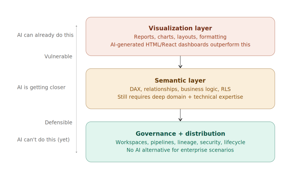
The semantic model is the moat. This is the part that most “AI will kill Power BI” arguments miss entirely. A Power BI report is not just a collection of charts. Behind every decent Power BI report sits a semantic model, a carefully designed layer of tables, relationships, measures, and business logic that encodes how the organization understands its data. DAX measures that calculate year-over-year growth, time intelligence that handles fiscal calendars, row-level security that controls who sees what – all of this lives in the semantic model, and it’s incredibly difficult to replicate with a prompt.
You can absolutely ask an AI to generate a beautiful d3.js chart. But can you ask it to build a semantic model that correctly handles semi-additive measures, many-to-many relationships, and dynamic currency conversion, while also enforcing RLS for 500 users across 12 business units? Today, the answer is no. Not reliably, not at scale.
Governance and enterprise readiness. Power BI doesn’t just make dashboards. It manages them. Workspaces, deployment pipelines, data lineage, endorsement labels, sensitivity labels, usage metrics, refresh monitoring, this is the entire ecosystem of governance, distribution, and lifecycle management that enterprises need. An AI-generated HTML dashboard has none of this. It’s a file. A beautiful file, perhaps, but a file that needs to be hosted, secured, maintained, and version-controlled manually.
The installed base. There are millions of Power BI reports in production across the world right now. Organizations have invested years in training their teams, building their models, establishing their governance frameworks. That investment creates enormous inertia. Even if a clearly superior alternative emerged tomorrow, the migration cost alone would keep Power BI relevant for years.
The ecosystem. Tabular Editor, DAX Studio, Semantic Link Labs, PBIR format, the new tools… The community tooling around Power BI is mature and actively evolving. This ecosystem makes Power BI more productive and more maintainable than any prompt-generated alternative.
But here’s another side of the story…
The pace of AI improvement is relentless. A year ago, asking an AI to generate a fully interactive dashboard from a prompt was a novelty. Today, it’s routine. Project forward 12-18 months, where does that leave us? The governance gap can be closed with tooling. The semantic model gap can be narrowed as AI gets better at understanding data relationships. The design gap is already gone… AI-generated dashboards frequently outperform Power BI reports visually.
Power BI’s visual layer has been stagnant. And I say this as someone who deeply respects the Power BI team. The core report authoring experience: the canvas, the formatting pane, the visual interactions, hasn’t changed fundamentally in years. Custom visuals help, but they come with their own limitations and maintenance burden. Meanwhile, AI-generated dashboards offer unlimited visual flexibility because they’re just code. The gap between what you can imagine and what you can build is dramatically smaller when AI writes your frontend.
The “five minutes to wow” factor has shifted. Kurt makes this point eloquently in his recent article about AI tools and user enablement. Power BI’s original magic was its ability to let a non-technical person create an impressive, interactive dashboard in minutes. That was genuinely revolutionary. But now? AI coding tools offer the same “five minutes to wow” experience, except the ceiling is much higher. The starting point is just as accessible, but the upper bound of what you can create is orders of magnitude greater.
The report layer is not the semantic layer. Microsoft seems to understand this, even if the community hasn’t fully internalized it yet. Notice how Fabric’s investments have been disproportionately focused on the data platform (lakehouses, warehouses, mirroring, Real-Time Intelligence) and the semantic layer (Direct Lake, semantic models, Copilot) rather than on the report authoring experience. I think Microsoft sees the writing on the wall: the data layer and the meaning layer are defensible moats. The visualization layer? That’s increasingly commoditized.
What does this mean for YOU?
I won’t pretend I have a crystal ball, but here’s where I’ve landed after weeks of thinking about this:
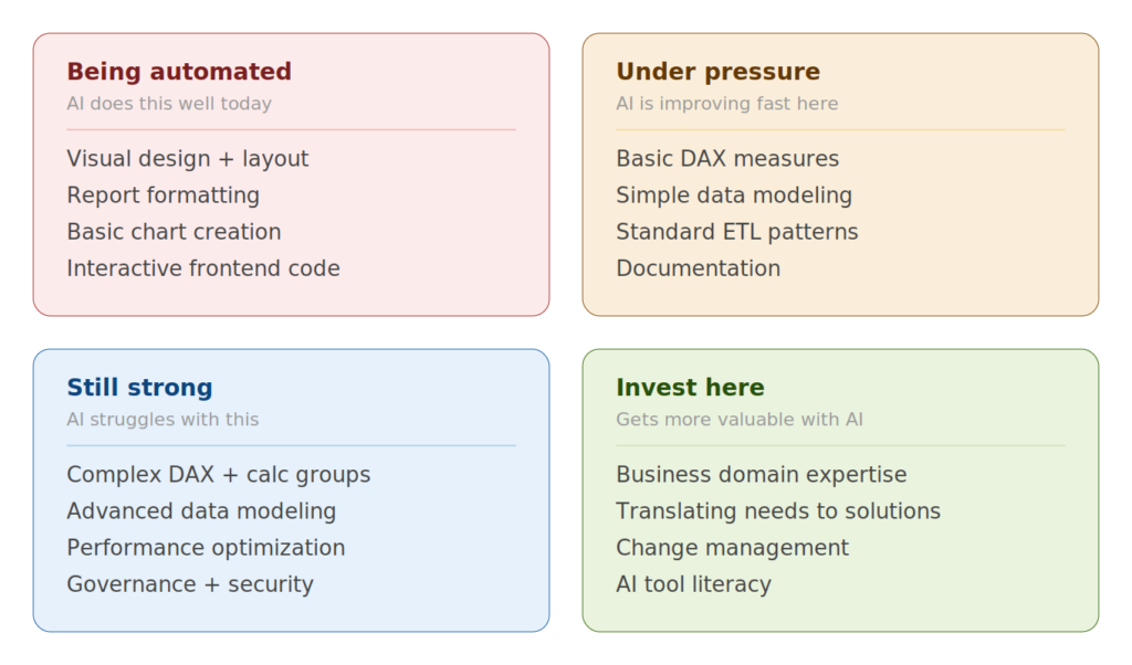
If your value is in building pretty dashboards, you should be concerned. That skill is being automated at an alarming rate. Not replaced, but automated. The human eye for design and the understanding of what makes data communicable are still essential. But the mechanics of placing visuals on a canvas, formatting them, and making them interactive? That’s exactly the kind of work AI excels at.
If your value is in the semantic layer: data modeling, DAX, business logic, you’re in a much stronger position. This is the hard part. The part that requires a deep understanding of both the data and the business. The part where a single wrong relationship or an incorrect measure can produce misleading numbers. AI can’t reliably do this yet. When it can, that’s when the real disruption happens.
If your value is in understanding the business problem and translating it into a data solution, you’re going to be fine. AI doesn’t know what questions the business needs to ask. It doesn’t know that the CFO cares about cash flow more than revenue, or that the operations team needs to see data by shift pattern rather than by calendar day. Domain expertise and the ability to connect data to decisions is a skill that only get more valuable as the technical barriers drop.
Diversify your toolkit. I’ll echo what Kurt attributes to Reid Havens: it’s time to multiclass. If you’re a Power BI specialist, start experimenting with AI coding tools. Not because you need to abandon Power BI, but because understanding what’s possible outside Power BI makes you a better advisor inside it. And if the shift happens faster than expected, you won’t be caught off guard.
My prediction
Power BI will continue its successful trajectory for the coming months. Microsoft’s investment in Fabric, the depth of the semantic model, the governance ecosystem, and the sheer installed base guarantee that. But if AI-generated dashboards continue developing at their current pace (and, honestly, I see no reason why they wouldn’t), the visualization layer of Power BI will face serious competitive pressure within the next two to three years.
The organizations and professionals who will thrive are the ones who double down on what AI can’t easily replicate: the semantic layer, the business understanding, the data governance, the change management. And who stay curious enough to experiment with what AI can do, rather than pretending the wave isn’t coming.
Is Power BI going to die? No. But is it going to look fundamentally different in three years? I sincerely think so. And the professionals who start preparing for that shift now will be the ones leading it, rather than being disrupted by it.
Thanks for reading!
As usual, thanks to Claude for generating illustrations and diagrams.
Last Updated on April 1, 2026 by Nikola