This article is the part of the series related to mastering DP-500 certification exam: Designing and Implementing Enterprise-Scale Analytics Solutions Using Microsoft Azure and Microsoft Power BI
Table of contents
As you may know, the same report may look completely different across different devices. Power BI report that contains exactly the same data points, looks quite different on a desktop compared to a mobile phone.
Similar applies to different persons – you have to keep in mind that your users might have visual, motor, or cognitive impairments. So, the same report may look different from the perspective of users with deficiencies.
Why accessibility matters?
If you ask yourself: why accessibility matters? Let me show you one very basic example. If you are a normal person, and when I say normal, I mean you don’t have any visual impairments, that’s how you’ll see this nice balloon flying over green fields:

But, if you are diagnosed with Deuteranopia, which is the medical name for Green-Blind impairment, this same picture will look quite different, don’t you agree?

The same applies to colors used in the reports. With that in mind, you should always design your reports to be accessible to as many users as possible.
Accessibility features in Power BI
Luckily, Power BI offers a whole range of built-in accessibility features. Some of them don’t even require additional configuration, so let’s briefly introduce them:
Built-in features
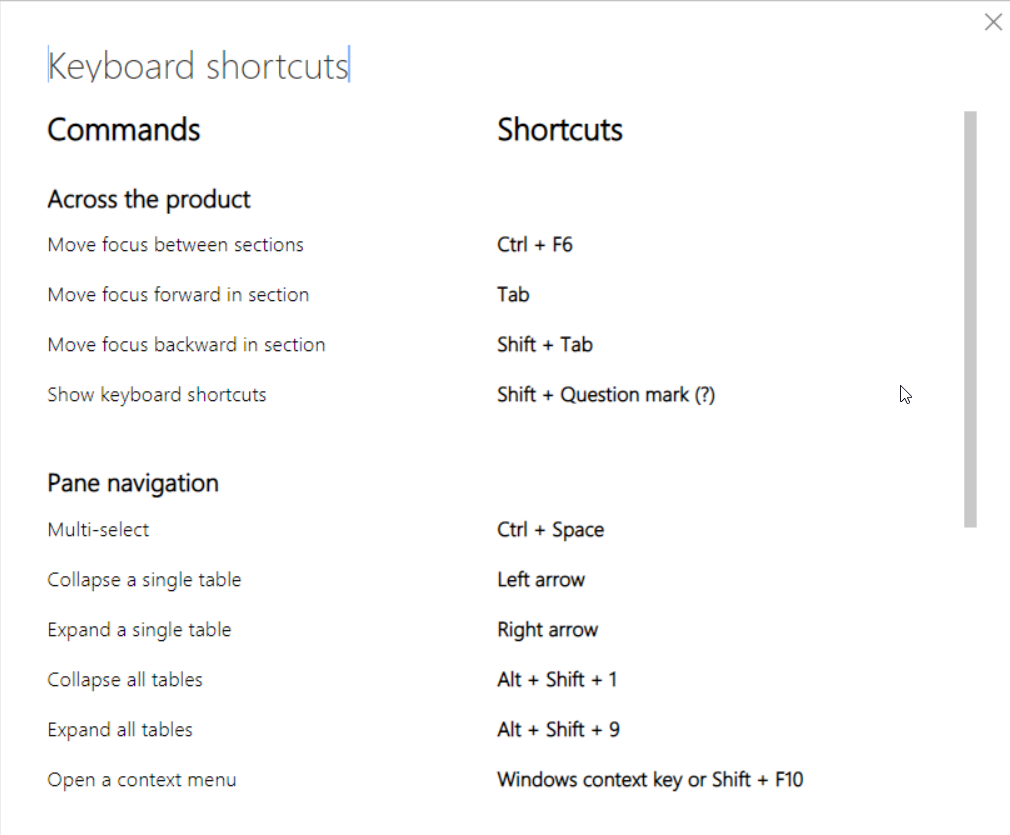
- Keyboard navigation – all Power BI visuals are “keyboard friendly” and you can navigate between them. You can also click on the question mark to access the most frequently used keyboard shortcuts
- Screen reader – generally, every Power BI object is compatible with screen readers
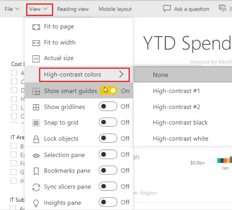
- High contrast color – if you set high contrast mode in Windows, Power BI will automatically detect the theme used in Windows, and apply the same setup to your reports. To set the theme manually in the Power BI Service, while you are in Edit mode of the report, select View > High contrast colors, and choose the theme you would like to apply
- Focus mode – enables users to fill up more space on their screens
- Show Data table – using a shortcut Alt Shift F11, users can switch to a tabular view of the data from the visual
Configurable features
Aside from these built-in features, that don’t require any additional configuration, Power BI also offers a set of features out-of-the-box, but they need to be configured by the report author. Let’s examine all of these features:
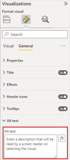
- Alt text – enables you to add a textual description of the visual elements on your report page. This way, users can understand what kind of message the visual provides, even if they are not able to see the visual itself
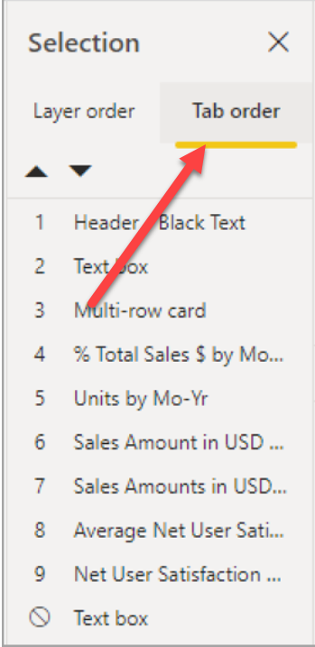
- Tab order – helps smooth keyboard navigation between the report elements, matching the way users will visually process the same elements. You can enable the Selection pane under the View tab, and configure the Tab order:
- Titles and labels are extremely important to provide clarity to your visual elements. Hence, avoid using acronyms and other abbreviations, as that may produce confusion for the users
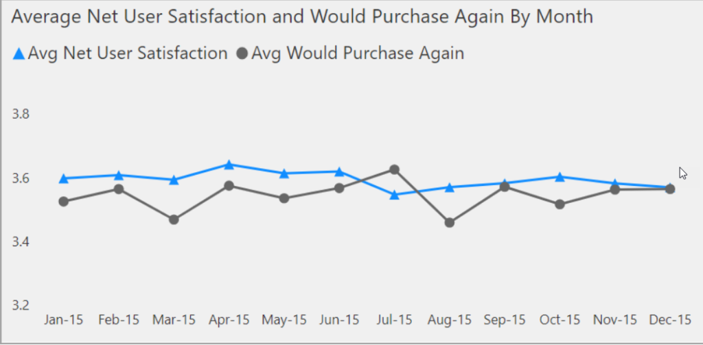
- Markers are a powerful technique to improve the readability of the series visuals
- Finally, carefully choose the report theme, contrast, and colors. Don’t forget the photo of the balloon and green fields, as users with color vision deficiencies may have issues understanding the data based on colorblind-unfriendly colors. The following color combinations are especially difficult for users with color vision deficiencies:
- green and red
- green and brown
- blue and purple
- green and blue
- light green and yellow
- blue and grey
- green and grey
- green and black
Accessibility checklist for your Power BI reports
Let’s quickly reiterate through the best practices when it comes to designing Power BI reports for accessibility:
- Ensure that color contrast between the report elements is at least 4.5:1
- Try to avoid using colors as the only way for transmitting the message. You may want to supplement colors with text or icons.
- Always use clear textual descriptions of the report elements.
- If you use non-decorative visuals in your report, make sure to add alt text to them
- Be mindful when choosing a color palette for your report, and make sure that users with color vision deficiency can also understand the data
- Avoid using tooltips as a method for transmitting important information. They are difficult to access for users with motor issues or users that don’t have a PC mouse
Conclusion
Designing reports is one thing, but designing for accessibility requires a whole different mindset! Many report developers “calibrate” their solutions and visualizations based on the majority of consumers that don’t have visual or any other impairments. However, whenever you’re creating a holistic solution, you must keep in mind those users that may face issues while consuming the data.
Think of it in this way: if you need to adjust your approach when designing reports for mobile devices compared to a “regular” desktop experience – you should also adjust your design approach for users with different needs.
If you want to learn more about designing for accessibility in Power BI, I strongly recommend reading articles from Meagan Longoria on this topic.
Thanks for reading!
Last Updated on January 20, 2023 by Nikola