
Just recently, I was working on the Power BI report for one of the clients, where one of the requirements was to highlight specific data points in the clustered bar chart visual, based on the slicer selection.
To illustrate the requirement, I’ll be using a Contoso sample database:

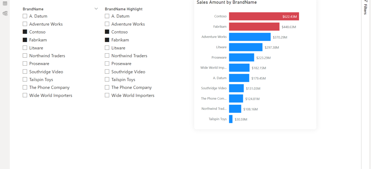
To quickly explain: when a user selects, for example, Contoso in the slicer, the Contoso bar should be highlighted by using a different color. As much as this sounds like a very basic and common business request, there is no straightforward solution in Power BI (or, at least, I’m not aware of it:))
However, the client’s wish is (almost) always our command – so, let’s see how this feature can be implemented with a little bit of data model tweaking and leveraging some DAX code.
Setting the stage
As you may see in the following illustration, data model is fairly simple:

We have only two tables: DimProduct as our dimension table, and FactOnlineSales as our fact table. The first “problem” we have with a data model like this, is that when a user selects something from the slicer, the filter will be propagated and our bar chart visual will only display corresponding values:
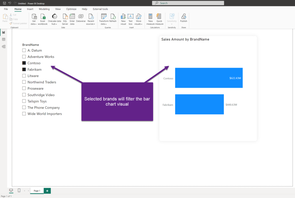
Therefore, the first thing we need to ensure is that when a user makes a selection, the bar chart visual is not affected. Remember, our goal is to keep all the brands displayed, while coloring selected brand(s) with a different color.
I’ll go to the Format tab on the top, select my slicer on the report canvas, and choose Edit interactions. Finally, I’ll turn off cross-filtering for the bar chart visual:

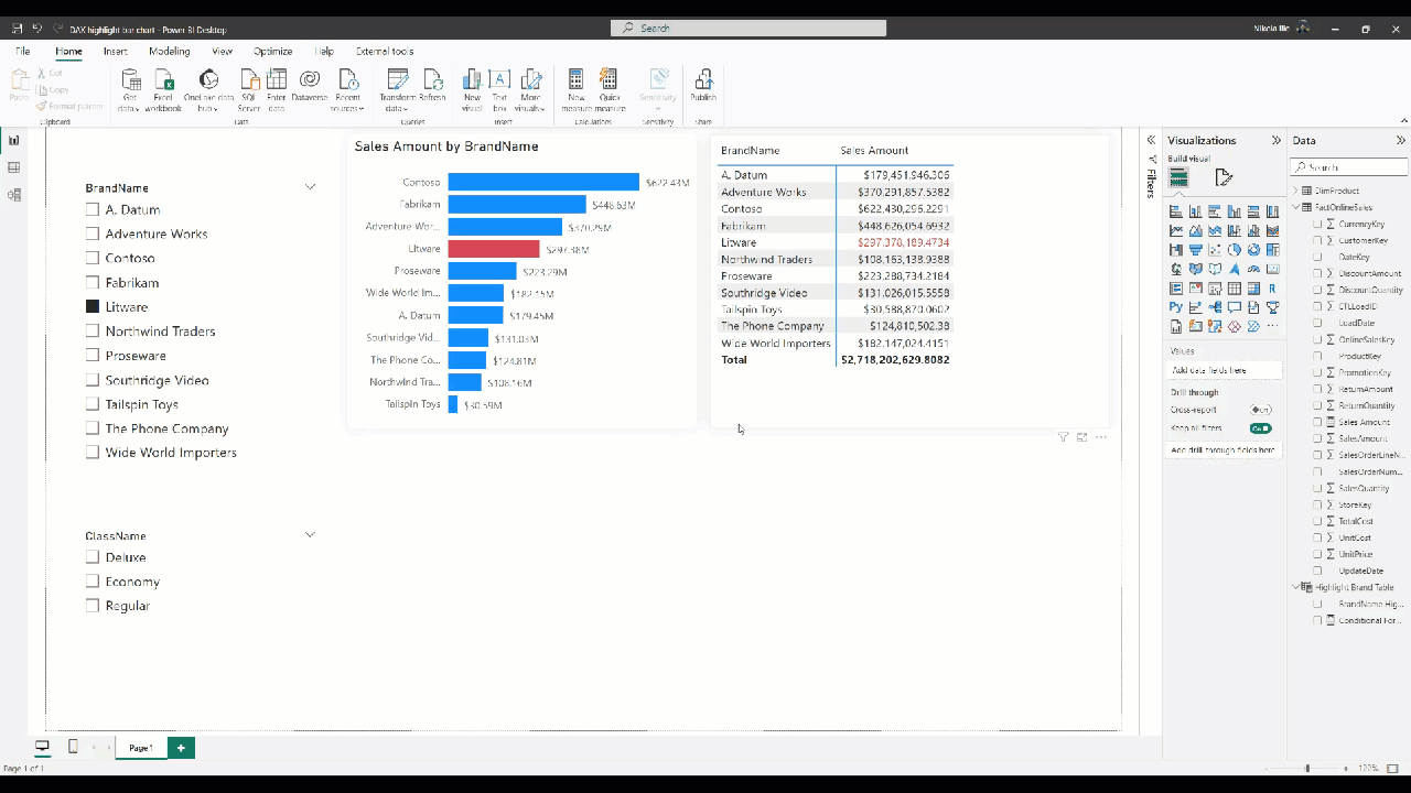
As you may notice, all the brands are now displayed in the bar chart, despite only Contoso being selected in the slicer.
Fine, the next step is to “instruct” the bar chart what is selected in the slicer and change the color only for these values. As you may assume, it’s not feasible with the current setup, so we need to add more ingredients.
Creating a disconnected table
The first step is to create a “helper” table, which will be disconnected from the rest of the model. This table will contain all distinct values from our slicer:
Highlight Brand Table = VALUES(DimProduct[BrandName])
For the sake of clarity, I’ll rename the column name in the helper table to BrandName Highlight, and create another slicer on my report canvas, which will show these newly created column values:

Since this new slicer is disconnected from the existing data model, if you select a specific value(s), nothing happens in the rest of the report – data will not be filtered.
Syncing the slicers
The next step is to synchronize both slicers on the report page:

Let me quickly stop here and explain why this step is so important. By putting both slicers in the same group, and leaving the option to sync field changes, we are ensuring that selection will be equal between two slicers. Since the original slicer (BrandName) can’t be used to filter the bar chart visual (remember, we turned off cross-filtering), the idea is to leverage the helper slicer to affect the bar chart.
Now, whatever I select on the original slicer (i.e. Adventure Works), the same selection will be applied to another slicer.
Pulling the DAX magic
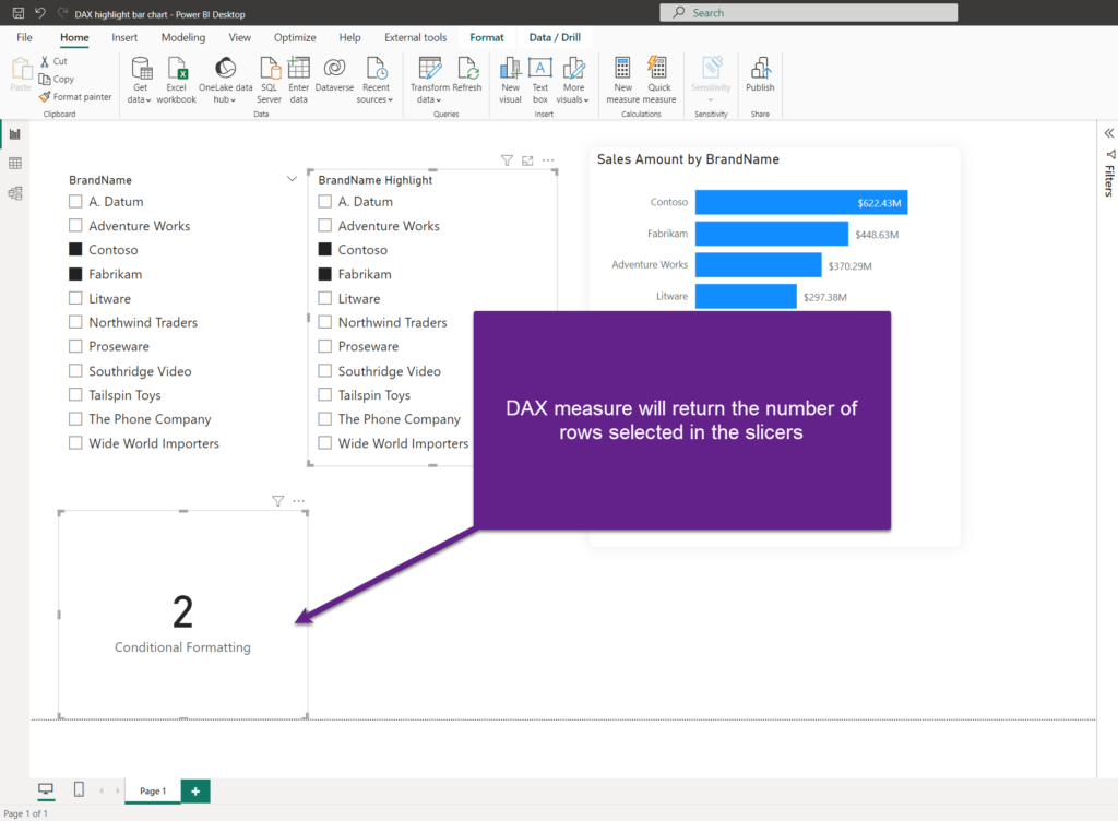
Now, it’s time to apply some DAX magic and define a measure that will be used for conditional formatting of the bar chart:
Conditional Formatting =
VAR SelectedBrand = COUNTROWS(
                        INTERSECT(
                            VALUES('Highlight Brand Table'[BrandName Highlight])
                            , VALUES(DimProduct[BrandName])
                            )
                            )
RETURN
IF(
    ISFILTERED('Highlight Brand Table'[BrandName Highlight])
        , SelectedBrand
        , 0
        )
To explain shortly: in a variable SelectedBrand, we are using the INTERSECT function, which will return the rows of the left-side table (in our case, all distinct values of the helper table) that appear in the right-side table (all distinct values from the original, DimProduct table). Then, we count the number of rows in this new virtual table.
As a final step, we are checking if the “helper” slicer is filtered. If that’s true, we are returning the value of the variable. If not, we are returning 0.
Conditional formatting of the bar chart
It’s time to put our newly created DAX measure into action. I’ll select the bar chart visual, go to the Format panel, expand Bars, and click on the fX button to change the default color settings:
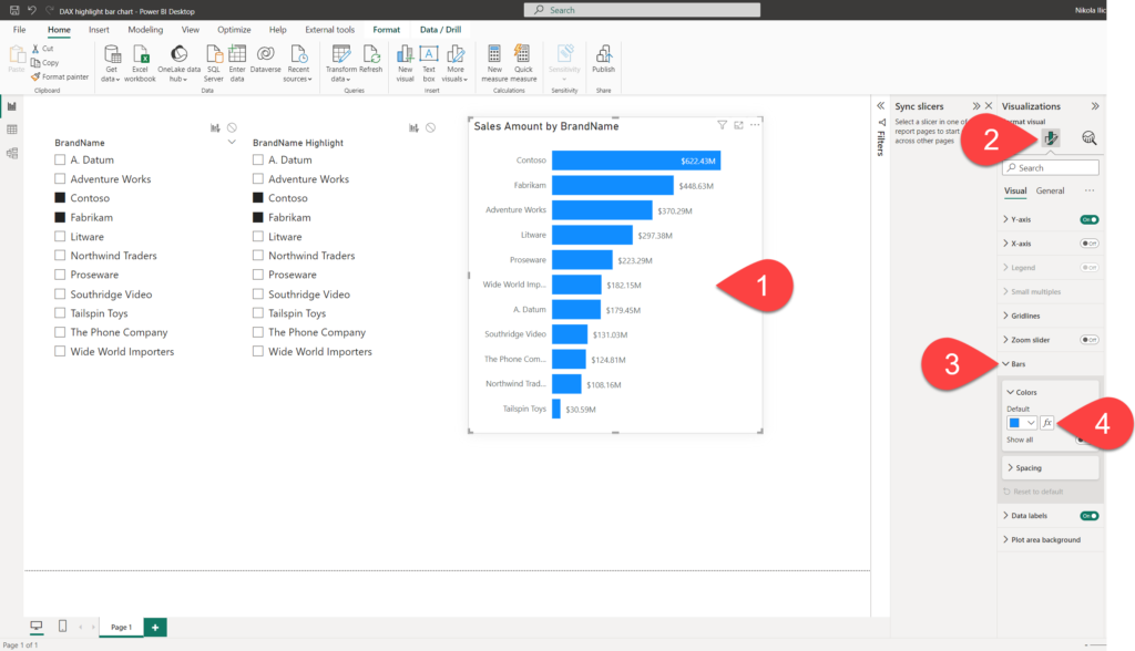
Once in the conditional formatting window, I’ll set the color to be defined by the following rule:
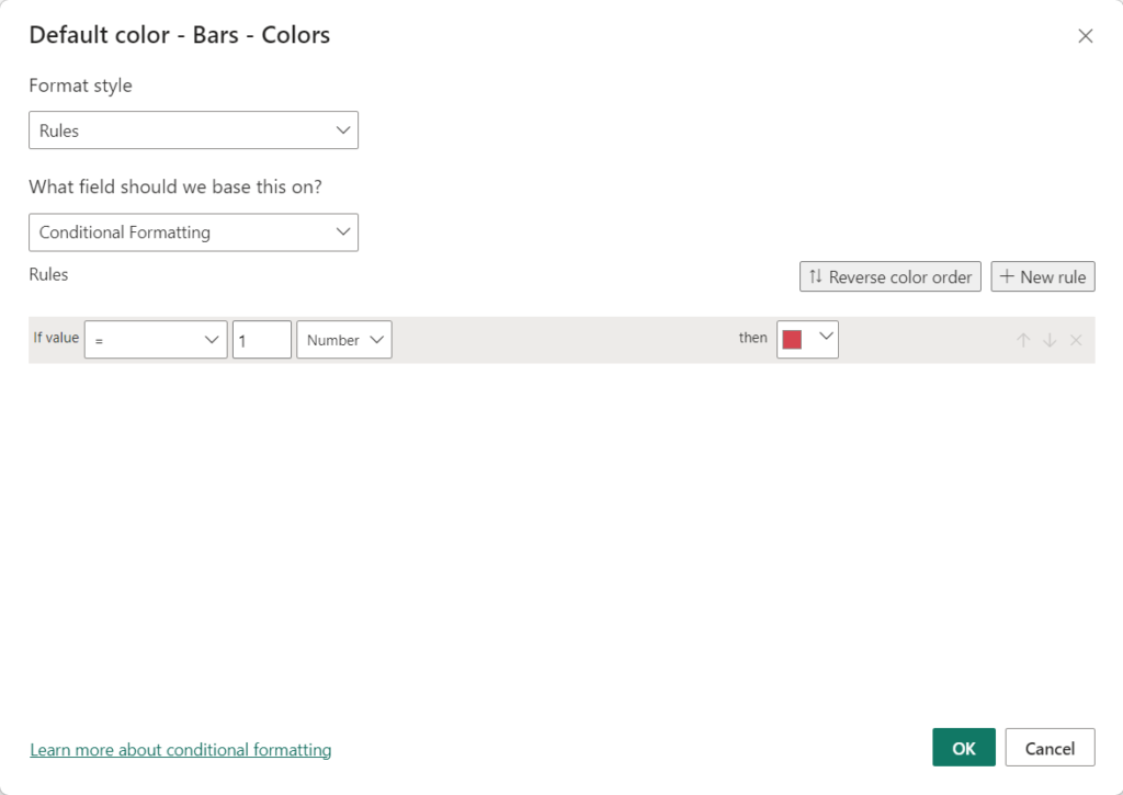
And, voila! As soon as I confirm it, my bar chart visual will show the different colors for the bars of the selected brands!

Let’s now hide the helper slicer, as we don’t really want to confuse our end user with two slicers on the report canvas:

And, let’s test if our solution works as expected…

Works like a charm!
Additional considerations
Now, you are probably wondering: what if we want to have additional slicers, but their selection shouldn’t change the default coloring of the bar chart visual?
No worries, as it’s only important to keep other slicers out of the slicer group we previously created:

The other thing that you may ask is: can I use this measure for other visuals as well, not only for the bar chart? Yes, of course you can! Essentially, any visual type and any property that supports a conditional formatting option can be configured using the same measure.
Let me quickly show you how to change the font color of the selected brand within the matrix visual:
BAM! Again, works like a charm!
Conclusion
As you’ve witnessed, we made it! The client’s request, as simple as it sounds, couldn’t be fulfilled out-of-the-box, so we had to apply some tricks (DAX included) to implement this workaround solution.
Thanks for reading!

Last Updated on October 27, 2023 by Nikola


Mykhailo
If filtering by brand is still not implied, isn’t it easier:
IF(SELECTEDVALUE(‘BrandName'[Brand]) IN VALUES(‘BrandName Highlight'[Brand]), “Red”, “Blue”)
Nikola
Yes, great tip! Thanks for sharing.