
Huge things sometimes happen by accident. That’s exactly what I’ve experienced while working on a Power BI report recently. I needed Stacked Column chart visual to properly display figures, but the problem was that, by default, you can’t display grand total values in this type of visual.
Since this is pretty common request when creating reports, I was quite sure that Power BI offers solution to it. Whole journey to a final solution started quite painfully, but in the end it appeared that it can be done literally in few minutes…
Let’s switch to Power BI, so you can imagine what I’m talking about. As usual, I will use Contoso sample database.
Solution #1
Goal is to display Sales Amount value, broken down by product class (Deluxe, Economy and Regular) per month.
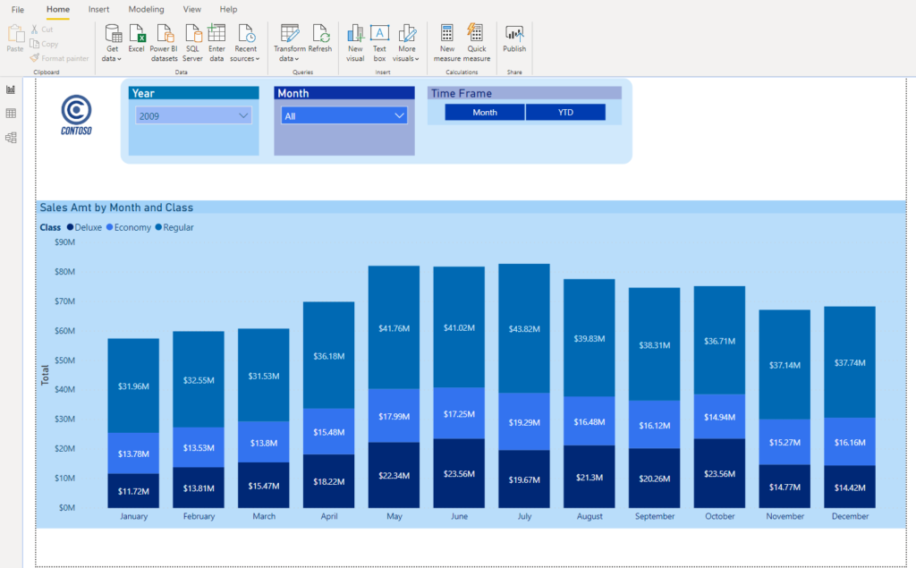
As you can notice, all values are there, but we are missing grand totals: summarized Sales Amount for every month.
Since there is no out-of-box solution to display grand totals, my first idea was to playing with Z-order of the visuals and specific formatting for each visual, so they would overlap in that way that Stacked Column chart will be as it is in the picture above, while regular Clustered Column chart would overlay it with total values and “hidden” charts. That way, totals will be visible from Clustered Column chart and Stacked Column chart bars will show values per product class.
Accidental Solution
I’ve already started to work on this, but had to put it on hold because of other, more urgent request. And I suddenly found a solution by an accident. In that other report, I needed Line and Stacked Column chart visual to display two different measures’ trend over time.
While formatting visual, I’ve accidentally discovered that Line stroke width can be set to 0! I don’t know if that’s a bug or a “feature”, but I was sure that stroke width value can’t be less than 1.
Let’s see how this helped me solve original request:
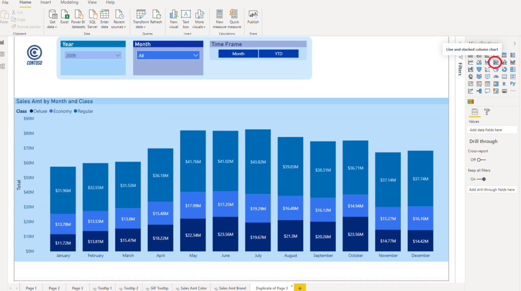
First step is to switch visual type to Line and Stacked Column chart. As you can see in the following picture, I’ve dragged Sales Amount value to Line values field and renamed it to “Total”.
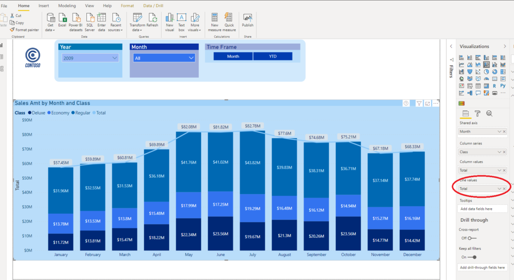
Let me stop for a moment and explain what is happening here. We have two identical measures on our visual: Total in Column values field represents Sales Amount figure broken down by product class (default behavior of Stacked Column chart), while this same Sales Amount figure in Line values field show totals per month.
Now, real thing comes into place…
Bug or “feature” ?
Now, when you go to Format pane and expand Shapes, you will see that Stroke width is by default set to 3. Now, you would expect that minimum value for the stroke width should be greater than zero, but it isn’t! I will change this to 0 and look what happened!

Line just disappeared and our totals are still there!!!
Little more formatting and we are good to go. First, expand Data labels and turn on Customize series menu. Choose to customize Total:
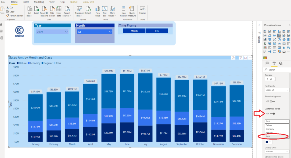
Under the Position drop down menu, select Above option. This way, you will ensure that Total value will always be displayed above the bar. You can additionally customize look and feel of the numbers (background, color, etc.), but basically our original request to display totals within Stacked Column chart was fulfilled without any additional workload!
Here is the final look of the visual:

Conclusion
Power BI is full of hidden gems:)…Sometimes, you find them after long research and sometimes they appear simply by an accident (like in this case).
Last Updated on May 31, 2020 by Nikola