

I must admit that Power BI development team does really awesome job! Every month (or even less, like in these April and May Power BI Desktop update), they are going above and beyond and introducing fantastic new features.
In March 2020, Microsoft announced Page Navigation as an action for buttons as generally available and at the same time introduced Drillthrough action for buttons as a preview feature. It sounded really appealing to me, since I have a lot of users who are not aware of “right-click” Drillthrough capability, so I had to create different workarounds, such as tooltips, in order to engage users to use Drillthrough in the reports.
Buttons to the rescue
With new Drillthrough action for buttons now generally available, let’s try to make a full use and offer our users unforgettable experience…
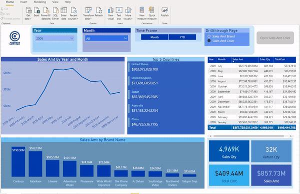
As usual, I will use Contoso sample database for demonstration. Before proceeding further, another very interesting feature related to buttons, is that now you can customize button for Disabled state (until now, you were able to customize button for Default, On Hover and On Press states).
Let’s see how this works in reality:
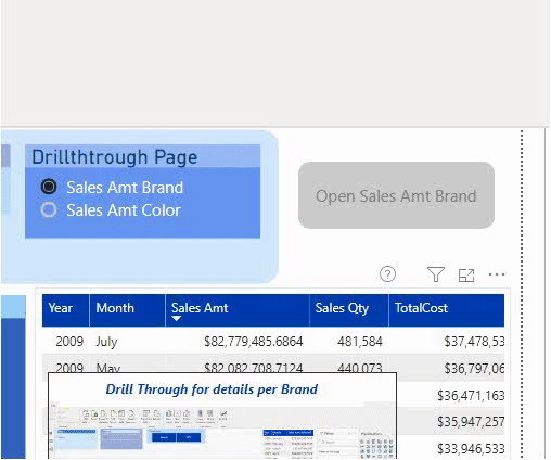
I’ve added blank button and formatted it for Disabled state (grey color).
Dynamically adjust button text
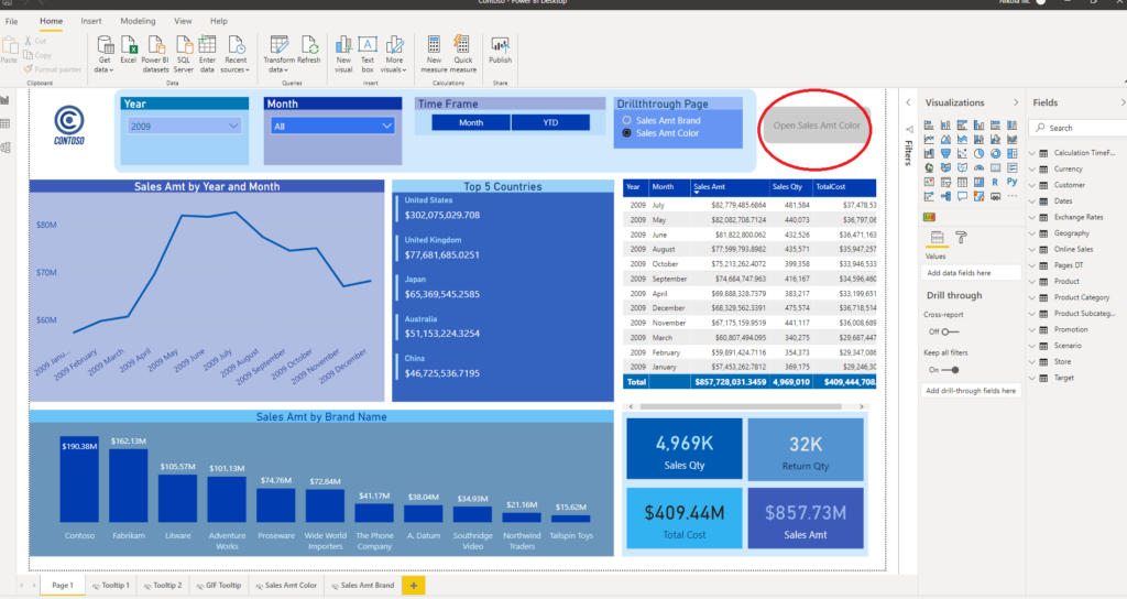
Next thing I do, because I have multiple Drillthrough pages within my report, I am giving my users a possibility what kind of details they would like to see. In my example, they can choose to see “Sales Amount per Brand” or “Sales Amount per Color”.
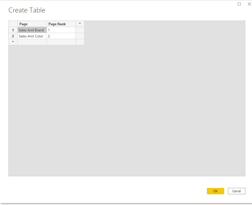
To achieve this, I need to create a new table which will hold data about drillthrough pages. Go to Enter data under Data ribbon and simply enter names of your drillthrough pages (it is of key importance that values in the table exactly match your drillthrough pages’ names). I’ve also added column for ranking, just in case that I want to sort pages in different order than alphabetically.
Now, just drag slicer on the canvas and put Page name column in the Field value. One more little trick to improve user’s experience: depending on user’s selection, we want to dynamically adjust text on the button which will be used for Drillthrough action.
Therefore, I’ve created simple DAX measure, which captures user’s selection:
Selected Page = "Open "& SELECTEDVALUE('Pages DT'[Page])This will dynamically change text on the button:
To achieve that, under formatting options of the button, choose Button Text and select option on the right:
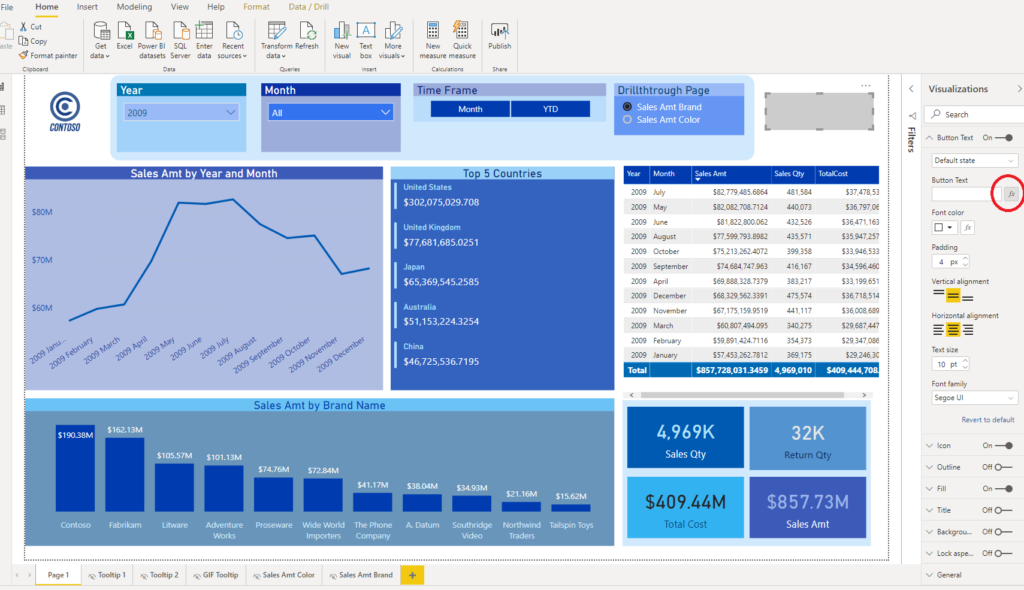
Choose to format by Field Value and select our newly created measure Selected Page.
Action, please!
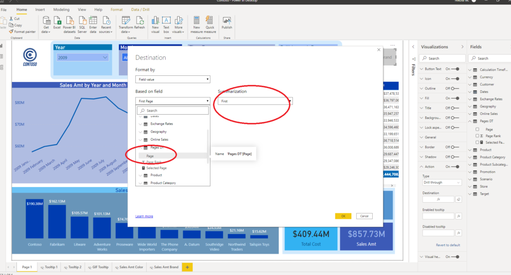
Next step is to instruct our button what to do, depending on user’s selection. Go to Action property of the button, again choose option on the right and select Page under the “Based on field” dropdown menu and leave default First as Summarization type. Since we defined user selection to one value exclusively within a slicer (by turning Single Select ON), we don’t need to worry – whatever user selects, this will be first (and only) selection…
One last thing to do is to format button Fill property, so the user can recognize when it is ready for drilling down. As I mentioned previously, button is greyed out in Disabled state. But, as soon as I choose single data point from my table, look what will happen!
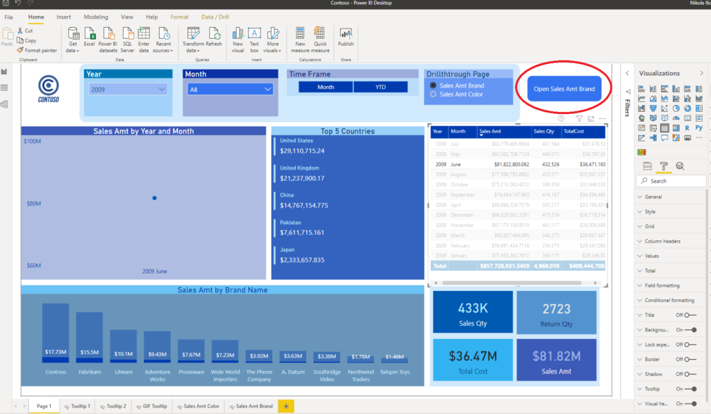
Our button becomes blue and now user can interact with it and click on it in order to be navigated to a drillthrough page, which contains details about Sales Amount for June 2009. How cool is that!
Once we go back to a main page and select Sales Amt Color under Drillthrough Page slicer, button goes back to Disabled state and we will be informed that we need to select one single brand if we want to drill trough to a page which contains data per brand color.
So, let’s check how it works:
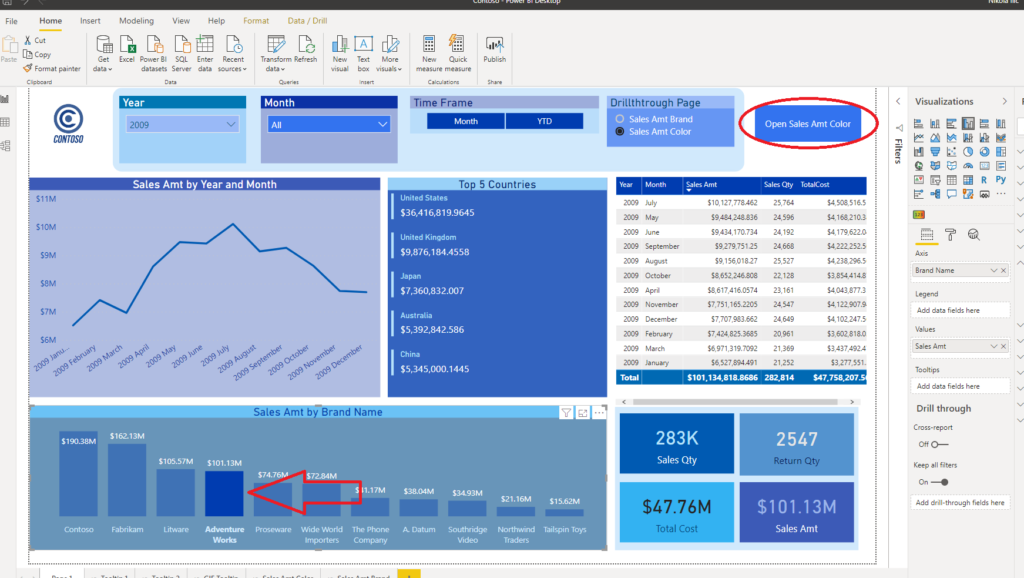
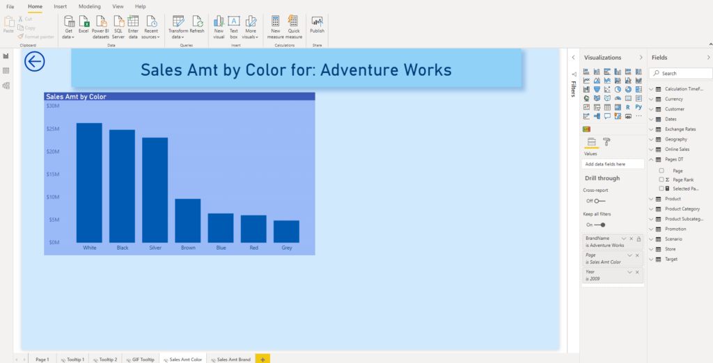
I’ve chosen Adventure Works brand within Sales Amt by Brand Name visual and my button is ready for action again! Once I click on it, I will be navigated to a page which displays data per product color for Adventure Works brand:
Same as in previous example, as soon as I’m back on main page, button again becomes greyed out.
To summarize, here is the complete behavior of our button:
Conclusion
With dynamic formatting of the buttons and tweaking actions to enable usage of different drillthrough pages, you can really create awesome user experience for your Power BI reports, avoiding complexity of working with multiple bookmarks.
Last Updated on May 21, 2020 by Nikola


Jeannie Jones
I am currently trying to implement this in my dashboard but having an issue getting it to work is there a video that shows how to do this?