

As I promised on Friday, here are the answers to all questions asked during the session. Special thanks to Chris Hyde, who was an exceptional host and who collected all of your questions.
#Q1 What are implicit vs explicit measures?
An implicit measure is created by Power BI when you drag a field, such as Sales Amount, Unit Price, etc. to your report. Power BI “assumes” that you want to do some kind of aggregation (SUM, COUNT, etc) and perform things instead of you.
On the other hand, explicit measures are defined manually and give you much more power than using just basic aggregations (SUM, COUNT, AVG…). The main advantage of using explicit measures instead of implicit ones is their reusability. You define measure once and you can refer to it as many times as you need. The other obvious benefit is the easier maintenance of the data model. If you create a base explicit measure, for example:
Sales Amt = SUM(OnlineSales[Sales Amount])
And you use this measure as a reference in 20 other different measures (for example, to calculate gross margin, YoY, etc.), if any background logic needs to be changed, you will change it at only one single place! All referring measures will automatically apply new logic.
Thanks for asking this question, I plan to dedicate a separate article to explain the differences between implicit and explicit measures in more detail.
#Q2 Can you repeat the address for the icons?
I’m using ezgif.com for creating GIFs, but there are also other free GIF creators on the web.
#Q3 Can you give us a tip on how to get rid of default white space at the bottom of each report. When we post in Power BI Service our Report Page as a Live Page there is a big white space at the bottom of each live page visual on our dashboards. There has to be a setting in Power Bi Desktop for the Report Page where we can get rid of white space at the bottom so there is not a white gap at bottom separating our live pages in the dashboard in service?
I was investigating this and came to the conclusion that you can’t completely remove the space between the pinned live pages, especially when you significantly reduce width size.
What you can do though, is to change the white color to a custom one, by modifying Outspace property within the JSON file of your Power BI theme. See in the following animation how it looks like when you change the color:
#Q4 How can I calculate the average number of cases dynamically by month or year?
This is a too generic question and I would need more details: what is the current set up and what is the expected outcome? You can ping me on LinkedIn or Twitter, so we can discuss the details
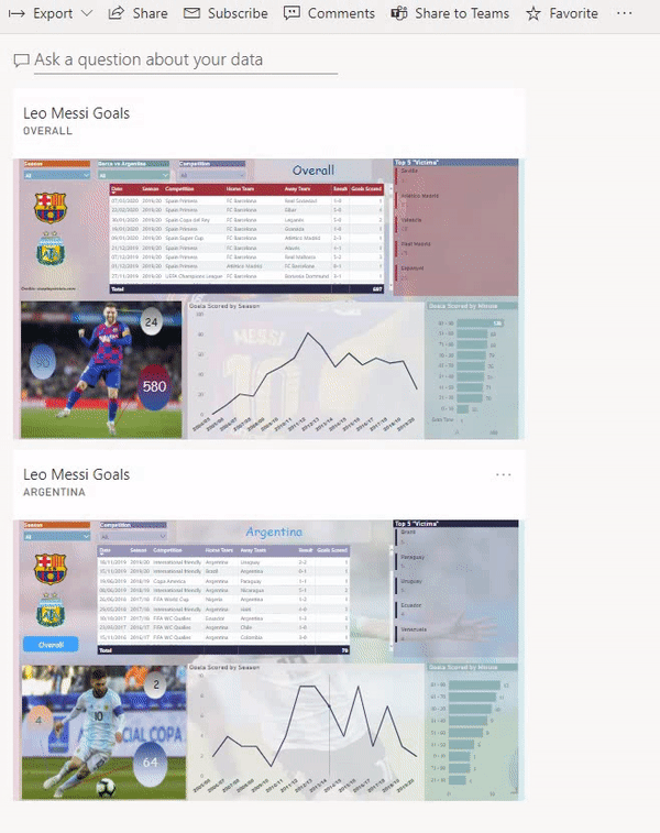
#Q5 Which graph would you recommend using to display for a particular product. The change in its status over time?
Using a specific kind of visual mostly depends on the business request itself. There are no strict rules when to use which visual, but there is a very useful reference guide created by Marco Russo and Alberto Ferrari from SQLBI.com.
I’m often referring to this resource when creating my reports. And you will see which type of visuals you should use for your specific business requests.
#Q6 Is there a way to create a template for all our pages with the logo?
Sure, and creating templates is a very powerful feature in Power BI. Not only because of logos, formatting, etc. I wrote here how I’m using Power BI Template files to reuse my custom date dimension.
As stated in the official Microsoft’s documentation: Power BI report template contains the following information from the report from which it was generated:
- Report pages, visuals, and other visual elements
- The data model definition, including the schema, relationships, measures, and other model definition artifacts
- All query definitions, such as queries, Query Parameters, and other query elements
What is not included in templates is the report’s data.
If you want to save your Power BI report as a template file, when you click on Save As under File tab, choose to save as a .pbit (Power BI Template files) instead of default .pbix type:

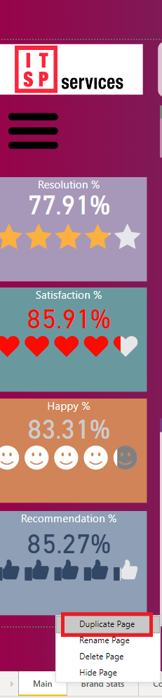
DISCLAIMER: If the question meaning was: how to create multiple pages within one single report, each page containing logo, the way to go is to create a sample page with all the necessary elements (logo, background. etc.), right-click on the tab with the page name, and then choose to Duplicate page. Something like this (excluding those visuals, so you should include only those elements which need to appear on every report page):
#Q7 Is there a way to show the actual active filters as a result of the slicer choices on the page?
You can use DAX to achieve this. Here is the pseudo-code for the measure:
Selected Filter = CONCATENATEX(VALUES(Table[Column]),Table[Column],",")
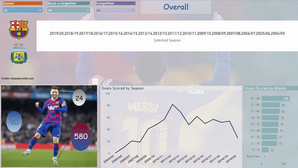
In my example, that’s how it works:
The last argument of the function is separator – I’m using a comma, but you can adjust it according to your needs.
Conclusion
Hope that you will find these answers useful. In case some additional clarifications being needed, feel free to write in the comments section.
Last Updated on August 17, 2020 by Nikola


mobile legends cheat
Hmm it seems like your blog ate my first comment (it was
extremely long) so I guess I’ll just sum it up what I wrote and say, I’m thoroughly enjoying your blog.
I too am an aspiring blog writer but I’m still new to everything.
Do you have any helpful hints for newbie blog writers?
I’d really appreciate it.
we just did shirt
These are actually enormous ideas in on the topic of blogging.
You have touched some nice factors here. Any way keep up wrinting.
Nikola
Thank you, I’m glad if you find these questions inspiring