

Can you spot the difference between the following two reports?
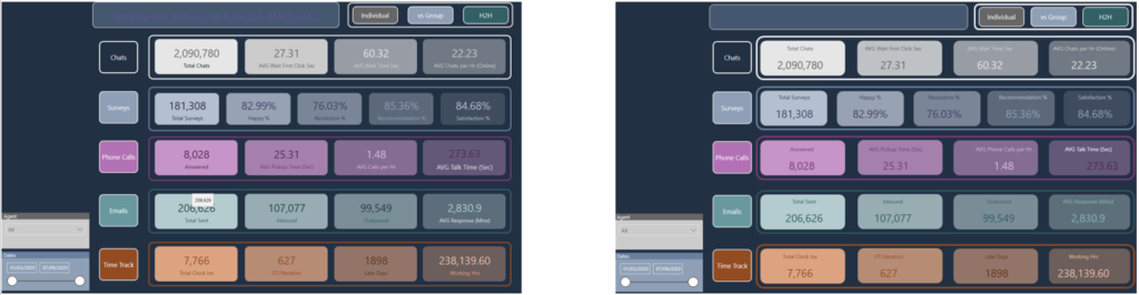
Yeah, neither do I!
But, there is a huuuuuge difference between those two reports! What if I tell you that the report on the right is 5x faster than the one on the left? Would you believe me? No? Then keep reading and I will show you how’s that possible…
How it all started…
I was reading a great blog post by Chris Hamill, where he explained how to substitute some visuals in the report while keeping the same visual look. So, I was immediately tempted to try to apply a similar technique to one of the reports I previously created.
The report page which you see on the left side in the illustration above displays some figures related to the performance of the customer support center. There are a whole bunch of metrics related to chats, surveys, phone calls, emails, etc.
However, this report page needs a hell of a lot of time to render and load. The main culprit is the big number of card visuals (21 in total). Since Formula Engine behind the Power BI works single-threaded, as explained in detail in this article, for every single Card visual, a new query is being generated and can’t be executed until the previous one is completed!
That is best reflected in the times captured by the Performance Analyzer. Performance Analyzer is a quite powerful built-in feature within Power BI, that gives you a good insight on what’s going on behind the scenes. You can also use external tools for getting report metrics, such as DAX Studio.
Let’s turn on Performance Analyzer and see what is going on under the hood in the original report version:
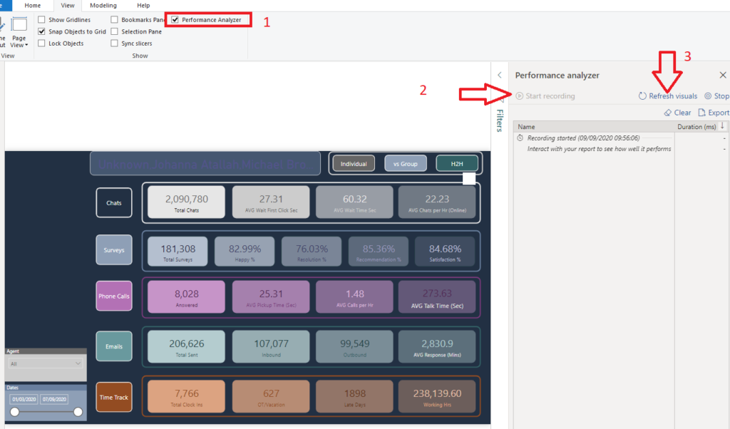
This report page took more than 3 seconds to render! That’s unacceptable for not so large volumes of the data. Let’s sort the individual timings by Total time in descending order and see what makes our report slow:
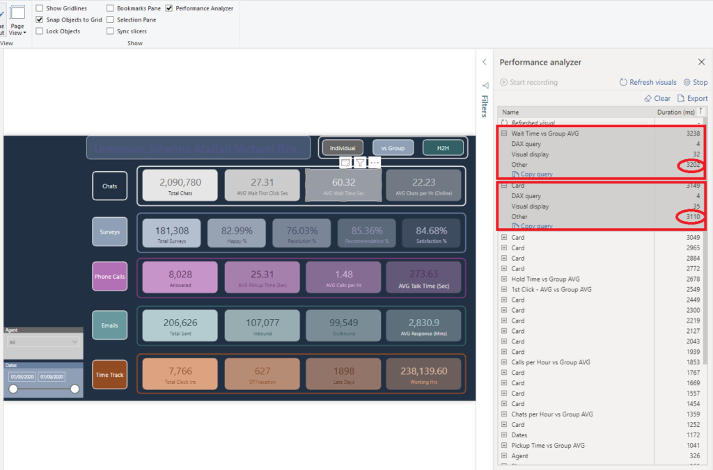
You can see that 2 of our card visuals hold the top with 3238 and 3149 ms respectively. However, once we expand to see the details of these numbers, we can notice that the “Other” part of the visual takes almost 99% of the total time!
What that “Other” even means ?!
The “Other” shows how long a specific visual had to wait in the execution queue before the DAX query for that visual could have been executed! Because my report contains more than 30 visuals, 21 of which are card visuals, some of them have to wait for others to complete before they are able to perform any action.
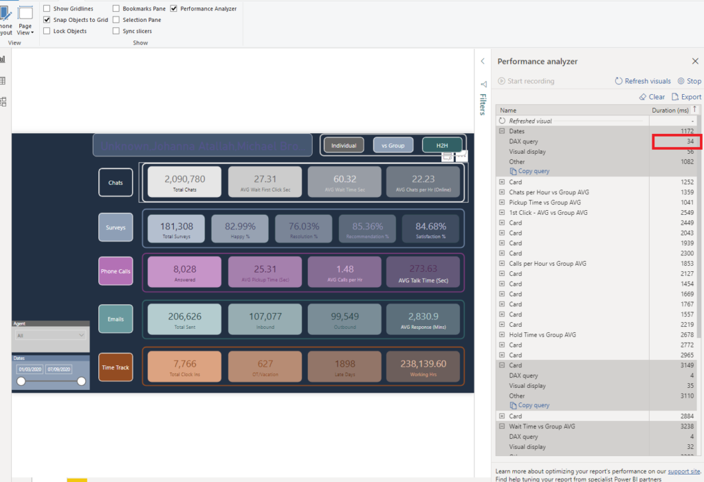
So, DAX queries are not a problem here, as you see that both these visuals took only 4ms to execute their DAX query. Even if I sort timings by DAX query, I can see that the longest DAX query took just 34ms:
Optimizing the report
I can’t stress enough how important it is to follow the blogs from all the great experts in the Power BI community and try to learn from them as much as possible.
Chris Hamill’s blog was an inspiration for me to try to optimize my original report. The starting point was to try to reduce the number of visuals on my report page. Since I confirmed that DAX queries were not a problem, the idea was to reduce the “Other” timings.
Create a background with shapes
The first thing I’ve done was to remove all of my shapes from the report (rectangles, etc.). How can you achieve this? You can simply create your background layout in PowerPoint and save it as an image!
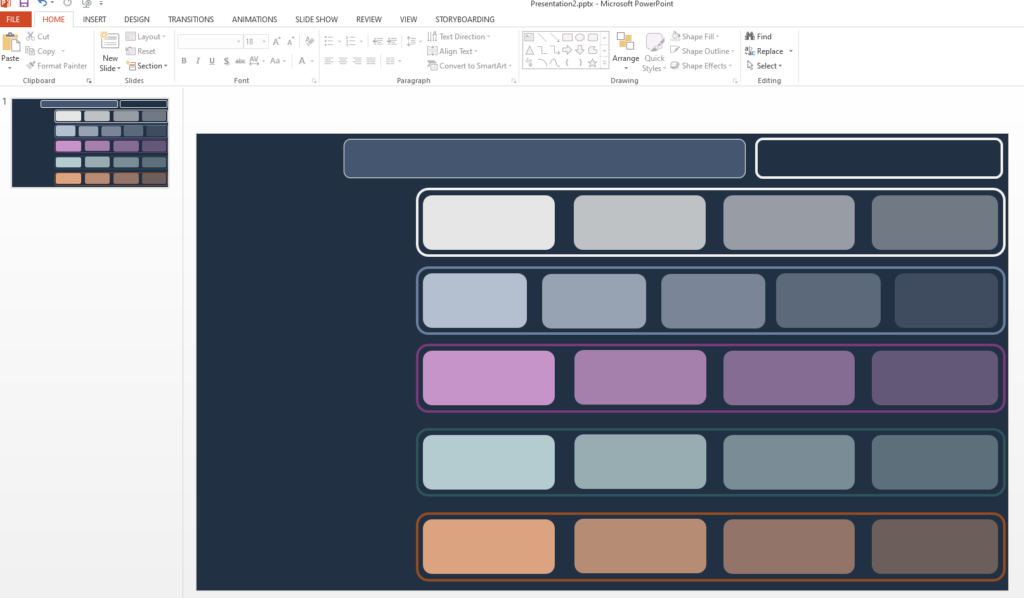
This is the layout I’ve created in PowerPoint, to “mimic” the look of the original page. Save it as an image:
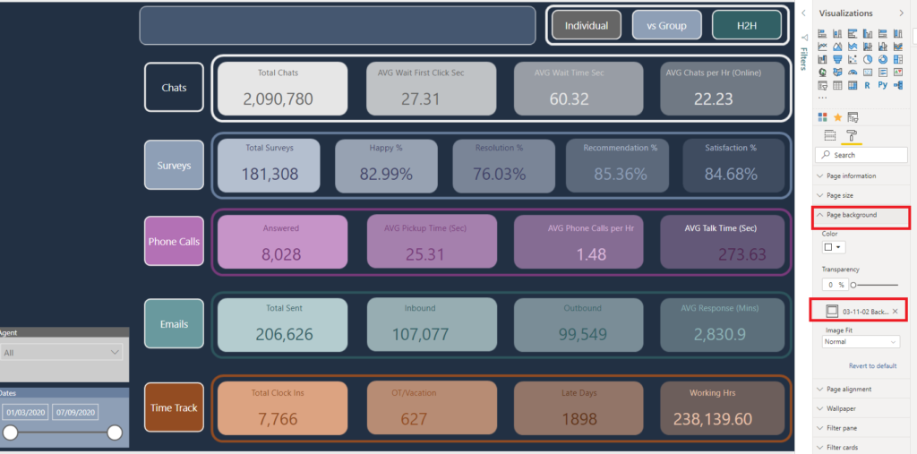
And put this image as a background image of your report! It’s simple as that!
Here comes the magic…
Now comes the most entertaining part…How can we replace existing card visuals, while at the same time keeping the “look and feel” of the original version?
That’s the point where Chris’s trick gets on stage. I’ve simply put my calculations in Matrix visuals, replacing separate card visuals with one single Matrix visual. And, with some tweaking and formatting, got (almost) the same report look!
The first thing you should do is to set Style to “None”, remove Outlines from both Column headers and Row headers, and turn-off Auto-size column width:

The key formatting is required within the “Field Formatting” property under the Format pane, where you should set proper colors, fonts, font sizes, etc. to follow the pattern from the original report.
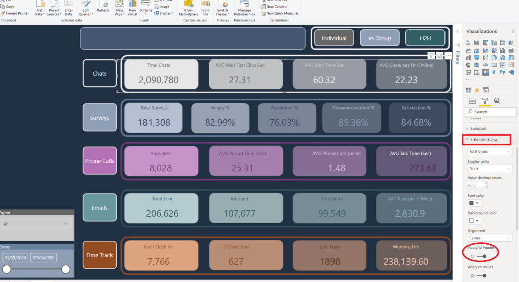
You should also not forget to stretch the individual matrix fields to take their place within the “card” shapes.
Fasten your seatbelts!
Now, let’s check the most important thing – don’t forget that we started whole this process in order to improve the performance of our report.
So, I will turn on Performance Analyzer again, now on my revamped report, and check the metrics:
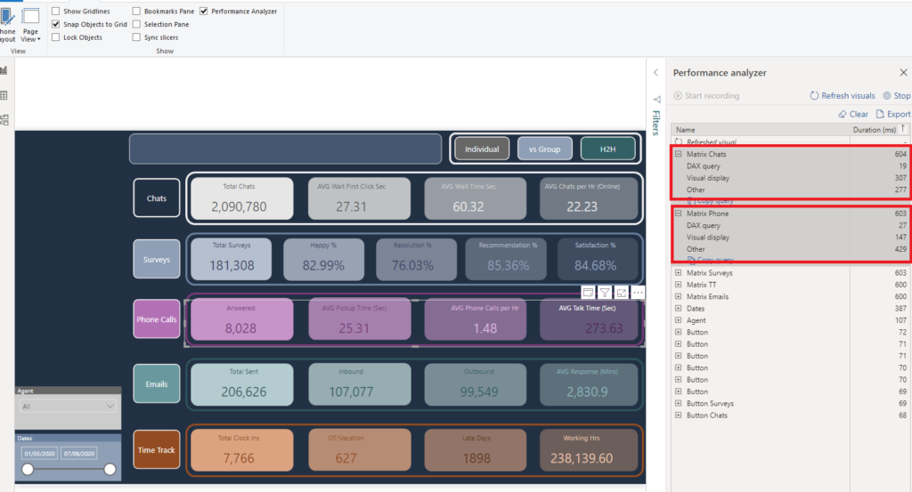
Oh, my God! The two slowest visuals in my report now took around 0.6 seconds to display! Comparing to 3 seconds in the original version, that’s 5x faster!!!
Now, you can notice that “Other” timings sank from approx. 3000 ms to under 300! And finally, the number of visuals in our report was significantly reduced by moving a bunch of them into the background image created in PowerPoint.
But, the key takeover here is: we practically didn’t change the original look of the report – we’ve just dramatically improved the underlying processes! Therefore, everything is the same for our users, except they will see the numbers much faster now! And you know what it means when your users get the results faster – “USERS-WILL-LOVE-YOU”:)
Conclusion
There are two key takeovers here:
- If your report runs slow, there are multiple ways to check the cause: use Performance Analyzer or DAX Studio to determine if you can apply some additional steps to improve the report
- Follow the blogs and videos from the Power BI experts. There are soooo many things to learn over there, and you can always find an inspiration for your own work
Final note: in case you need to apply similar improvement on the vertically placed Card visuals, Chris Hamill’s blog also explains how to achieve this.
Thanks for reading!
Last Updated on September 9, 2020 by Nikola


Carlos Santos
Very nice and sinple way to improve the report performance!
Nikola
Thanks Carlos, I’m glad if you find it useful
Small Multiples in Power BI – Curated SQL
[…] report performance even if they aren’t displaying any data; several other people have written similar posts too. Small multiples are just another way you can replace several visuals with a single visual […]