

Power BI is an awesome tool (and I know that you are aware of it). One of the things I like most about it, is a bunch of possibilities to enhance your reports using some simple techniques and create unbeatable experience for your users.
One of the coolest tricks to apply is creating tooltip report pages. With little creativity and in matter of minutes, you can enable your users to look through the data window with much more flexibility.
Default Tooltips
I’ve created simple report using Contoso dataset. By default, when you hover over data bar, you will see numbers for the specific portion of data:

Here, you can see that there was around 82 million sales amount in June 2009.
Custom Tooltips
Let’s say that I want to give my users opportunity to quickly get a better overview of the underlying data, by just hovering over data bars.
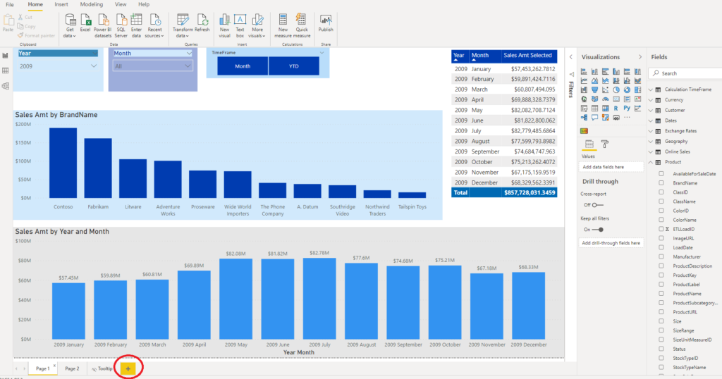
First step is to create a new report page, by clicking on “+” sign.
In the Format section of newly created page, we need to apply some settings in order to make this page a tooltip page. Under Page Size menu, instead of default 16:9, choose Tooltip size.

Then, under View tab, under Page View, I’m selecting Actual size, so I can create visualizations in “real” size, as it will be displayed on the main report page.
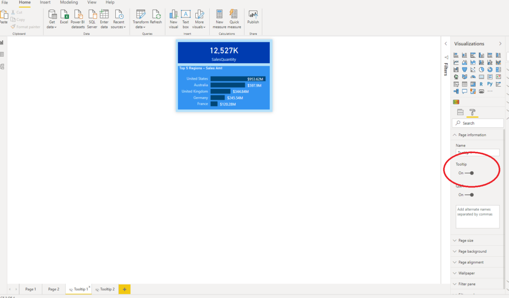
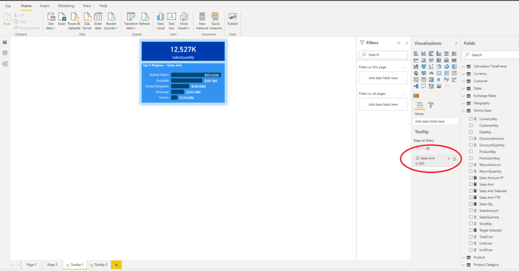
I’ve renamed my tooltip report page to Tooltip 1 (of course, you should give it more meaningful name, especially when you deal with multiple tooltip pages). On this page, I’ve put one Card visual, which displays total number of sales, and one Clustered Bar Chart, which shows top 5 regions by sales amount. I’ve also made this page hidden, so that users can’t see it when they open the report.
One last step is to “tell” Power BI that I plan to use this page as a tooltip. Therefore, under Page Information, I toggle Tooltip to ON:
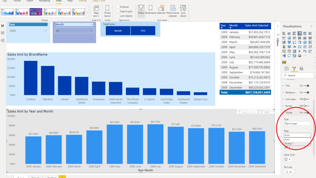
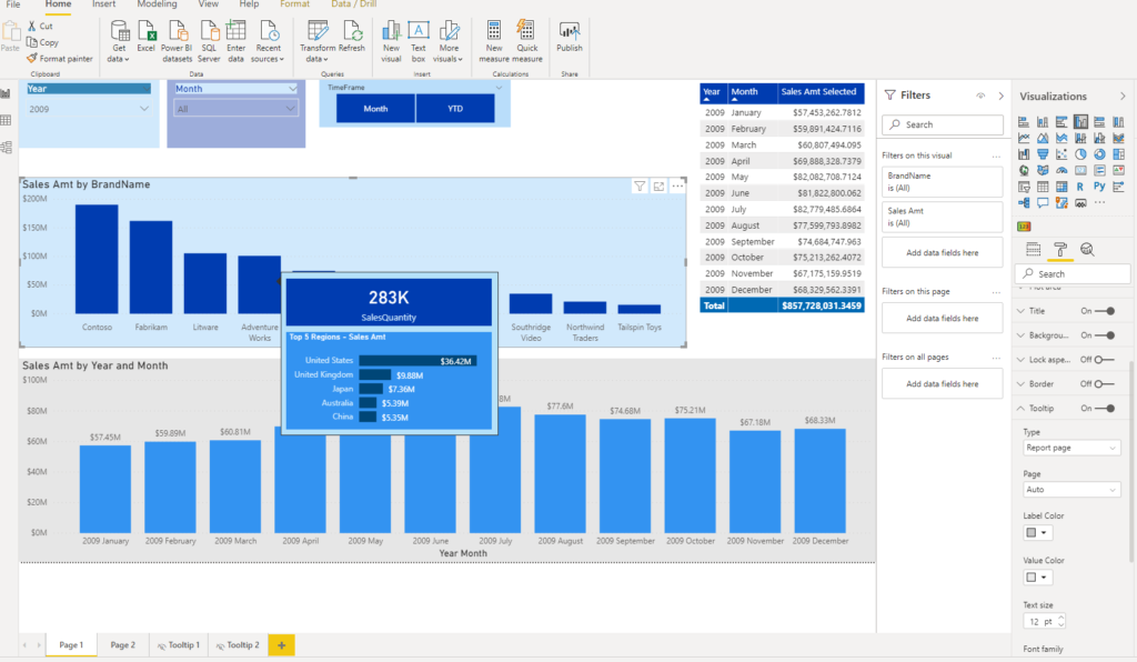
Now, let’s switch back to main page. Under Format pane, there is a Tooltip menu. You just need to select Report page under Type and our newly created tooltip page under Page:
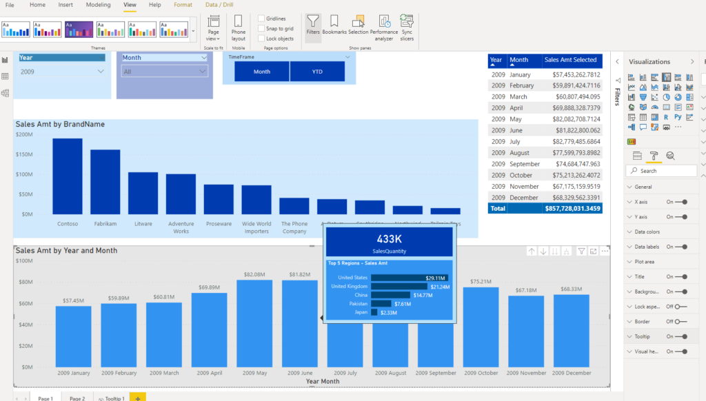
And that’s it: now, when user hovers over specific data bar, he can immediately see drilled down data, as defined in our tooltip!
Make it your own…
Beside default tooltip page size (320x240px), you can also create your own tooltip page size. Instead of selecting Tooltip under Page size, simply choose Custom and enter values you want. I’ve created a tooltip page Tooltip 2 and changed size to 328×200 pixels. It simply shows sales amount break down per product color, so now when user hovers over product, he will see figures per color for selected product:
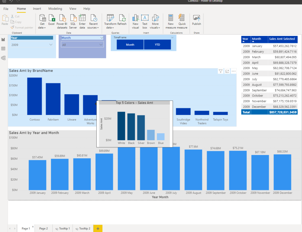
This way, I see which colors produced greatest sales amt for Adventure Works brand in 2009.
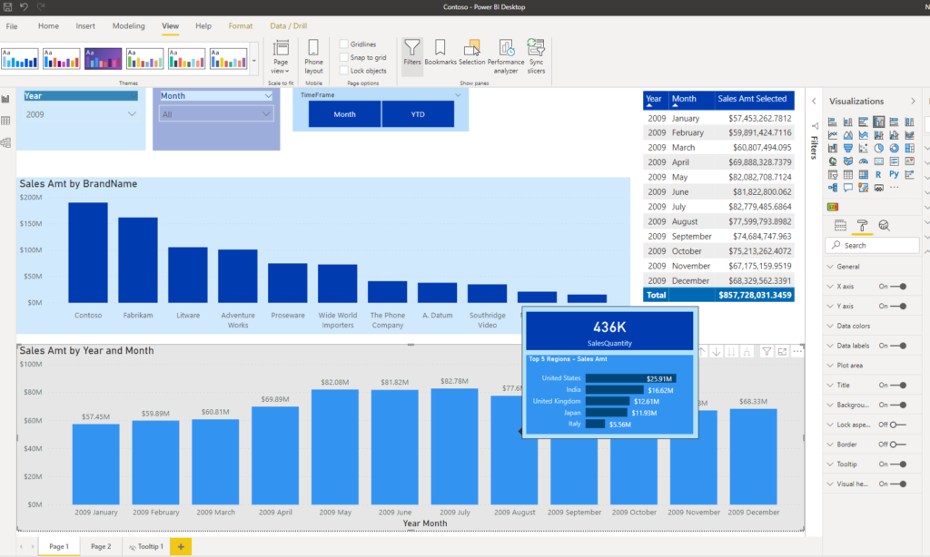
Finally, you can specify a Tooltip field on a Tooltip page. That means that every visual in your report which refers to specified field, will display your tooltip page instead of default Power BI tooltip.
Now, if I back to main report and leave Auto option as a tooltip report page, any visual which displays sales amount measure will show my customized tooltip! How cool that is!
So, when I hover over brand name, I will get sales quantity and top 5 regions:
Level PRO with animated tooltips
Last technique is really level PRO and credits go to Jason Cockington from Exceleratorbi, who explained this in details. In short, you can add GIF as a tooltip! This is extremely useful, because lot of users are unaware of all Power BI capabilities and need some kind of guidance in order to use report in its full capacity.
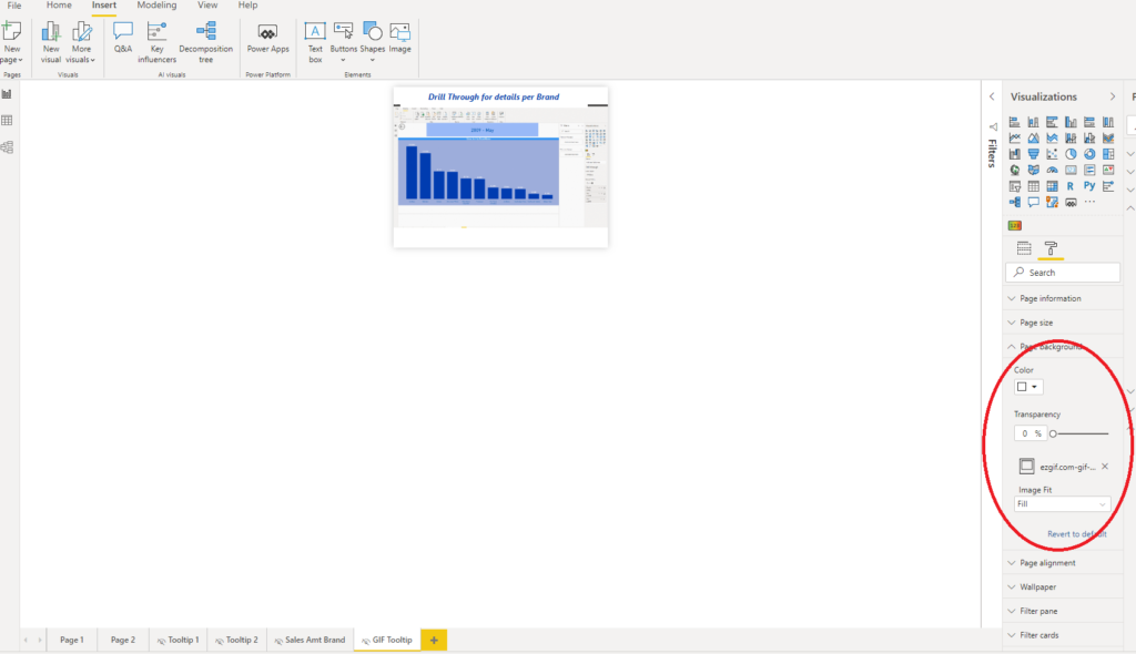
One of the most common scenarios is when you create drillthrough page within your report, but your users are not aware of it, or simply don’t know how to reach it. So, I’ve created a GIF (there are bunch of free GIF creators on the web, this is one of them) which shows steps to perform drill through action from main page table to detailed overview of sales amount per brand.
After you created a GIF, all the steps previously explained in this post are same. The only difference is that, instead of putting GIF as an image on your tooltip page, you should set it as a background image, with 0% transparency and set Image Fit property to Fill:
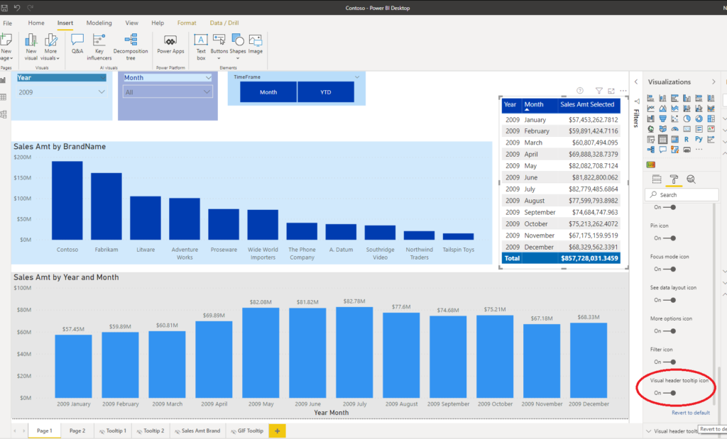
Next, on the main page table, I’ve turned on Visual header tooltip icon:
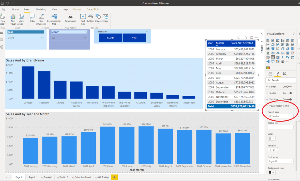
Finally, under Visual header tooltip, I defined my newly created tooltip page (in my example it’s called GIF Tooltip).
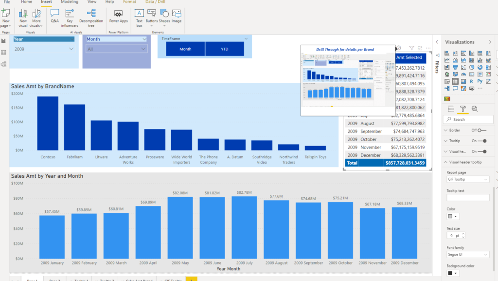
So, now when someone hovers over small question mark icon, he will see animated instructions on how to perform drill through action. Awesome!
Conclusion
Report page tooltips are quite powerful feature and they can really enrich your reports. However, be careful when using them, especially if your report contains many visuals, since performance can drop due to increased rendering time.
As for any other technique in Power BI: Try to find right balance between user experience enhancement and additional overhead regarding report performance.
Last Updated on August 18, 2020 by Nikola


Building an End-To-End Analytic solution in Power BI: Part 5 — Action, please! – Kamran Mahmoudi
[…] over a specific visual, the respective action should be displayed! I’ve already written how to enhance your report using tooltip pages, and here we will follow a similar […]
Wale
This is fantastic. Had no idea you could do that gif thingy.