Recently, I was dealing with a Power BI report where the client had a very specific requirement – to sort the data in the visual based on a particular field from the semantic model. The only “issue” was that this particular field wasn’t part of the visual. So, while figuring out how this can be accomplished (because, yes, everything can be accomplished when the client needs it, hehe), I decided to write it down and share it with everyone who might find it useful.
Setting the stage
Let me briefly explain the client’s requirement first. For this example, I’ll be using the sample Adventure Works database.
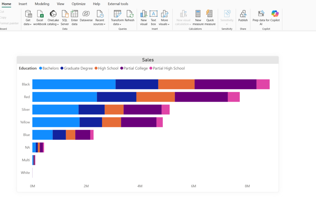
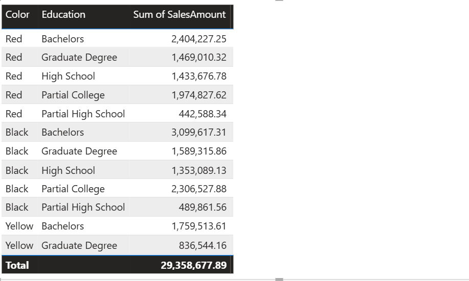
As you may notice, I’m displaying the total sales amount per color and education level. Now, regular sorting allows you to sort the data based on the fields that are part of the visual – Color or Sales Amount:
However, this will sort the data points based on the OVERALL sales amount value. But what if I need to sort the data based on the sales amount value for a specific education level, such as High School (the orange one in our visual)? This was the exact requirement in my project.
DAX to the rescue!
As usual, DAX is our swiss-knife for solving numerous Power BI challenges! Let’s create a measure that will calculate the sales amount for the “High School” education only:
Sales High School = CALCULATE(
                            SUM(FactInternetSales[SalesAmount]),
                            DimCustomer[EnglishEducation] = "High School"
)
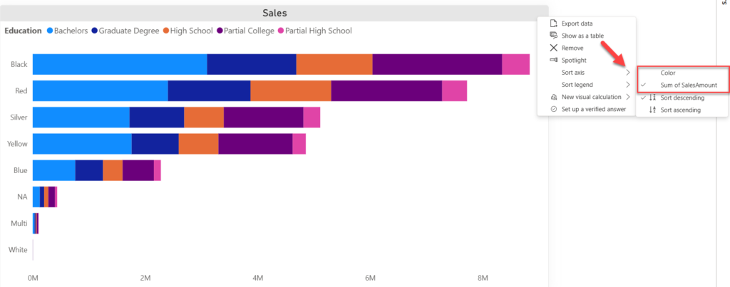
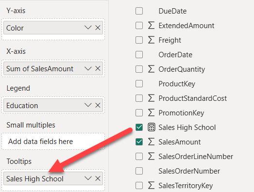
Now that we have this new measure in place, we can drag it to the Tooltips section of the visual:
Once the measure is in the Tooltips section, click on the three dots of the visual again…
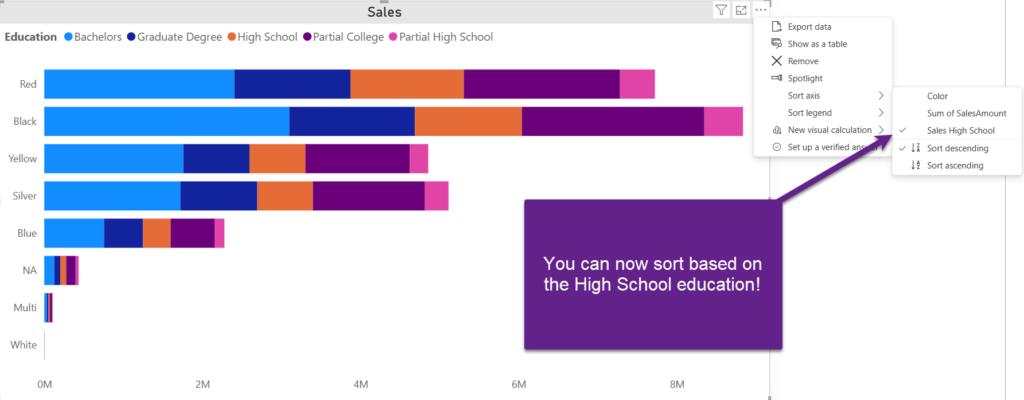
Voila! We can now sort data based on the High School education sales! As you might have seen, the visual changed accordingly.
What about visuals that don’t support Tooltips?
Fair question! Not all visuals in Power BI support the Tooltips feature. A good example is a Table visual, which is commonly used in Power BI reports. So, how do we make our client happy in this case? Fear not, I’ll show you a workaround!
In the following illustration, you see our starting point:
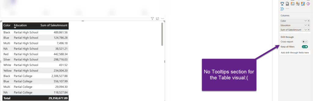
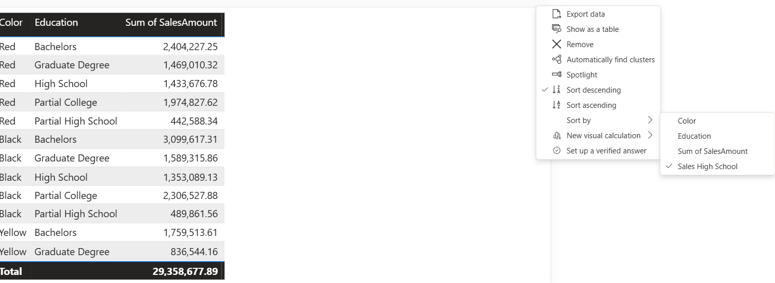
No Tooltips section, and the data in the Table visual is sorted by Education. But, remember, the requirement is to sort it based on the total sales for the High School education level. In this case, we can’t trick Power BI, and we really need to include our DAX measure in the Table visual:
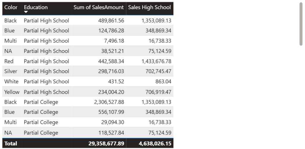
Here, we will apply the brute force and reduce the column width to 0 pixels to make it invisible…
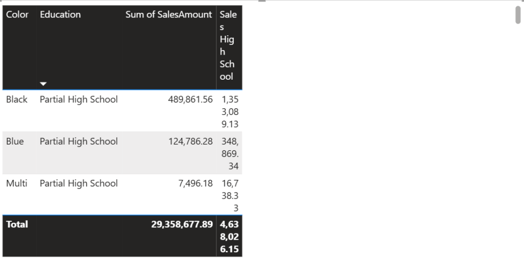
Oh, God, what is this now??!! This looks so ugly, and it doesn’t accomplish the goal. Again, fear not:)
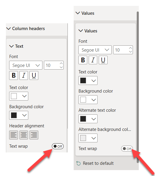
Simply open the Format pane and turn the Text wrap option off for both Values and Column headers:
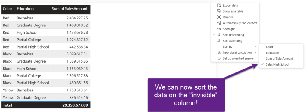
Now, go back to the Table visual and collapse the Sales High School column until it becomes invisible:
If you click on the three dots for this Table visual, you can now sort the data based on the “invisible” column:
Yeah, I know it’s not the most sophisticated way of accomplishing the goal – but, hey, my client was more than happy with the solution. And, in most cases, that’s what counts in the end – a happy end user!
Have you found any better solutions to requirements like this? Drop me your ideas in the comments.
Thanks for reading!
Watch on YouTube:
Last Updated on August 29, 2025 by Nikola